#3751

Posted 14 September 2012 - 03:05 PM
#3752

Posted 14 September 2012 - 05:50 PM
NOT into the final poster, however...
#3753

Posted 14 September 2012 - 07:39 PM
#3754

Posted 14 September 2012 - 07:58 PM
#3755

Posted 14 September 2012 - 08:01 PM
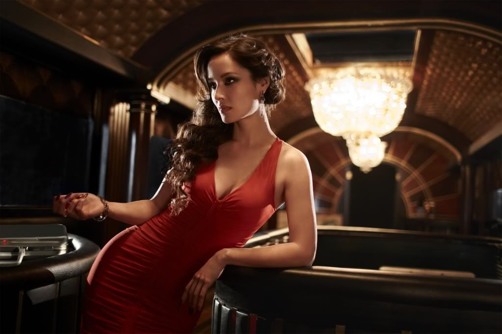
What's that symbol (tattoo) on her wrist? A new "spectre-ring"? Looks like a chinese sign.
I noticed that too, good question.
xxx
WOW!!!
It looks like a train but its the floating Casino right?
#3756

Posted 14 September 2012 - 08:31 PM
#3757

Posted 14 September 2012 - 08:35 PM
Here's a pretty crude low quality image of what I believe to be the final theatrical poster.
#3758

Posted 14 September 2012 - 08:40 PM
Edited by DamnCoffee, 14 September 2012 - 08:40 PM.
#3759

Posted 14 September 2012 - 08:48 PM
#3760

Posted 14 September 2012 - 09:07 PM
Would I have liked a bit more going on? Absolutely. It's not perfect, but it beats the photoshop nightmare of the final Brosnan posters. (Bar GoldenEye).
Edited by DamnCoffee, 14 September 2012 - 09:12 PM.
#3761

Posted 14 September 2012 - 09:13 PM
The teaser did that, sure, but at least it had an aesthetic sensibility to it.
#3762

Posted 14 September 2012 - 10:05 PM
#3763

Posted 14 September 2012 - 10:34 PM
I wonder if these are 'location posters'. We see London in the background there. What if they released a few more, with a different shot of Bond for each one, with Shanghai, Turkey and Scotland behind him?
I like that idea.
#3764

Posted 14 September 2012 - 11:27 PM
I can't imagine the final poster not having Berenice or Eve in it and London in the background. I figure they'll follow the formula of the CR and QOS posters.
#3765

Posted 14 September 2012 - 11:29 PM
#3766

Posted 14 September 2012 - 11:33 PM
No the one in the red dress is not the floating casino, nor is it from the film at all, however the picture of her in the black dress, I believe, is from the film set at the floating casino.
Here's a pretty crude low quality image of what I believe to be the final theatrical poster.
Ordinarily I’d say it’s way too amateurish to be real. However, having seen the crap produced for the character posters and the design atrocities forwarded for this film so far, I honestly can’t say even this rubbish is unbelievable.
#3767

Posted 15 September 2012 - 12:20 AM
#3768

Posted 15 September 2012 - 12:45 AM
#3769

Posted 15 September 2012 - 12:48 AM
What are the chances the finale poster will be out for the release of the 'Bond On Set Filming Skyfall' book so that it can be include in it?
The film posters have never been used in Bond on Set I don't think. It's an insight into the production, not the publicity department.
#3770

Posted 15 September 2012 - 01:27 AM
No the one in the red dress is not the floating casino, nor is it from the film at all, however the picture of her in the black dress, I believe, is from the film set at the floating casino.
Here's a pretty crude low quality image of what I believe to be the final theatrical poster.
If that's the final theatrical poster, than that's pretty sad.
Looks like I'll be buying the teaser poster and the character poster of Severine.
#3771

Posted 15 September 2012 - 05:56 PM
Anyway -- the new U.S. one-sheet --- I like it. It does the job. It's innovative and unusual, clean and effective.
#3772

Posted 15 September 2012 - 08:50 PM
Anyway -- the new U.S. one-sheet --- I like it. It does the job. It's innovative and unusual, clean and effective.
Woah, woah, woah. Clean? It's a disproportional mess. Simple on the other hand, yes.
#3773

Posted 15 September 2012 - 09:36 PM
Anyway -- the new U.S. one-sheet --- I like it. It does the job. It's innovative and unusual, clean and effective.
Yes, quite. I think it works better as a quad, but it's still eye-catching and fresh. Finding a new Bond pose is quite a tricky thing!
#3774

Posted 15 September 2012 - 11:13 PM
Well, not all that new.
Anyway -- the new U.S. one-sheet --- I like it. It does the job. It's innovative and unusual, clean and effective.
Yes, quite. I think it works better as a quad, but it's still eye-catching and fresh. Finding a new Bond pose is quite a tricky thing!
http://www.thebookbo...s-familiar.html
#3775

Posted 15 September 2012 - 11:49 PM
Well, not all that new.
Anyway -- the new U.S. one-sheet --- I like it. It does the job. It's innovative and unusual, clean and effective.
Yes, quite. I think it works better as a quad, but it's still eye-catching and fresh. Finding a new Bond pose is quite a tricky thing!
http://www.thebookbo...s-familiar.html
Fancy that!
#3776

Posted 16 September 2012 - 11:30 PM
http://bit.ly/rogerdeakins
xxx
#3777

Posted 17 September 2012 - 12:54 AM
#3778

Posted 17 September 2012 - 01:16 AM
Marketto posts to image topic. Get excited.
haha...
xxx
#3779

Posted 17 September 2012 - 04:58 AM
Always a treat when Marketto posts new stunning images!
#3780

Posted 17 September 2012 - 07:53 AM
Also tagged with one or more of these keywords: Skyfall, photo, beard
Film Eras →
General Bond Film Discussion →
The 007th Minute: a review seriesStarted by Jim , 17 Nov 2013 |
|
||
Film Eras →
Daniel Craig (2006 - ) →
Skyfall (2012) →
SPOILERS: Skyfall (2012) →
Shades of You Only Live Twice in Skyfall?Started by Colombo , 08 Jan 2012 |
|


