I don't have a problem with the title. While I wouldn't call it "Bondian", it does leave a lot to the imagination which I think is good.
But you do have the weirdness of British Hero, American Author, Dubai location, and, um, French title.
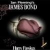
Regarding the cover, I realize it is difficult to come up with something unique for a fiction series that is almost 60 years old.
Fleming agonized over his covers. He paid money out of his own pocket for Chopping because Jonathan Cape would only spend a pittance on covers.
I can't say that the CB cover required much more than a passing knowledge of Photoshop to create. Some of you like the minimalism and I'm happy for you. But I hope you'd at least acknowledge that minimalism isn't for everybody.
I like the title. It's not really Fleming, but I'm glad it's not really trying to be. At least that's my take.
The cover art, yeah. It's minimalist and I like that, but it's nothing special. It was probably whipped up in Photoshop in 5 minutes. It's not original as you've pointed out. It's definitely been done in the Bond world, usually with a gun, a cigarette or a cigar. Examples being the Die Another Day poster (Dr. No also does it), the Secret Servant cover, the recent Blofeld cover and it's been used more than once for the title sequences of some Bond movies. But nothing is original with the Bond world anymore. It's all been done. Girls, shadows, gunplay, smoke, fire, flowers, things you can smoke, coins, explosions, bugs, wood, skeletons, animals, odd-looking bad guys, mutations (I don't know what to call it, think Devil May Care flower / girl - Octopussy hair / octopus), outlines (including the more complex ones with something inside like The World Is Not Enough's fire girl), and even just random crap thrown on there (Pan used to do this).
As the start of a new series, I think it's simply fine. I think they could have done something else. If it were me in charge, I would have looked to Casino Royale and the other pre-Chopping Fleming first editions. They're simple, sometimes just elegant looking text and that's alright. I think they work wonderfully for the beginning of a series and there's something about not looking cliche Bond or spy that is quite attracting to me at the moment.


