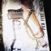
Shouldn't he be holding a Tom Ford branded shopping bag in that watch hand as well? Just so we know? Or at least have a label hanging down from the jacket.
The poster is growing on me - I just wish they wouldn't annoy me with that watch!

Second 'Quantum of Solace' poster revealed
Started by
Simon
, Jul 04 2008 09:56 AM
241 replies to this topic
#152

Odd Jobbies
-

- Veterans
-

- 1573 posts
Lt. Commander
- Location:London
Posted 10 July 2008 - 10:16 AM
I think this image will be at the top of the movie, or possibly in the title sequence.
It looks like Mr. White's 'Point of View' angle from the end of Casino Royale -- after he's shot, we saw Bond's shadow move across him. It's a fantastic image - best shot in the trailer. Has the nice burnt out quality of a 60s French gangster movie, or perhaps the feel of 'The French Connection'.
Since they've said the action picks up an hour after Casino Royale, i'm guessing this replay of the seen will be somewhere right at the top of the movie.
Maybe they'll reverse the gunbarrel motif and have the actor in the sights, surprisingly getting shot, but then it's revealed it's in fact not Bond, but Mr White. Then we'd see this POV angle of Bond approaching.
Would be a nice catch-up on CR's ending and would be a bold statement that in this story Bond is turning the tables on the villains; whereas he's usually reacting to the villain's opening move/attack, he's the one attacking, seeking revenge (a motive usually associated with the villain).
#153
marktmurphy
-

- Veterans
-
- 9055 posts
Commander
- Location:London
Posted 10 July 2008 - 10:50 AM
It rather echoes the trailer for me: it's the same old, same old; but there's nothing actually wrong with it.
#154
Publius
-

- Veterans
-
- 3225 posts
Commander
- Location:Miami
Posted 10 July 2008 - 12:57 PM
It's okay. I loved the teaser poster since it reminded us so strongly that this is going to be a direct continuation from CR, all with nothing more than a shadow cast over some gravel. This one, however, is just a little boring.
Then again, the CR teaser poster was one of the best I've ever seen for a movie, while the main poster that came later didn't interest me a bit, so I'm not reading too much into this.
Then again, the CR teaser poster was one of the best I've ever seen for a movie, while the main poster that came later didn't interest me a bit, so I'm not reading too much into this.
#155
marktmurphy
-
- Veterans
-
- 9055 posts
Commander
- Location:London
Posted 10 July 2008 - 01:39 PM
I wasn't over keen on the main CR poster, but the other quad one which had three or so Daniels all walking in a line was great, I thought. Something actually new.
#156
Skudor
-

- Veterans
-
- 9286 posts
Commander
- Location:Buckinghamshire
Posted 10 July 2008 - 01:53 PM
I wasn't over keen on the main CR poster, but the other quad one which had three or so Daniels all walking in a line was great, I thought. Something actually new.
That was a great poster - saw it in pretty big scale in a couple of places. Great poster that was.
#157
David_M
-

- Veterans
-
- 1064 posts
Lt. Commander
- Location:Richmond VA
Posted 10 July 2008 - 01:56 PM
Nowhere near as good as the classics, of course, but it beats the heck out of the previous teaser poster, with that impossible "shadow" spray-painted on the ground.
If they're going to give work to interns, at least they're putting them in charge of the posters now instead of the CGI.
If they're going to give work to interns, at least they're putting them in charge of the posters now instead of the CGI.
#158
Simon
-
- Veterans
-
- 5884 posts
Commander
- Location:England
Posted 10 July 2008 - 02:10 PM
The 'three Daniels' poster was never actually released as a quad. I believe this was more an image that got to billboard level of distribution.I wasn't over keen on the main CR poster, but the other quad one which had three or so Daniels all walking in a line was great, I thought. Something actually new.
(This of course unless you actually have a quad, but there was also no mention made of it as such in the Marketing Guide to CR)
#159
Aris007
-

- Veterans
-
- 3037 posts
Commander
- Location:Thessaloniki, Greece
Posted 10 July 2008 - 03:39 PM
Shouldn't he be holding a Tom Ford branded shopping bag in that watch hand as well? Just so we know? Or at least have a label hanging down from the jacket.
The poster is growing on me - I just wish they wouldn't annoy me with that watch!
Right! This watch looks awful! I think that a Submariner would be better! It's the only piece that doesn't look nice in that poster. I'm glad that it doesn't overshadow it!
#160
HH007
-

- Veterans
-
- 1833 posts
Lt. Commander
- Location:U.S.A.
Posted 10 July 2008 - 04:11 PM
Btw Craig's hand looks ugly, like that of Gothmog from LOTR-3

His hand looks like that Bald Dude's from "The Machinist".
#161
Tuxedo
-
- Crew
-
- 237 posts
Sub-Lieutenant
- Location:Europe
Posted 10 July 2008 - 04:28 PM
Bond walking on the moon. In a correct suit. With a SILLY gun . Doesn´t work for me.
#162
Krilencu
-

- Crew
-
- 257 posts
Sub-Lieutenant
- Location:Novosibirsk, Russia
Posted 10 July 2008 - 04:56 PM
Btw Craig's hand looks ugly, like that of Gothmog from LOTR-3
His hand looks like that Bald Dude's from "The Machinist".
I was referring to another poster, the one with exploding car.
#163
Jericho_One
-

- Veterans
-
- 1370 posts
Lt. Commander
- Location:Portugal
Posted 10 July 2008 - 05:55 PM
Shouldn't he be holding a Tom Ford branded shopping bag in that watch hand as well? Just so we know? Or at least have a label hanging down from the jacket.
The poster is growing on me - I just wish they wouldn't annoy me with that watch!
I'm right there with you on that one. Isn't the watch actually whispering "Buy me!" or something of the kind?
Now even teaser posters get product placement?
Geez...
#164
blueman
-

- Veterans
-
- 2219 posts
Lt. Commander
Posted 10 July 2008 - 08:05 PM
I still prefer the screen grab from the teaser trailer with Craig wearing the sunglasses. Nice poster either way though.
#165
bonds_walther
-

- Crew
-
- 419 posts
Sub-Lieutenant
Posted 10 July 2008 - 09:59 PM
I really like it. Bah to those who don't! Haha!
Seriously, I understand those who want more of a traditional Bond poster, but you've got to remember we're in the era of a different style of Bond. I think the marketing strategy has to reflect that, but without alienating anyone.
Seriously, I understand those who want more of a traditional Bond poster, but you've got to remember we're in the era of a different style of Bond. I think the marketing strategy has to reflect that, but without alienating anyone.
#166
DavidSomerset
-

- Crew
-
- 879 posts
Lieutenant
- Location:Moonbase Alpha
Posted 10 July 2008 - 11:45 PM
I hope they dont show DC with the same silly gun with GAL1 on left and GAL2 on right. As someone mentioned here, they are using them interns for sure.
#167
Skudor
-
- Veterans
-
- 9286 posts
Commander
- Location:Buckinghamshire
Posted 11 July 2008 - 08:24 AM
I hope they dont show DC with the same silly gun with GAL1 on left and GAL2 on right. As someone mentioned here, they are using them interns for sure.
Don't forget the villain and the henchman peeking over their shoulders, the Aston Martin (and some Ford car) prominetly displayed and the watch hand magnified so much that you can see the brand stamped on it.
#168
honeyjes
-

- Crew
-
- 183 posts
Sub-Lieutenant
Posted 11 July 2008 - 01:54 PM
It may not be a deliberate product placement, thats how DC wears his watch. You will invariable find product placement/fault if you go looking for it. I'm surprised we enjoy anything as were so busy analysing and looking for an ulteria motive we seem to forget it's only entertainment.
#169
Aris007
-
- Veterans
-
- 3037 posts
Commander
- Location:Thessaloniki, Greece
Posted 12 July 2008 - 09:29 AM

The new quote will be: "It doesn't bother you destroying all these Astons?"
#170
Professor Dent
-

- Veterans
-
- 5326 posts
Commander
- Location:Pennsylvania USA
Posted 12 July 2008 - 01:39 PM
The more I look at this poster, I really like how the 007 logo in the title is a different color than than the rest of the Quantum of Solace wording. It sets it off in a way that the Casino Royale title didn't. The color match to "October 31" is also cool.
#171
Skudor
-
- Veterans
-
- 9286 posts
Commander
- Location:Buckinghamshire
Posted 12 July 2008 - 01:55 PM
It really isn't bad for a fan effort. Pity that the blurb at the bottom is all wrong. The flaming Aston is a nice idea (better than not burning!) - although it looks rather fake.
The new quote will be: "It doesn't bother you destroying all these Astons?"
#172
Nicolas Suszczyk
-

- Veterans
-
- 3735 posts
Commander
- Location:Buenos Aires, Argentina
Posted 12 July 2008 - 03:16 PM
I love the new poster! hope we get it here in Argentina!
#173
Mr. Blofeld
-
- Veterans
-
- 9173 posts
Commander
- Location:North Smithfield, RI, USA
Posted 13 July 2008 - 04:11 AM
Here's a slightly altered version of the poster, for everyone complaining about the watch:

http://img149.images...ever2xlgln0.jpg
Now, for all you Batman fans:

http://img149.images...oseriousmu6.jpg
http://img149.images...ever2xlgln0.jpg
Now, for all you Batman fans:
http://img149.images...oseriousmu6.jpg
#174
Captain Tightpants
-
- Veterans
-
- 4755 posts
Commander
- Location::noitacoL
Posted 13 July 2008 - 10:00 AM
The truth of it is, this poster is a hell of a lot more effective at conveying its message than a "traditional" one (ie Bond posing with Walther PPK). And this is why:I really like it. Bah to those who don't! Haha!
Seriously, I understand those who want more of a traditional Bond poster, but you've got to remember we're in the era of a different style of Bond. I think the marketing strategy has to reflect that, but without alienating anyone.
When creating something like this, there's a whole range of messages and subtleties that need to be communicated. In much the same way as the pose of the shadow in the international teaser poster, the gun establishes a link between this film and the last. When Bond is standing over White at the villa, there are three things you notice in the foreground: Bond, the gun and the phone (which doesn't count for much as he turns it off an puts it away). In creating this teaser poster, they've clearly gone for an approach that says "this is a sequel" without physically writing it on a poster. The idea of a teaser poster is to generate interest, and with so many films being released, most audiences are simply skimming them while waiting to enter the theatre, and not all of them are as informed of the going-ons of the film as we are. Most people won't take five minutes to read all the text that appears on a poster; most of the time, they'll probably give it about five seconds. While the 007 logo is enough to draw the attention of pretty much anybody - beause Bond is one of those cultural icons; we all know who 007 is - it always features on a film poster. It's enough to establish it as a Bond film, but it doesn't offer any degree of differentiation between this film and any of its predecessors. The image of Craig, which naturally draws the eye because of the way the poster is arranged (we read left-to-right, so his image wouldn't be nearly as effective if it were on the left side of the poster) tells us that he is James Bond, and that this is his second film (assuming people have already sen Casino Royale). While the desert offers some insight to the setting of the film - up until now everything says "this is a James Bond film in the desert" - it still doesn't really differentiate anything. Die Another Day's poster was domnated by ice. Tomorrow Never Dies featured Bond in front of a whole array of television screens showing news reports, and so on. It's the preence of the gun that establishes a link between this film and the last, and is the agent of differentiation within this poster. People who have seen Casino Royale will know that it is a sequel. People who have not seen it, but have seen previous Bond films will not the change in Bond's hardware as previously, Bond has consistently been seen in posters with the Walther PPK and will therefore register the change and be drawn into it. People who have never seen a Bond film before will see a see a contradiction of images: Bond is wearing a suit, but he's standing in the middle of the desert, which is hardly the clothing to be wearing there; he's also carrying a rather big gun in a pose that he suggests he knows exactly how to use it, which says he's not your average action hero, so maybe it's a film to watch out for.
(Yes, this is lifted almost verbatim from a post by another user over at MI6 Forums ... but he is me and copying this over is okay.)
#175
Aris007
-
- Veterans
-
- 3037 posts
Commander
- Location:Thessaloniki, Greece
Posted 13 July 2008 - 10:00 AM

#176
DamnCoffee
-

- Executive Officers
-
- 24459 posts
Commander
- Location:England
Posted 13 July 2008 - 10:02 AM
Now, for all you Batman fans:
LMAO! This is fantastic!
#177
bond 16.05.72
-

- Veterans
-
- 1068 posts
Lt. Commander
- Location:Leeds, West Yorkshire, United Kingdom
Posted 13 July 2008 - 10:52 AM
Now, for all you Batman fans:
LMAO! This is fantastic!
I have to agree very funny and a great combination of my 2 most awaited films this year, I'm half tempted to put it has my desk top.
#178
SecretAgentFan
-

- Commanding Officers
-
- 9055 posts
Commander
- Location:Germany
Posted 13 July 2008 - 11:09 AM
The new quote will be: "It doesn't bother you destroying all these Astons?"
Nice but too much of a knockoff of the Dark Knight poster with Batman in front of the burning building.
#179
Professor Dent
-
- Veterans
-
- 5326 posts
Commander
- Location:Pennsylvania USA
Posted 13 July 2008 - 12:45 PM
Mr. Blofeld, nice work on the Batman themed poster!
#180
Mr. Blofeld
-
- Veterans
-
- 9173 posts
Commander
- Location:North Smithfield, RI, USA
Posted 13 July 2008 - 03:48 PM
Thanks, everyone; it took me half the night to do, but I'm glad you like it.Mr. Blofeld, nice work on the Batman themed poster!
