
Second 'Quantum of Solace' poster revealed
#121

Posted 09 July 2008 - 06:42 AM
#122

Posted 09 July 2008 - 12:26 PM
xxx
Edited by Marketto007, 09 July 2008 - 02:52 PM.
#123

Posted 09 July 2008 - 01:26 PM
Nothing but, Marketto007, nothing but... Btw, the name's Krilencu.Thanks for the 'High Res' Kurilenko. If you're able to get the REAL UK QUAD for us in a good quality too, we appreciate.
xxx
#124

Posted 09 July 2008 - 02:52 PM
xxx
#125

Posted 09 July 2008 - 02:55 PM
I have a hi-rez image of this so-called "poster" and it has some mistakes in the credits block, like "directed by Martin Campbell", "based on the novel by Ian Fleming", one time it says EON Productions, another - Production, and the Bond image is taken from the promo shot of Bond and Camille walking thru the desert. Btw Craig's hand looks ugly, like that of Gothmog from LOTR-3
LOL
I wish I could see this picture.
#126

Posted 09 July 2008 - 03:06 PM
As fan art, I've seen a lot worse.I have a hi-rez image of this so-called "poster" and it has some mistakes in the credits block, like "directed by Martin Campbell", "based on the novel by Ian Fleming", one time it says EON Productions, another - Production, and the Bond image is taken from the promo shot of Bond and Camille walking thru the desert. Btw Craig's hand looks ugly, like that of Gothmog from LOTR-3
A lot worse.
#127

Posted 09 July 2008 - 03:56 PM
Nothing to lose your sleep about. Still, tell me where to upload it, if you do want to see it.I wish I could see this picture.
#128

Posted 09 July 2008 - 04:15 PM
Thanks for the 'High Res' Krilencu. If you're able to get the REAL UK QUAD for us in a good quality too, we appreciate.
xxx
Here you go man:
http://www.impawards...e_ver2_xlg.html
as high as it gets.
Smaller version:
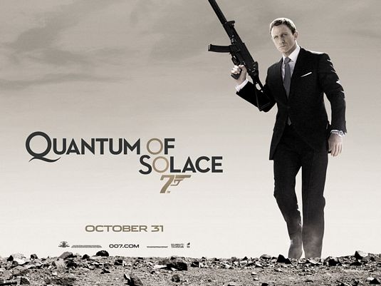
#129

Posted 09 July 2008 - 04:19 PM
#130

Posted 09 July 2008 - 04:30 PM
I am surprised they didn't roll his trouser leg up a little to get the sock manufacturer's name a mention.
And I don't want to hear Any reports from Omeeega that they didn't pay for this.
#131

Posted 09 July 2008 - 04:31 PM
Thanks for the 'High Res' Krilencu. If you're able to get the REAL UK QUAD for us in a good quality too, we appreciate.
xxx
Here you go man:
http://www.impawards...e_ver2_xlg.html
as high as it gets.
Smaller version:
OMFG!!! OMFG!!! How tha hell did you get this?
Thank you so much.
xxx
#132

Posted 09 July 2008 - 05:01 PM
Thanks for the 'High Res' Krilencu. If you're able to get the REAL UK QUAD for us in a good quality too, we appreciate.
xxx
Here you go man:
http://www.impawards...e_ver2_xlg.html
as high as it gets.
Smaller version:
OMFG!!! OMFG!!! How tha hell did you get this?
Thank you so much.
xxx
Thank you, as well! Great poster! I'm sure It's a wallpaper for many of you out there!
Edited by aris007, 09 July 2008 - 05:03 PM.
#133

Posted 09 July 2008 - 05:05 PM
#134

Posted 09 July 2008 - 05:08 PM
I'm sure It's a wallpaper for many of you out there!
Oh yes!
#135

Posted 09 July 2008 - 05:09 PM
His hand still looks a mite large, and the watch neatly tucked outside his shirt and jacket sleeve....
I am surprised they didn't roll his trouser leg up a little to get the sock manufacturer's name a mention.
And I don't want to hear Any reports from Omeeega that they didn't pay for this.
I rather like the poster. The watch does look incredibly vulgar, though. But then they do, don't they?
So much for James Blond.
#136

Posted 09 July 2008 - 05:10 PM
At least they removed the sunglasses. Thank god for that!
Now, put a walther in his hand dammit
Couldn't agree more. Oh come on Sony/EON, put back Bond with the Walther...please.
xxx
Same here. I'm not a big fan of this big rifle (is it a H&K MP5?) for a poster, it screams "action hero" rather than "Bond".
I'm not sure if somebody answered this already, but that gun is an HK UMP 9mm SMG. While it's larger than an MP5, it is by no means a "big rifle," It looks bigger because the one in the poster is equipped with a silencer. FYI, It's the same gun he uses to shoot White at the end of CR, if that isn't obvious to you.
My opinion is also that there is nothing wrong with Bond having this. Not saying anything about this style choice for the poster, a PPK or P99 or what have you would not stand out effectively here.
#137

Posted 09 July 2008 - 05:45 PM
It fits with Craig's era perfectly.
I'm sure the main poster will be something to moan about as well for you people who have already decided this is going to be a disaster.
Wait to you see the product first, god there's so much negativity from people, if you get DAD 2 come October 31st (Jammy I know) or Nov 07 then come and bitch about it then.
Don't purport to know what your gonna get cause nobody here know's that. A select group of people know what the finished product will be and they aren't on this site,
despite that some might make you think they know more than they will say with their prick teasing.
#138

Posted 09 July 2008 - 05:48 PM
It fits with Craig's era perfectly.
Couldn't agree more!
#139

Posted 09 July 2008 - 06:15 PM
Oh the poster I like, if one is accepting of the photo way forward for poster advertising. And I am not an advocate of drawn art or photo art, just so long as it is done well.His hand still looks a mite large, and the watch neatly tucked outside his shirt and jacket sleeve....
I am surprised they didn't roll his trouser leg up a little to get the sock manufacturer's name a mention.
And I don't want to hear Any reports from Omeeega that they didn't pay for this.
I rather like the poster. The watch does look incredibly vulgar, though. But then they do, don't they?
So much for James Blond.
It is the badly effected adding and subtracting of elements that upset as these are more indicative of untidyness than lack of design or in this case, what could otherwise be seen as effective simplicity.
#140

Posted 09 July 2008 - 06:44 PM
I think some fans need to leave the 60's behind. Surely these can't be the same ppl that demanded change after DAD? *sigh*
What is un-Bondish about the poster? It screams action? Well, in case i'm not mistaken Bond is action! But I think some want Moore's softly softly approach to action, when I prefer Craig's hard as nails action. And, unlike the terrible LTK, I know Bond means business, and he means business with style. The only Bond that I can picture striking the same pose effectively is Connery...yes and that includes the gun, which in my opinion is already establishing itself as an iconic image. I applaud EON for trying new things and playing with imagery.
Its a great poster, i'd love to own it and have it on my wall. Timeless in fact.
Lets gradually leave the Golden period of the 60's and enter the 21st Century please. All this 'its not Bond' is just too tiresome. Tennis is no longer played with wooden rackets, doesn't make it any less the sport it is does it? Do you guys want a kitchen sink drama, or a 21st Century Bond movie?
p.s. - love the watch, suit, sunglasses. Brosnan/Dalton never looked as stylish. At least they're bringing the style, flair and swagger back, mixed with a little rough stuff.
BOND IS BACK
#141

Posted 09 July 2008 - 07:08 PM
Although his interpretation of the character has done nothing but pour scorn and turn the character into a joke, I think I've blamed Brosnan too much for this in the past. Watching Rog talking to Octopussy with his Trousers hitched up around his stomach just hit a nerve.
Am I supposed to think this guy is cool, his dress sense is awful, I know they said they dressed him in the clothes of the time (big mistake) but Rog is so lacking the suave smooth panther look that Connery, Lazenby & Craig has displayed.
Many mourn Cubby not being around but he let Rog continue to a ridiculous point and should have learned to say no. At least his children had the good sense to put Pierce out to pasture at the right time.
My point and there is one, is when I see a poster like this I feel enormously greatful that we've come this far since that jokey era and Craig walking across a desert with big
I used to think I was quite a fan of Rog's Bond but I think I'm beginning to hate it sorry but this poster compounds it.
Once again I'll say it, Bond is back and by god he looks great.
#142

Posted 09 July 2008 - 07:48 PM
#143

Posted 09 July 2008 - 07:56 PM
#144

Posted 09 July 2008 - 08:02 PM
I think that helped a bit in some cases.I love it how nearly everyones feeling towards the poster has changed, since they've seen a higher quality version!
#145

Posted 09 July 2008 - 08:10 PM
I love it how nearly everyones feeling towards the poster has changed, since they've seen a higher quality version!
Yep. I simply loved the Poster now.
xxx
#146

Posted 09 July 2008 - 08:58 PM
#147

Posted 09 July 2008 - 10:38 PM
#148

Posted 09 July 2008 - 11:55 PM
#149

Posted 10 July 2008 - 12:50 AM
But anywho, I don't see why everyone has their panties in a bunch over this poster. I suppose it's the same crowd that have doomed the film because of the trailer, but regardless. The poster is cool - very much as metaphorical as the first with the muted tones.
Bond looks pissed off. It's good, relevant marketing. The poster shows Bond is mad, he's alone (the desert is quite a good symbol for that), and that he's out to take names. I don't think a lavish, Moore-era poster would be suitable.
I like it.
#150

Posted 10 July 2008 - 09:26 AM
As fan art, I've seen a lot worse.
A lot worse.
Yes, I think it's rather good. The explosion is a bit crude but it's a nice idea and the colours work well.
Oh the poster I like, if one is accepting of the photo way forward for poster advertising. And I am not an advocate of drawn art or photo art, just so long as it is done well.
True; I think the best-ever Bond poster was Goldfinger; and that's entirely photographic. And it's from the 60s!

