I've never been a huge connoisseur of the title sequences, but I thought SKYFALL's was tremendous. The title song also worked excellently alongside the imagery in my opinion.

Did you like Danny Kleinman's Skyfall titles?
Started by
I never miss
, Nov 03 2012 08:31 PM
100 replies to this topic
#61

Vauxhall
-

- Executive Officers
-

- 10744 posts
Commander
- Location:London, UK
Posted 15 November 2012 - 05:27 PM
#62
Hockey Mask
-

- Veterans
-
- 1027 posts
Lt. Commander
- Location:USA
Posted 15 November 2012 - 06:44 PM
I loved the location titles. I was hoping it would become a new Bond tradition. Could you imagine having 50 years of location titles in the vault and the outrage if it ever ended.(though I still appreciate their efforts in creating those location title cards, which I had hoped we'd be seeing again this time around).
#63
Vauxhall
-
- Executive Officers
-
- 10744 posts
Commander
- Location:London, UK
Posted 15 November 2012 - 07:50 PM
Excellent point! I also really liked the location cards in QUANTUM OF SOLACE. They were generally imaginative and not too obtrusive. Perhaps they could try something similar in the future.I loved the location titles. I was hoping it would become a new Bond tradition. Could you imagine having 50 years of location titles in the vault and the outrage if it ever ended.
(though I still appreciate their efforts in creating those location title cards, which I had hoped we'd be seeing again this time around).
I was about to go off-topic about SKYFALL's locators but will start a new thread instead.
#64
The Real X Filter
-

- Crew
- 12 posts
Cadet
Posted 15 November 2012 - 08:24 PM
I haven't see the Skyfall textless credits, and now seems to be offline.
Anyone has downloaded it?
Anyone has downloaded it?
#65
x007AceOfSpades
-

- Veterans
-
- 4369 posts
Commander
- Location:Sunny Southern California
Posted 15 November 2012 - 09:32 PM
I haven't see the Skyfall textless credits, and now seems to be offline.
Anyone has downloaded it?
The opening Credit sequence you mean?
#66
The Real X Filter
-
- Crew
- 12 posts
Cadet
Posted 15 November 2012 - 10:33 PM
Yes, the one is it at the main page, but doesn't work anow
#67
Trevelyan 006
-
- Crew
-
- 820 posts
Lieutenant
- Location:Antenna Cradle
Posted 15 November 2012 - 10:41 PM
They were great! I liked them better than both Quantum Of Solace and Casino Royale...
**Ducks before tomatoes are thrown**
**Ducks before tomatoes are thrown**
#68
Nicolas Suszczyk
-

- Veterans
-
- 3735 posts
Commander
- Location:Buenos Aires, Argentina
Posted 16 November 2012 - 12:53 AM
They were great! I liked them better than both Quantum Of Solace and Casino Royale...
**Ducks before tomatoes are thrown**
My toughts exactly!
#69
x007AceOfSpades
-
- Veterans
-
- 4369 posts
Commander
- Location:Sunny Southern California
Posted 16 November 2012 - 04:15 AM
Yes, the one is it at the main page, but doesn't work anow
I have it downloaded and if you want, I could email it to you.
#70
Bucky
-

- Veterans
-
- 1031 posts
Lt. Commander
- Location:Maryland
Posted 16 November 2012 - 12:37 PM
Wow I did not notice before that it was young Bond the first time they showed his eyes. That is pretty awesome.
#71
thecasinoroyale
-

- Veterans
-
- 14358 posts
Commander
- Location:Basingstoke, UK
Posted 16 November 2012 - 12:56 PM
Nor did I Bucky until second viewing, and it all made sense. A chilling and yet brilliantly small touch.
#72
sharpshooter
-

- Executive Officers
-
- 8996 posts
Commander
Posted 16 November 2012 - 01:00 PM
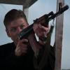
I've had a peek at the titles - and that definitely looks to be a young Craig Bond, and an older version at the end. In the tunnel as a boy, emerging as a man.
Silva is in the sequence as well by the looks of it, pointing a gun behind Bond's back.
Silva is in the sequence as well by the looks of it, pointing a gun behind Bond's back.
#73
thecasinoroyale
-
- Veterans
-
- 14358 posts
Commander
- Location:Basingstoke, UK
Posted 16 November 2012 - 02:18 PM
Yeah, Silva turning against Bond with his gun is a great moment, just making him out from the shadows with the dramatic brass cue in the music.
A very well thought out sequence.
A very well thought out sequence.
#74
Pedro92
-

- Crew
-

- 4 posts
Recruit
Posted 16 November 2012 - 03:44 PM
After viewing Skyfall for a second time, I spotted something during the title sequence that blew my mind. In this scene we see two zooming shots of Bond's face... but they are not the same. In the first one Craig's face is younger, he looks like an adolescent, instead in the last one he's older. We see the first glimpse of child-Bond!!!! That's fantastic!!
#75
Ernst Stavro Blofeld Jr.
-

- Crew
-
- 213 posts
Sub-Lieutenant
Posted 16 November 2012 - 09:39 PM
Clearly you didn't read the last three pages.
Its nice to see that these have leaked, though I'd have love for Casino and Quantum to be released textless as well.
Its nice to see that these have leaked, though I'd have love for Casino and Quantum to be released textless as well.
#76
Bucky
-
- Veterans
-
- 1031 posts
Lt. Commander
- Location:Maryland
Posted 16 November 2012 - 09:43 PM
The previous one was taken down but here is another one
#77
Animal Clans
-

- Crew
- 18 posts
Cadet
- Location:Sydney/Halifax, Nova Scotia, Canada
Posted 17 November 2012 - 04:51 AM
Notice between 2:53-2:55, Bond's shadow is mysteriously cut off before the top of the screen.The previous one was taken down but here is another one
http://vimeo.com/53618018
I found Skyfall's titles to be superb. Feels like TB meets TND, with two blatant references to LALD and TLD.
Regarding QOS, I really wish there was a textless version available. The imagery I didn't mind, Even though it wasn't Kleinmann, it worked well. It kind of felt like a cross between TWINE and YOLT. But the one think I absolutely HATED about QOS was the font they used for the opening credits. The incredible thick, round font, and all lower case titles were too much of a variation. Almost all movies have used a simple gothic-based fonts with slight variations (YOLT the biggest variation as it seems to be an oriental gothic style font, but the font they use, along with the repeating dot motif, is so insanely distracting that it doesn't feel that it's an Albert R. Broccoli's Eon Productions production. That facet is primarily what drags QOS down the most for me, even more so than the frenetic editing and its unusual brevity.
#78
singleentendre
-

- Crew
-
- 204 posts
Sub-Lieutenant
- Location:Tampa, FL
Posted 21 November 2012 - 03:47 PM
The previous one was taken down but here is another one
http://vimeo.com/53618018
Now that one's been taken down too. Does anyone else have it?
Regarding QOS, I really wish there was a textless version available. The imagery I didn't mind, Even though it wasn't Kleinmann, it worked well. It kind of felt like a cross between TWINE and YOLT. But the one think I absolutely HATED about QOS was the font they used for the opening credits. The incredible thick, round font, and all lower case titles were too much of a variation. Almost all movies have used a simple gothic-based fonts with slight variations (YOLT the biggest variation as it seems to be an oriental gothic style font, but the font they use, along with the repeating dot motif, is so insanely distracting that it doesn't feel that it's an Albert R. Broccoli's Eon Productions production. That facet is primarily what drags QOS down the most for me, even more so than the frenetic editing and its unusual brevity.
Its weird that they didn't just make the CR and QoS re-releases UEs, complete with UE menus and textless titles. :-\
#79
thecasinoroyale
-
- Veterans
-
- 14358 posts
Commander
- Location:Basingstoke, UK
Posted 21 November 2012 - 03:51 PM
I noticed on my viewing last night another skull, this time in the form of the riverbed when 'Skyfall' appears on screen, and the mouth is opening drawing Bond down/in.
I thought that was anothing chillingly nice touch.
I thought that was anothing chillingly nice touch.
#80
x007AceOfSpades
-
- Veterans
-
- 4369 posts
Commander
- Location:Sunny Southern California
Posted 21 November 2012 - 06:22 PM
I noticed on my viewing last night another skull, this time in the form of the riverbed when 'Skyfall' appears on screen, and the mouth is opening drawing Bond down/in.
I thought that was anothing chillingly nice touch.
Just now noticed that, chilling indeed!
#81
Bucky
-
- Veterans
-
- 1031 posts
Lt. Commander
- Location:Maryland
Posted 21 November 2012 - 06:24 PM
I noticed on my viewing last night another skull, this time in the form of the riverbed when 'Skyfall' appears on screen, and the mouth is opening drawing Bond down/in.
I thought that was anothing chillingly nice touch.
I had noticed that also. I like some of the small touches in Kleinman's titles, like in the Casino Royale titles when the blood of one of the men makes the letters CR.
#82
Armand Fancypants
-

- Crew
-
- 121 posts
Sub-Lieutenant
Posted 23 November 2012 - 12:28 AM
Seeing it in the theatre only confirmed it for me - I think CR and this are definitely Kleinman's best work. There are Binder touches, but he's not trying to ape Binder at all, and that's wise. And I really just love the bit with the middle 8. As great a syncing of song and visual as I can remember in a Bond title sequence.
#83
freemo
-
- Veterans Reserve
-
- 2995 posts
Commander RNR
- Location:Here
Posted 23 November 2012 - 02:17 AM
Beautiful. Looking forward to watching them again.
I was very critical of Kleinman's TND and TWINE work, especially TWINE (though he's hardly Robinson Crusoe when it comes to bad work on TWINE), but he's really come into his own with CASINO ROYALE and now SKYFALL.
I was very critical of Kleinman's TND and TWINE work, especially TWINE (though he's hardly Robinson Crusoe when it comes to bad work on TWINE), but he's really come into his own with CASINO ROYALE and now SKYFALL.

#85
sharpshooter
-
- Executive Officers
-
- 8996 posts
Commander
Posted 24 November 2012 - 07:55 AM
The titles were great. Up there with Kleinman's work on Goldeneye and Casino Royale. First of all, they look good, secondly they draw on a bunch of thematic material and lastly the song works a treat.
#86
00Twelve
-

- Veterans
-
- 7706 posts
Commander
- Location:Kingsport, TN
Posted 26 November 2012 - 04:53 PM
Whichever poster asked about Kleinman's font that I'm too lazy to go back and look for, it's some variant on Helvetica, slightly more narrow than what Binder used to use.
Fabulous titles; agreed with Harms and sharpshooter that they're his best work along with CR and GE.
As "worthy" a successor he is to Binder, I'd say even moreso to Bass, to whom they both owe much.
Fabulous titles; agreed with Harms and sharpshooter that they're his best work along with CR and GE.
As "worthy" a successor he is to Binder, I'd say even moreso to Bass, to whom they both owe much.
#87
x007AceOfSpades
-
- Veterans
-
- 4369 posts
Commander
- Location:Sunny Southern California
Posted 26 November 2012 - 04:57 PM
Whichever poster asked about Kleinman's font that I'm too lazy to go back and look for, it's some variant on Helvetica, slightly more narrow than what Binder used to use.
Century Gothic is the font.
#88
Nicolas Suszczyk
-
- Veterans
-
- 3735 posts
Commander
- Location:Buenos Aires, Argentina
Posted 26 November 2012 - 04:58 PM
Whichever poster asked about Kleinman's font that I'm too lazy to go back and look for, it's some variant on Helvetica, slightly more narrow than what Binder used to use.
Century Gothic is the font.
Same of CASINO ROYALE logo.
#89
FlemingBond
-

- Crew
-
- 610 posts
Lieutenant
- Location:Phoenix, Az U.S.
Posted 26 November 2012 - 10:33 PM
The titles were good...a bit dark and morbid though.
#90
00Twelve
-
- Veterans
-
- 7706 posts
Commander
- Location:Kingsport, TN
Posted 27 November 2012 - 12:18 AM
Oh, thought we were talking about the rest of the credits, not the title logo itself. Right, bolded Century Gothic.
Whichever poster asked about Kleinman's font that I'm too lazy to go back and look for, it's some variant on Helvetica, slightly more narrow than what Binder used to use.
Century Gothic is the font.
Same of CASINO ROYALE logo.