James Bond 007 Fan Art
#331
Posted 19 May 2009 - 03:13 PM
I had to draw James Bond by hand - with pens and paper and everything! Sean Connery never did the gunbarrel pose so I used Roger Moore's body and put Connery's head on top, copying from a Goldfinger still. You can just about tell it's him, I suppose.
What do you think?
Dr_No.jpg 44.95KB 76 downloads
#332
Posted 25 May 2009 - 12:01 PM
I hope you liked my Dr. No poster (see above). Here's is my attempt at a From Russia With Love poster. Enjoy, and let me know what you think.
Owain
From_Russia_With_Love.jpg 37.56KB 55 downloads
Edited by Henry-Jones-Sr, 28 May 2009 - 12:09 PM.
#333
Posted 25 May 2009 - 01:24 PM
#334
Posted 25 May 2009 - 01:42 PM
Gosh, some fan art that is actually quite good and takes things forward rather than backwards to a graphic design era of Bond film posters that tend to look like charity shop romantic-fiction cover-art.Hello again,
I hope you liked my Dr. No poster (see above). Here's is my attempt at a From Russia With Love poster. Enjoy, and let me know what you think.
Owain
I like your style. Sympathetic yet looking forwards.
I have a request:
title: THE KILLERS
Director: Ridley Scott
Screenplay by: Paul Haggis & Tony Gilroy
Starring:
Kiefer Sutherland as James Harding
John Malkovich as Morgan Cheynein
Gene Hackman as President Sean Bauer
Daniel Craig as John Macarone
Jon Voight as Vice President Stone (first name not revealed)
Angelina Jolie as Janette Volker
Edward Burns as Pvt. Fawkes
Art Malik as Al-Asaad
The Actors and their Roles:
The story is a mixture of 24, and Black Hawk Down. Morgan Cheynein (Malkovich) is atempting to rob a bank in Los Angeles. However, he doesn't know who James Harding (Sutherland) is. So that gives Harding an advantage to fake him out. But when his plan goes down with a fellow agent (Daniel Craig), whom is killed by Cheynein for trying to take out one of his men.
Meanwhile, in Baghdad, when an intelligence agent undercover as an American soldier (Burns), his unit his bombed. When the President (Hackman) is informed on his death, he sends another agent to transport Al-Asaad (Malik). Thats the end of Part 2 in the Black-Ops series.
Locations and Summary:
James Harding and John Macarone are meeting and exchanging intel on terrorist organization when Smokeheart/Black Legion leader Morgan Cheynein storms into the Gemenshaft bank in Los Angeles. They are armed. When Macarone tries to make take out a guard Cheynein shoots him in the arm. Harding stps forward trying to help him, when Cheynein threatens to kill him. Harding says his a doctor and that convinced Cheynein.
In Bagdad, the squad/unit of men are on patrol until they run into a group of terrorists guarding Al-Asaad. The soldiers defeat and capture Asaad. He is taken to the US base and interrogated.
In Washington DC, the VP tells the President of Fawkes' death in a bombing. The President gives an order to transport Asaad into the United States.
In LA, the bank's door's are blown and Harding is recued and taken to interrogate Asaad.
End
A bit hackneyed, no?
#335
Posted 26 May 2009 - 10:23 AM
#336
Posted 26 May 2009 - 10:29 AM
Hello again,
I hope you liked my Dr. No poster (see above). Here's is my attempt at a From Russia With Love poster. Enjoy, and let me know what you think.
Owain
Bloody cool. Well done, mate!
#337
Posted 28 May 2009 - 02:21 PM
For all those who enjoyed my Dr. No and From Russia With Love movie posters, here is my design for Goldfinger.
Owain
PS - By the way, how do you guys get your images directly onto the webpage, as opposed to these attachments like I'm using? I'm hopeless at stuff like this.
Attached Files
Edited by Henry-Jones-Sr, 04 June 2009 - 01:04 PM.
#338
Posted 30 May 2009 - 07:58 AM
#339
Posted 30 May 2009 - 10:01 AM
#340
Posted 30 May 2009 - 11:26 AM
#341
Posted 30 May 2009 - 01:04 PM
I'm a decent paper-and-pencil artist and have been drawing my own movie posters since I was a kid (I'm 33), but I've only just started using PhotoShop and these are my first efforts. Rather than go down the usual PhotoShop nightmare route of style-free photo montages, I thought I'd stick to simple, stark images with strong lettering and credit layout.
Honestly, I'm having a blast with these. However, Thunderball is proving something of a head-scratcher ...
Edited by Henry-Jones-Sr, 30 May 2009 - 01:06 PM.
#342
Posted 07 June 2009 - 12:20 PM
To free up room on my bookshelf, I decided to sell my Special Edition DVD's since I have most of the Ultimate Editions... but there's one problem.
"Casino Royale" and "Never Say Never Again" stick out like a sore thumb. Could someone please direct me to decent Ultimate Edition lookalikes for those?
I could help with good looking ones.
#343
Posted 08 June 2009 - 10:03 AM
And here is my Thunderball poster. Possibly my least inspired Bond poster so far (there's surprisingly little good material to work with), but I think it's rather smart looking anyway. You can't beat a nice bit of blue now and then, can you?
I spent hpurs reworking and rearranging the text only to go for the very first layout I came up with.
I had the design for You Only Live Twice locked down in the old noggin long before this one, so that'll follow very shortly.
I love this poster designing lark, me.
Owain
Attached Files
#344
Posted 08 June 2009 - 10:06 AM
Again - good stuff. You nail the point of a Bond poster which is 99% of the problem solved.Morning folks,
And here is my Thunderball poster. Possibly my least inspired Bond poster so far (there's surprisingly little good material to work with), but I think it's rather smart looking anyway. You can't beat a nice bit of blue now and then, can you?
I spent hpurs reworking and rearranging the text only to go for the very first layout I came up with.
I had the design for You Only Live Twice locked down in the old noggin long before this one, so that'll follow very shortly.
I love this poster designing lark, me.
Owain
#345
Posted 08 June 2009 - 12:36 PM
Truly wonderful work. Your GOLDFINGER poster is one of the very best pieces of fan art I've ever seen. I wonder, though, whether it'd look even better without the contraption holding up the laser, so that it appeared as though the laser were floating freely above Bond.
#346
Posted 08 June 2009 - 05:35 PM
Loomis, I did wrestle with that possibility myself when I was designing the poster, but I decided the cool mid-60s Ken Adam architecture nails the James Bond feel even more. It gives the poster a little more shape.
Owain
#347
Posted 10 June 2009 - 08:20 AM
And here is my You Only Live Twice poster. You may or may not have picked up on it, but the red text forming the circle is supposed to suggest the Japanese flag.
Add the white background and a vaguely Oriental typeface for the film title, and you have a slight Japanese feel. I think this is quite a smart looking poster, if I may say so myself.
Owain
Attached Files
Edited by Henry-Jones-Sr, 10 June 2009 - 08:48 AM.
#348
Posted 10 June 2009 - 12:36 PM
#349
Posted 11 June 2009 - 01:56 PM
your work is fantastic,
are you planning to create more of these?
#350
Posted 11 June 2009 - 03:02 PM
I certainly will continue to produce more posters. A month or so back I thought it would be fun to design my own posters for every single Bond movie in order, given that I'm crazy about movie posters and have long wondered what I would do with the Bond series. I finished You Only Live Twice the other day, and already I'm playing around with ideas for On Her Majesty's Secret Service. It's fun!
Owain
#351
Posted 11 June 2009 - 03:06 PM
#352
Posted 13 June 2009 - 07:30 PM
And here is my poster for On Her Majesty's Secret Service.
I wondered if two white posters in a row would be a bit naff, but then I thought what the hell. This Bond movie is almost completely snow-bound, so it had to be white to get the feel of the film across.
I spent a long time trying to perfect an image of Blofeld's mountain-top hideaway at the top of this poster, with a big snowy backdrop leading down to Lazenby, but in the end it looked quite silly. Without it, this simpler layout is way more elegant and striking.
Besides, the little shadow running across the poster reinforces the suggestion of snow very nicely by itself.
I sincerely hope you enjoy my poster. And now, I'm going to take a break from James Bond on this fine Saturday evening by brewing a nice cup of tea and watching ... Casino Royale!
Owain
Attached Files
Edited by Henry-Jones-Sr, 13 June 2009 - 10:26 PM.
#353
Posted 13 June 2009 - 07:31 PM
#354
Posted 13 June 2009 - 10:38 PM
Is it possible by any chance that you have your From Russia with Love poster in a higher resolution? I really love your work, it's one of the best poster work I have seen for the Bond movies.
Edited by O.H.M.S.S., 13 June 2009 - 10:38 PM.
#355
Posted 13 June 2009 - 10:48 PM
Sometimes less is more. Plain and simple - I love it.
#356
Posted 14 June 2009 - 12:45 AM
When I started uploading my posters on this site I really had no idea what I was doing - I still don't - and didn't understand why From Russia With Love was so small. Someone tipped me off about image hosting sites but I haven't looked into it yet.
Anyway, I don't know if this is higher resolution, but here is a bigger version of From Russia With Love.
Nighty-night!
Owain
Attached Files
#357
Posted 14 June 2009 - 05:00 AM
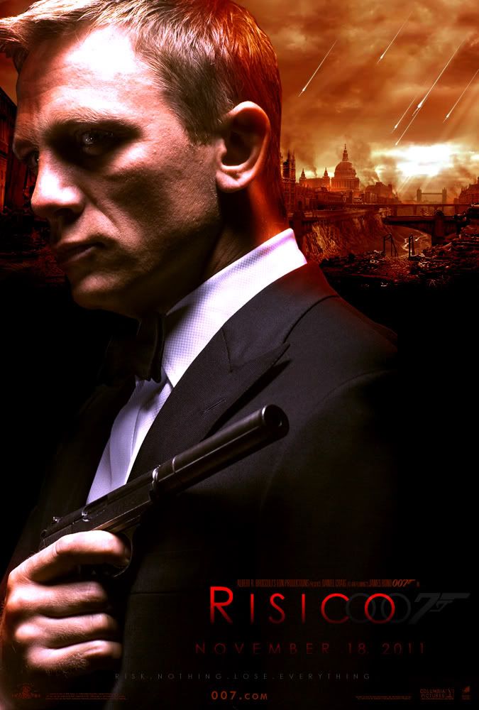
Found these on the internet. If they have been posted before, sorry.
#358
Posted 14 June 2009 - 11:06 AM
The first of those two Risico posters is pretty nice, danslittlefinger.
Edited by O.H.M.S.S., 14 June 2009 - 11:09 AM.
#359
Posted 14 June 2009 - 03:19 PM
#360
Posted 27 June 2009 - 06:56 PM