New for cinemas:
Lovely!
Why do Bond fans think that more stuff = a better poster?
I'd hate to see what they'd say if this poster got released today:

Commander


Posted 05 September 2015 - 03:17 PM
New for cinemas:
Lovely!
Why do Bond fans think that more stuff = a better poster?
I'd hate to see what they'd say if this poster got released today:
Sub-Lieutenant
Posted 05 September 2015 - 03:20 PM
Edited by antovolk, 05 September 2015 - 03:21 PM.
Commander

Posted 05 September 2015 - 03:21 PM
Why do Bond fans think that more stuff = a better poster?
Commander
Posted 05 September 2015 - 03:21 PM
Commander
Posted 05 September 2015 - 03:26 PM
Why do Bond fans think that more stuff = a better poster?
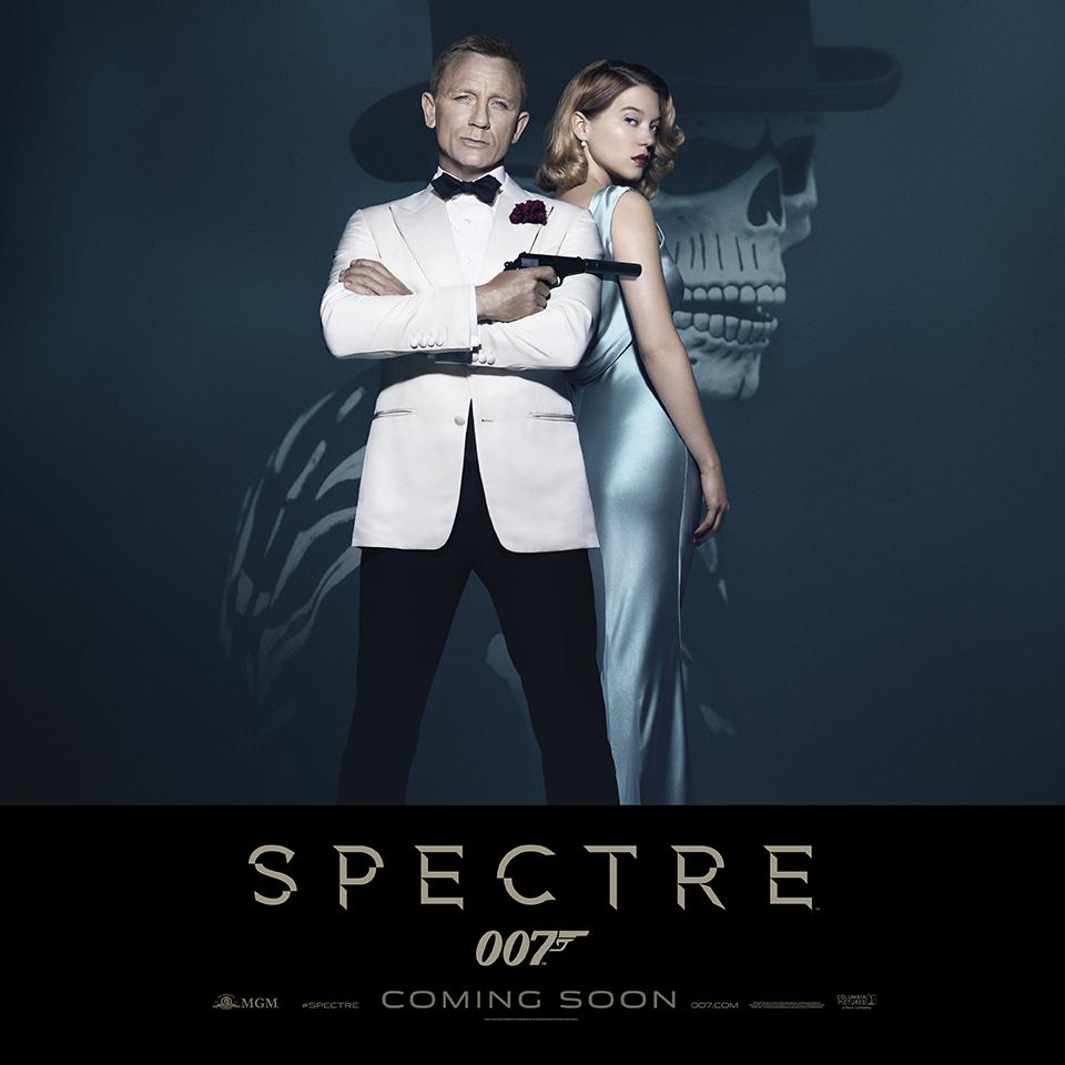
In this case, it's the background and the rather washed-out look of the poster that's the culprit. It all looks like something a twelve year old with basic Photoshop skills could put together in a few minutes.
No it doesn't. It looks rather stylish.
Ask a twelve-year with basic photoshop skills to put something together and you'll get that crappy effort on the previous page crammed with cars and cities and explosions and people's heads, and no focus whatsoever. I'm so tired of reading 'bad photoshop'; it's such a lazy, meaningless comment. When people who don't understand what designers do see something simple they think that it's a waste of money and that hundreds of man hours should be poured into the actual final act of visualisation; the thinking behind the message or the style of the poster or logo isn't something that people ever consider. They just think the value lies in the time it took to make. That's rubbish I'm afraid.
Commander
Posted 05 September 2015 - 03:32 PM
Why do Bond fans think that more stuff = a better poster?
In this case, it's the background and the rather washed-out look of the poster that's the culprit. It all looks like something a twelve year old with basic Photoshop skills could put together in a few minutes.
No it doesn't. It looks rather stylish.
Commander
Posted 05 September 2015 - 03:47 PM
In no way does that poster look stylish. It's a rather lame repeat of the "Bond goes to the prom" posters we got for Skyfall with a dreadful skull mask in the background.
No, it does look stylish. I love the rich tones and the nicely narrow palette. It's very sumptuous-looking and classy, and Craig looks in complete control. Plus I love the unashamed way it's a completely retro Bond pose.
I'm not sure what 'dreadful' means in that context. It's a skull mask: what's dreadful about it? Are you saying it's the choice of the mask, the execution, the pose? That's the problem with this sort of criticism: it's just too easy to drop in words like 'dreadful' and it makes me think it's all a bit empty.
As for your other comment, people who don't work in the design/marketing industry can pass judgment on what they see. Just because we don't know what their thinking behind putting the poster together doesn't mean that we're not qualified to look at it and say that it's terrible.
Perhaps, but it doesn't qualify you to drag out the tired out 'bad photoshop' comment when you don't know what that means; that's the bit I object to more, really. Does the projection of Sean and Honor not look like bad photoshop too? Looks: there's no painting involved. And it's just on a black background: how dull.
Commander

Posted 05 September 2015 - 03:50 PM
Commander
Posted 05 September 2015 - 03:53 PM
Also very nice! Not sure what more people want out of a poster. Both look cool and convey the product effectively. Bring on the TV spots.
I think, as with all fan forums, they're a bit too focused on it being 'A Thing To Talk About' rather than considering what it's supposed to do and the way it does it. Hence too much importance is placed upon it, and nothing can stand up to that.
Commander
Posted 05 September 2015 - 03:53 PM
In no way does that poster look stylish. It's a rather lame repeat of the "Bond goes to the prom" posters we got for Skyfall with a dreadful skull mask in the background.
No, it does look stylish. I love the rich tones and the nicely narrow palette. It's very sumptuous-looking and classy, and Craig looks in complete control. Plus I love the unashamed way it's a completely retro Bond pose.
I'm not sure what 'dreadful' means in that context. It's a skull mask: what's dreadful about it?
As for your other comment, people who don't work in the design/marketing industry can pass judgment on what they see. Just because we don't know what their thinking behind putting the poster together doesn't mean that we're not qualified to look at it and say that it's terrible.
Perhaps, but it doesn't qualify you to drag out the tired out 'bad photoshop' comment when you don't know what that means; that's the bit I object to more, really. Does the projection of Sean and Honor not look like bad photoshop too? Looks: there's no painting involved. And it's just on a black background: how dull.
Edited by tdalton, 05 September 2015 - 03:56 PM.
Commander
Posted 05 September 2015 - 04:17 PM
Commander
Posted 05 September 2015 - 04:28 PM
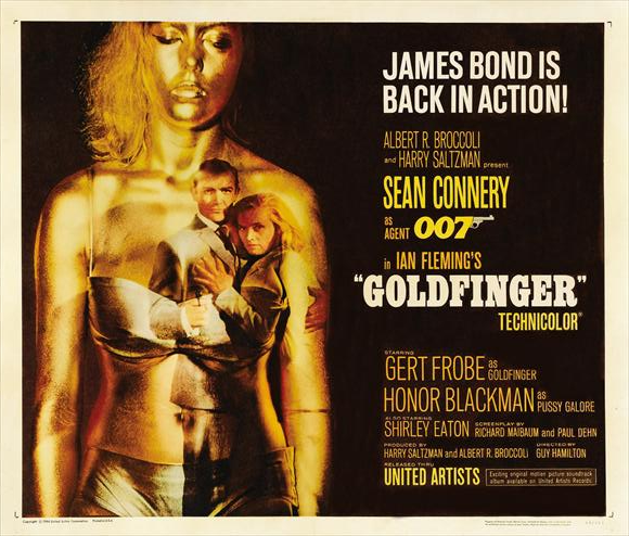
The Goldfinger poster doesn't even matter in this context. Posters were made differently in the 1960s than they are today. You could trot out many different posters from that time period that look like that (fairly simple image, a lot of text, etc.)
Are you thinking that I'm saying the Goldfinger one looks bad? I'm not: I think it's the strongest poster Bond has ever had. It's beautiful. This one doesn't quite compare in terms of the strong concept, but that's a hard job for any poster to do.
It does matter in this context because I'm comparing them. Again you're focused on how a poster is made rather than the final result. It seems an odd thing to judge any work of art by.
As for the skull mask, it's ridiculous-looking image for a film that is, supposedly, taking itself seriously. It's also a callback to one of the series' lowpoints. And, the fact that it's a callback is a mark against in itself. You can say it looks classy all you want, but, as you've said to me on the other point, that doesn't really qualify you to tell me what I'm supposed to view as "classy".
Lowpoints? No idea what you're talking about. I have to presume Live and Let Die? Is that regarded as a low point? I don't even see how it's a callback; this long into a series there are always going to be paths you cross twice. I don't see how it's ridiculous-looking either. It's a guy (Bond?) wearing a skull mask for a festival. It is what it is. It's not comedic. Are you going to be squirming in your seat in that scene, complaining everyone looks ridiculous? It's a very odd complaint. Viewed from that point, a girl painted gold looks ridiculous.
And yes, I can say it looks classy all I like. Just as many times as you can say it doesn't. As you pointed out, I don't have to be qualified to do that. I just know that it does.
Commander

Posted 05 September 2015 - 04:33 PM
Commander
Posted 05 September 2015 - 04:33 PM
Callbacks are off-limits now?
Commander

Posted 05 September 2015 - 04:50 PM
New for cinemas:
Lovely!
Why do Bond fans think that more stuff = a better poster?
I'd hate to see what they'd say if this poster got released today:
I know what still irks me. On the GOLDFINGER poster the space is used for the titles (right) and the key art (left). SPECTRE leaves so much room on both sides of Bond - it just looks to me as if it was not ready.
But maybe - and the addition of Sédoux helps a lot - there will be more characters added.
Commander
Posted 05 September 2015 - 05:01 PM
I know what still irks me. On the GOLDFINGER poster the space is used for the titles (right) and the key art (left). SPECTRE leaves so much room on both sides of Bond - it just looks to me as if it was not ready.
But maybe - and the addition of Sédoux helps a lot - there will be more characters added.
It's a standee rather than a poster; the sides possibly fold around or something.
The Bond in Goldfinger tux with leading lady I have no problem with. But I come back to something I've raised before. We had something which looked loosely like the SPECTRE emblem in the first teaser way back when. Why not include something similar in this? This film supposedly marks the return after over thirty years of Bond's main opponent from the classic era, albeit in re-booted form. So why not include the emblem again, instead of a shot of Bond in a top hat and skeleton suit? Unless it is to make a point - a "spectre" haunting Bond, maybe to do with his childhood or the duality of his life - or an intentional channeling of LALD, Craig and Mendes' favourite Bond film.
Doesn't need it, does it? Plenty of movies feature organisations with logos; they don't need to be on the posters.
Lt. Commander
Posted 05 September 2015 - 05:18 PM
I´m going on a limb here and say that one who thinks the skull has to go doesn´t really get Bond. It´s pure Fleming. Reminds me of the first editions for Goldfinger and Thunderball. And Bond´s all about death for breakfast. And does a skull with a rose on its mouth make sense (GF cover)? Does it have to? I mean, is symbolism dead? Bond as a stylish agent and as death itself doesn´t come across as classic? Again, I love the poster. I even love the second one more. And if they made one with Monica, Craig and Lea, I´d be one happy fan. This is miles aways from the weak efforts of SF and QOS. Interesting to note how divergent opinions are, but there we go, that´s why forums are interesting, right?
Commander
Posted 05 September 2015 - 05:23 PM
I´m going on a limb here and say that one who thinks the skull has to go doesn´t really get Bond.
Lt. Commander
Posted 05 September 2015 - 05:28 PM
I'm sorry, but no. You can dislike a particular element of the poster and still "get Bond".
Hey, one has to be drastic to make a point  Actually, this is a very perilous statement by itself, because what happens most of the time is that people get lost on the chocking bit and fail to read through the actual argument. This one being that the skull harkens back to Flemings recurring death theme and it makes a dual statement about Bond himself, IMO of course.
Commander
Posted 05 September 2015 - 05:33 PM
It is very Fleming. Not just with the skull theme (which his stuff seemed keen on) but as it shows a bit of local travelogue colour, itself showing an obsession with death.
Much more Bond than an octopus! 
Lt. Commander
Posted 05 September 2015 - 05:40 PM
It is very Fleming. Not just with the skull theme (which his stuff seemed keen on) but as it shows a bit of local travelogue colour, itself showing an obsession with death.
Much more Bond than an octopus!
I´d say. And that´s exactly the point. Symbolism - something which Fleming was very keen on, even though his death theme isn´t, say, William Blake's sunflower. But a skull is a skull, Yorick´s or otherwise. Humanity or Death are the two common solution for that analytical conundrum. I think it´s wonderfully used. Even though I still think it´s a bloody spoiler of which we are openly speaking about. Does everyone who as seen the trailer know who the masked man is? I know, for sure. But does everyone? Anyway, still loving the poster
Commander
Posted 05 September 2015 - 05:46 PM
It's Bond, isn't it? I don't know any of the spoilers but in the trailer M asks 'what were you doing in Mexico?' over the shot of someone with Daniel Craig's very recognisable walk wearing that mask.
Lt. Commander
Posted 05 September 2015 - 05:50 PM
It's Bond, isn't it? I don't know any of the spoilers but in the trailer M asks 'what were you doing in Mexico?' over the shot of someone with Daniel Craig's very recognisable walk wearing that mask.
Yes, I´d say so. Which is a bit odd. I´ve always assumed they would make a big deal of that particular reveal. You know, someone is walking along in that costume and than, bang, it´s Bond. But hey, they´re probable the wisest
Commander
Posted 05 September 2015 - 05:53 PM
Well it's the opening isn't it? No bigger a spoiler than giving away that it's Bond under the seagull in Goldfinger!
Lt. Commander
Posted 05 September 2015 - 05:55 PM
Well it's the opening isn't it? No bigger a spoiler than giving away that it's Bond under the seagull in Goldfinger!
My thoughts exactly!
Commander
Posted 05 September 2015 - 06:04 PM
Lt. Commander
Posted 05 September 2015 - 06:08 PM
I get the "death" aspect of the poster, and as I own some of the hardback Bond books with those Richard Chopping covers - including the one for Goldfinger" - I appreciate the Fleming aspect of it all. I have said in an earlier post that the skeleton might represent a "spectre" of death over Bond's shoulder, or stalking Bond.
But this movie is called "SPECTRE" and there are certain connotations attached. The first teaser poster with the bullethole in the glass pane and the cracks surrounding it alerted those of us who recalled the 1960s classics. The image on the ring shown in the trailer - and on the computer screen in the second trailer. There for a reason.
OK, by all means leave the skeleton in the top hat in the background - it's Bond in disguise, at a guess, as I notice in the trailer he's hand in hand with a young woman who looks, even behind her mask, like the female Mexican agent he is working with.
But why not add the SPECTRE emblem? Maybe as another watermark behing the title itself?
(I don't want to be too cranky, but I think after over forty years of following Bond I do get him! ;-) )
Yes, you do, as your "spectre of death" over Bond´s shoulder is a very apt analysis of the poster. Nicely done indeed. That´s actually why I think they have alluded to SPECTRE, without using the octopus, and that´s why I call it symbolism. Another watermark would´ve been redundant if we follow your own logic. I really did appreciate your "over the shoulder" remark. Don´t know if the "artist" had that in mind, but if he did, he gets my thumbs up.
Commander
Posted 05 September 2015 - 06:12 PM
Commander
Posted 05 September 2015 - 06:23 PM
I get the "death" aspect of the poster, and as I own some of the hardback Bond books with those Richard Chopping covers - including the one for Goldfinger" - I appreciate the Fleming aspect of it all. I have said in an earlier post that the skeleton might represent a "spectre" of death over Bond's shoulder, or stalking Bond.
But this movie is called "SPECTRE" and there are certain connotations attached. The first teaser poster with the bullethole in the glass pane and the cracks surrounding it alerted those of us who recalled the 1960s classics. The image on the ring shown in the trailer - and on the computer screen in the second trailer. There for a reason.
OK, by all means leave the skeleton in the top hat in the background - it's Bond in disguise, at a guess, as I notice in the trailer he's hand in hand with a young woman who looks, even behind her mask, like the female Mexican agent he is working with.
But why not add the SPECTRE emblem? Maybe as another watermark behing the title itself?
Maybe it didn't look very good?
You don't need everything in the movie in the poster; it's not there to tell you the plot.
Commander
Posted 05 September 2015 - 08:24 PM
It's simple and stylish. pure Bond