Jump to content


This is a read only archive of the old forums
The new CBn forums are located at https://quarterdeck.commanderbond.net/

 
Photo

SPECTRE Theatrical Poster (now with Poll)


254 replies to this topic

Poll: The poster

This is a public poll. Other members will be able to see which options you chose

Put bluntly

You cannot see the results of the poll until you have voted. Please login and cast your vote to see the results of this poll.

Put more verbosely (multiple choices generously permitted; there's no need to thank me, not that you will)

You cannot see the results of the poll until you have voted. Please login and cast your vote to see the results of this poll.

This Daniel Craig as Co-Producer thing

You cannot see the results of the poll until you have voted. Please login and cast your vote to see the results of this poll.
Vote Guests cannot vote

#61 univex

univex

    Lt. Commander

  • Veterans
  • PipPipPip
  • 2310 posts

Posted 03 September 2015 - 09:34 PM

Love it. It´s Bond. Period.

I, for one, always hated crowded or overcomplicated posters. And can anyone still say Craig is not Bond? And not every Bond actor could pull that one off. Connery did, obviously. 


Well, everything about this film is, so far, spot on. High hopes here.


#62 Matt_13

Matt_13

    Commander

  • Veterans
  • PipPipPipPip
  • 5969 posts
  • Location:USA

Posted 03 September 2015 - 10:12 PM

Love it. It´s Bond. Period.

I, for one, always hated crowded or overcomplicated posters. And can anyone still say Craig is not Bond? And not every Bond actor could pull that one off. Connery did, obviously. 


Well, everything about this film is, so far, spot on. High hopes here.


Same here. For me, as far as posters go, less is more. This poster screams Bond in a very sleek and simplistic way. It'll look good hanging in movie theaters. I love the blue background.


#63 univex

univex

    Lt. Commander

  • Veterans
  • PipPipPip
  • 2310 posts

Posted 03 September 2015 - 10:14 PM

It'll look good hanging in movie theaters. I love the blue background.


It will indeed. And isn´t that the same shade of blue as in the CR teaser? Or close to it.


#64 HoneyDiamond

HoneyDiamond

    Midshipman

  • Crew
  • 60 posts

Posted 03 September 2015 - 10:26 PM

I love this poster.  Nice homage to Live and Let Die. 


#65 Hockey Mask

Hockey Mask

    Lt. Commander

  • Veterans
  • PipPipPip
  • 1027 posts
  • Location:USA

Posted 03 September 2015 - 10:32 PM

I like it! Better than than the Brosnan years. My favorite is still the first bullet hole poster though.

#66 DaveBond21

DaveBond21

    Commander

  • Veterans
  • PipPipPipPip
  • 18026 posts
  • Location:Sydney, Australia (but from the UK)

Posted 03 September 2015 - 10:46 PM

Goldfinger and Live and Let Die all in one... and I have NO problem with that all!!


That's what I was thinking.


#67 AMC Hornet

AMC Hornet

    Commander

  • Veterans
  • PipPipPipPip
  • 5857 posts

Posted 03 September 2015 - 10:58 PM


Why is this image not on the main page yet?

Easy there. People have lives.


It now is.


Thank you.


I hope you will forgive my impatience (I am not renown for it).


#68 MattofSteel

MattofSteel

    Commander

  • Veterans
  • PipPipPip
  • 2482 posts
  • Location:Waterloo, ON

Posted 03 September 2015 - 11:02 PM

I'm all for simplicity (loved the teaser), Craig's pose/look is awesome,  I love the idea of meshing GF and LALD, and the poster's basic concept is great - but the final result is a bland, borderline unprofessional-looking disappointment.


"It looks like fan art" is a phrase that's thrown around far too often, but in this case, it's undeniably true. Not even good fan art. I could scroll over this in a fan art forum and not even slow down.


#69 PPK_19

PPK_19

    Lt. Commander

  • Veterans
  • PipPipPip
  • 1312 posts
  • Location:Surrey, England.

Posted 03 September 2015 - 11:17 PM

I really like the new poster. That said, it's not difficult to beat the ones from Skyfall. Good lord they were awful. The "prom night" one in particular.


Craig looks badass 


#70 sharpshooter

sharpshooter

    Commander

  • Executive Officers
  • PipPipPipPip
  • 8996 posts

Posted 03 September 2015 - 11:23 PM

I'm happy with the poster. It's colourful instead of black and white. Plus the pose is cool. 


#71 Vauxhall

Vauxhall

    Commander

  • Executive Officers
  • PipPipPipPip
  • 10744 posts
  • Location:London, UK

Posted 03 September 2015 - 11:25 PM

"I thought I saw a spectre at your shoulder..."


Just come back to it after a few hours. Still really pleased with it.


#72 stromberg

stromberg

    Commander RNVR

  • The Admiralty
  • PipPipPipPip
  • 6841 posts
  • Location:Saarland / Germany

Posted 03 September 2015 - 11:28 PM

"I thought I saw a spectre at your shoulder..."


Just come back to it after a few hours. Still really pleased with it.

Beat me to it by a minute...  :D


#73 Arbogast777

Arbogast777

    Lieutenant

  • Crew
  • PipPip
  • 626 posts
  • Location:Minneapolis, MN

Posted 03 September 2015 - 11:29 PM

I love it, personally. They are not saying that this is "Bourne with a martini" but full fledged BOND.

Must admit though that that many screenwriters has me a *bit* nervous...

#74 sharpshooter

sharpshooter

    Commander

  • Executive Officers
  • PipPipPipPip
  • 8996 posts

Posted 03 September 2015 - 11:30 PM

Yes, the skeleton masked Bond at the back provides the ghostly double meaning of spectre. 


The blue background, white jacket and gold font makes it all feel rather exotic.


#75 Vauxhall

Vauxhall

    Commander

  • Executive Officers
  • PipPipPipPip
  • 10744 posts
  • Location:London, UK

Posted 03 September 2015 - 11:46 PM


"I thought I saw a spectre at your shoulder..."


Just come back to it after a few hours. Still really pleased with it.

Beat me to it by a minute...  :D


Ha :D Only occurred to me on the second glance!


#76 kneelbeforezod

kneelbeforezod

    Lt. Commander

  • Veterans
  • PipPipPip
  • 1131 posts
  • Location:England

Posted 03 September 2015 - 11:53 PM

Check out this poster for SICARIO. Not necessarily *exactly* this, but a final Bond poster could look something like this... if they were putting any effort in.


http://fregatten.tra.../09/sicario.jpg


#77 univex

univex

    Lt. Commander

  • Veterans
  • PipPipPip
  • 2310 posts

Posted 03 September 2015 - 11:57 PM

Personally, I prefer the SPECTRE one. And it´s the first Bond poster I´ve liked since CR.


#78 sharpshooter

sharpshooter

    Commander

  • Executive Officers
  • PipPipPipPip
  • 8996 posts

Posted 04 September 2015 - 12:47 AM

Personally, I prefer the SPECTRE one. And it´s the first Bond poster I´ve liked since CR.

The CR posters are still king, but indeed...I'd say this one is my favourite since then. 


I take it they'll use this poster for the soundtrack cover, too. That will look good.


#79 Emrayfo

Emrayfo

    Sub-Lieutenant

  • Crew
  • Pip
  • 193 posts
  • Location:Severnaya

Posted 04 September 2015 - 01:01 AM

Just like I loved the LALD homage in the SPECTRE teaser poster, I love the GF homage in this poster. I agree it does look more like a character poster than a film poster, though.


bond24_6t.jpg      sean-connery-goldfinger.jpeg    


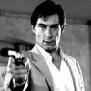
What I also find interesting is the width of the lapels in this Tom Ford jacket. Compared to most contemporary jackets they look massive! Ford has obviously decided the current trend of very narrow lapels has about run its course and is responding with instituting medium-wide peaked lapels in some of his suits. It will be interesting to see if the rest of the industry does the same. I think this white dinner jacket is in Tom Ford's 'Windsor' cut, as is at least one of the other SPECTRE suits worn by Craig. But that said, his O'Connor cut, with more narrow lapels (though granted not trendy super-narrow lapels like some brands have right now), also appears in SPECTRE, so who knows? Maybe it's just about variety? I think generally Ford has always avoided very narrow lapels anyway, but in this dinner jacket the much wider lapels are very noticeable.


#80 jamie00007

jamie00007

    Lieutenant

  • Crew
  • PipPip
  • 555 posts
  • Location:Sydney

Posted 04 September 2015 - 01:35 AM

Not seeing the problem with the poster... I think its great. Love the iconic Bond imagery, the colors and the background image. I can see this on my wall in the near future.

#81 SmirkingRevenge

SmirkingRevenge

    Recruit

  • Crew
  • 2 posts

Posted 04 September 2015 - 02:36 AM

It amazes me just how worse and worse these posters seem to get. The problem isn't that there's not much on it, minimalism is the way to go with Bond, but it just looks very amateurish. 10 minutes in Photoshop, zero creativity. Can't believe someone got paid to make this when fans are making better posters for free.


#82 AMC Hornet

AMC Hornet

    Commander

  • Veterans
  • PipPipPipPip
  • 5857 posts

Posted 04 September 2015 - 02:47 AM

At least EON has original photos to work from, instead of recycling familiar images from previous campaigns.


#83 sharpshooter

sharpshooter

    Commander

  • Executive Officers
  • PipPipPipPip
  • 8996 posts

Posted 04 September 2015 - 02:51 AM

At least EON has original photos to work from, instead of recycling familiar images from previous campaigns.

Indeed. The Dark Knight Rises promotional campaign was notorious for that. 


#84 007jamesbond

007jamesbond

    Lt. Commander

  • Veterans
  • PipPipPip
  • 1371 posts
  • Location:Vancouver

Posted 04 September 2015 - 04:23 AM

Interesting about Daniel as "Co producer" is this the first time a bond actor involve in the creative process? The poster is good 


#85 Jim

Jim

    Commander RNVR

  • Commanding Officers
  • PipPipPipPip
  • 14266 posts
  • Location:Oxfordshire

Posted 04 September 2015 - 04:57 AM

Poll is added.


#86 sharpshooter

sharpshooter

    Commander

  • Executive Officers
  • PipPipPipPip
  • 8996 posts

Posted 04 September 2015 - 05:02 AM

Poll is added.

And voted. Love your options, Jim. Funny and creative as always. 


#87 DaveBond21

DaveBond21

    Commander

  • Veterans
  • PipPipPipPip
  • 18026 posts
  • Location:Sydney, Australia (but from the UK)

Posted 04 September 2015 - 05:32 AM

It doesn't shout "Rogue Bond" at me. Or "This Time It's Personal".


It says "Classic Bond".


And yes I am aware that movie posters can't shout. Not all the time anyway.


______________________________________________________________________________________________________


#88 SecretAgentFan

SecretAgentFan

    Commander

  • Commanding Officers
  • PipPipPipPip
  • 9055 posts
  • Location:Germany

Posted 04 September 2015 - 06:17 AM

Hope a bit more effort's gone into the film.


That sums it up for me.


#89 S K Y F A L L

S K Y F A L L

    Commander

  • Veterans
  • PipPipPipPip
  • 6889 posts
  • Location:CANADA

Posted 04 September 2015 - 06:25 AM

The Craig era posters have kind of come in pairs haven't they? I mean CR and QOS shared the similar posters, titles and fonts. Now SP is following after SF...


#90 SecretAgentFan

SecretAgentFan

    Commander

  • Commanding Officers
  • PipPipPipPip
  • 9055 posts
  • Location:Germany

Posted 04 September 2015 - 06:31 AM

Just noticed - it reminds me of the retro poster for THE MAN FROM U.N.C.L.E. - just with less people.