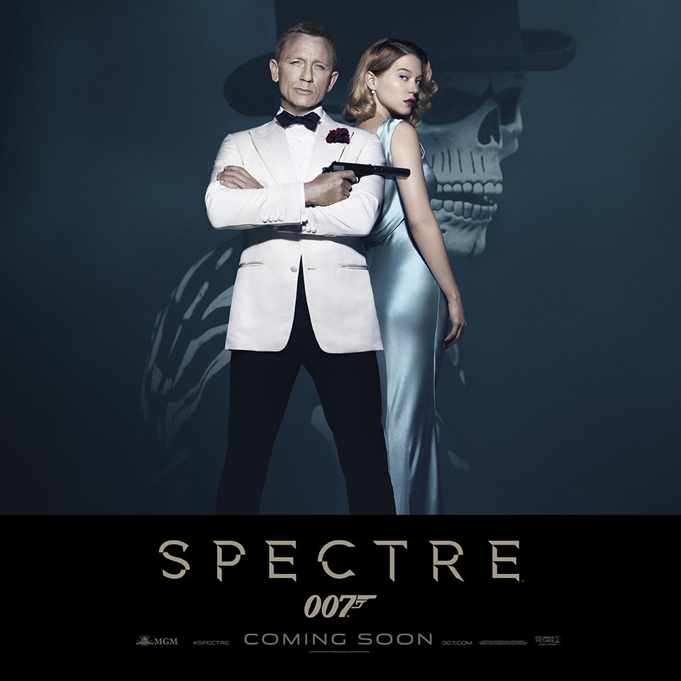
Does anyone not think Craig looks a bit washed out, over saturated and a shade like he is lit by a flood light for this shot?
Seems reminiscent of the photo effort for the final SF poster (Black gunbarrel and London)

Commander


Posted 04 September 2015 - 06:52 AM
Does anyone not think Craig looks a bit washed out, over saturated and a shade like he is lit by a flood light for this shot?
Seems reminiscent of the photo effort for the final SF poster (Black gunbarrel and London)
Commander

Posted 04 September 2015 - 07:06 AM
I was thinking about this going to bed last night, as we Bond fans do I'm sure you agree when news breaks, and I can't stomach this being a FINAL poster. It's too...easy. And I don't get the Mardi Gras man in the background, unless that's some HUGE plot-point to the film, I was under the impression this imagery would be over after the pre-title sequence.
Why not something of Oberhauser, or the SPECTRE logo...or anything!
Oh well... 
Commander

Posted 04 September 2015 - 08:47 AM
In my obsessive way, I´m really trying hard to like this poster.
I´m telling myself: Maybe my first negative reaction was only due to my unrealistic expectations of getting a poster like the classic early ones - or at least like the beautiful CR poster with Bond in front of the casino, with Vesper in her lovely gown in the background.
I´m telling myself: The main SKYFALL-poster with Craig posing in front of the gun barrel and a tiny London image was a lot less stylish.
I´m telling myself: The time for elaborate film posters is over.
And maybe... I should praise the efficiency of this lean minimalistic approach, telling us as little as possible about the plot (always a good thing for me) and going for the duality of Bond (hero, villain), combining this with iconic images (Goldfinger/Live and let die).
So... I´m warming to it.
Interesting side note: Jez Butterworth is getting a full writing credit along Logan and P&W. So, more than just a quick polish, right?
Commander

Posted 04 September 2015 - 08:49 AM
Commander

Posted 04 September 2015 - 09:24 AM
My initial reaction was meh. The more I look at it, the more I'm coming around to liking it--but only on a conditional basis. If this is NOT the final poster, then I am fine with it, and I will like it. But if this IS the final poster, then I will not like it. Daniel Craig looks great in the white tux. A nice touch, and as others have mentioned, very reminiscent of Goldfinger (and the skeleton of Live And Let Die). That pic would work anywhere on SPECTRE's final poster while the skeleton would work only as part of the background in a final poster as in the collage style of the '60s and '70s.
I've said this before and I will say it again. The final Bond posters have been very lackluster to say the least for decades now, not just years. Since The Living Daylights, the only really good final Bond poster was GoldenEye. I will say the Craig-era's teaser posters have been pretty good and have shown some creativity even with their minimalist slants. But the final posters have left a lot to be desired--although, as I said, that goes back to the Licence To Kill days.
Bond posters used to be the coolest and the best--exciting hand-drawn artwork that made you want to see the films and go out and buy the posters. And now they are run-of-the-mill, boring stuff that often disappoints and certainly fails to inspire.
Commander

Posted 04 September 2015 - 10:10 AM
I like the poll even more than I like the poster. Nicely done as always!
Lt. Commander

Posted 04 September 2015 - 10:51 AM
If the best thing you can say about it is it calls to mind Goldfinger, well, that's not very original, is it? And Goldfinger wasn't even one of the films featuring S.P.E.C.T.R.E., nor for that matter Live and Let Die, the other poster call back. Live and Let Finger?
Some of the latter posters had moments of brilliance (the Bond silhouette/girl on fire from TWINE or gun on melting ice cube from DAD), and others just plain awful (Die Another Day final, Skyfall final). The international final for TND with the monochromatic TVs in the background was the last poster I was excited about.
Quite frankly, most of these look like Daniel Craig head shots with "007" superimposed on it by an iPhone. The people who post the "007 fan art" posters are way more inspired and creative than the marketing hacks EON seem to be employing. Marvel is making good posters and I'm sure the new Star Wars ones will be awesome, but Bond has fallen behind in this arena. Even the video game covers were better than this bird cage liner.
Edited by Professor Pi, 04 September 2015 - 10:52 AM.
Commander
Posted 04 September 2015 - 11:41 AM
Cadet

Posted 04 September 2015 - 11:51 AM
Edited by Brimar, 04 September 2015 - 12:01 PM.
Commander
Posted 04 September 2015 - 01:56 PM
Ref tdalton's post about the concept of no posters other than a 007 logo on a plain sheet of paper, I have said the exact same, either on here or on a poster forum I frequent.
(Said, not to say I was 'ere first, just, great minds etc.)
Commander
Posted 04 September 2015 - 03:37 PM
Commander
Posted 04 September 2015 - 03:42 PM
Ref tdalton's post about the concept of no posters other than a 007 logo on a plain sheet of paper, I have said the exact same, either on here or on a poster forum I frequent.
(Said, not to say I was 'ere first, just, great minds etc.)
Commander
Posted 04 September 2015 - 03:48 PM
Sad thing is, they'd find a way to mess that up too. You wouldn't think that they could botch a simple image of Bond facing the camera, but on the last two films that's exactly what they've done, repeatedly.Ref tdalton's post about the concept of no posters other than a 007 logo on a plain sheet of paper, I have said the exact same, either on here or on a poster forum I frequent. (Said, not to say I was 'ere first, just, great minds etc.)
Commander RNVR
Posted 04 September 2015 - 03:56 PM
Does anyone not think Craig looks a bit washed out, over saturated and a shade like he is lit by a flood light for this shot?
Seems reminiscent of the photo effort for the final SF poster (Black gunbarrel and London)
Washed out and over saturated is a contradiction in itself. Actually, the image is a bit under saturated (but not as much as the SF London poster was). It's the current fashion, of which I've never been a big fan (it looks cool at times, but it's just done too often, now). But I do catch your drift. He's wearing a white (or ivory) dinner jacket, which looks nice and bright, so the heavy lighting is totally unnecessary. Makes the shirt look like a plain white "thing" with no visble structure (even the buttons are barely visble, it could as well be a white turtleneck). Minor Shadow/Highlight corrections on face, shirt and hands, one or two percents more Black and Yellow in the jacket (to keep the difference to the shirt visible). Can be done in less than ten minutes, works miracles.
Sub-Lieutenant

Posted 04 September 2015 - 05:11 PM
Check out this poster for SICARIO. Not necessarily *exactly* this, but a final Bond poster could look something like this... if they were putting any effort in.
Faux painted posters can look naff, and that does a little. Look at all the Photoshop brush work at the bottom.
The problem I have with the posters for Skyfall and Spectre is they communicate nothing about the film other than "it has Bond in it".
Sub-Lieutenant
Posted 04 September 2015 - 06:13 PM
Commander
Posted 04 September 2015 - 07:20 PM
Does anyone not think Craig looks a bit washed out, over saturated and a shade like he is lit by a flood light for this shot?
Seems reminiscent of the photo effort for the final SF poster (Black gunbarrel and London)
Washed out and over saturated is a contradiction in itself. Actually, the image is a bit under saturated (but not as much as the SF London poster was). It's the current fashion, of which I've never been a big fan (it looks cool at times, but it's just done too often, now). But I do catch your drift. He's wearing a white (or ivory) dinner jacket, which looks nice and bright, so the heavy lighting is totally unnecessary. Makes the shirt look like a plain white "thing" with no visble structure (even the buttons are barely visble, it could as well be a white turtleneck). Minor Shadow/Highlight corrections on face, shirt and hands, one or two percents more Black and Yellow in the jacket (to keep the difference to the shirt visible). Can be done in less than ten minutes, works miracles.
Ah, sorry.
Have I got it the wrong way round?
I stand corrected.
Sub-Lieutenant

Posted 05 September 2015 - 01:17 AM
For a different take, check out this fan art interpretation of the poster by Dog Hollywood on Deviant Art (Source: http://doghollywood....TRE-558185715):

As for the minimalist white tux jacket poster as released by EON, I quite like it as a character poster but dislike it if it is the final poster for the film, as many others have also said here.
On the Jez Butterworth credits in the poster, I stated on another thread here some time ago that it seemed Butterworth was being engaged to do some serious re-working even after the Purvis & Wade's re-working of the Logan script, but at the time the counter view was that it was just a minor polish. Given the credit he is receiving it seems it was a much larger writing role after all.
Commander

Posted 05 September 2015 - 02:12 AM
Lieutenant

Posted 05 September 2015 - 02:42 AM
A resounding "meh" from me. It's OK. I like the color, and it's better than QOS and SF posters (although that's not saying much.) The skeleton dude is pretty cool, and fits in with the title. But like others have pointed out, where is the broken glass/octopus logo? That was fairly iconic and you'd think they would want to emphasize it in all the subsequent artwork. Hmm...
Regarding the "producer credit", and we're assuming that DC is taking more of a creative role now, do you all think that (if SP makes a lot of money) that EON would basically give him "carte blanche" regarding Bond 25? That is to say, if he is reluctant to come back for one more film, that EON would give him the freedom to do whatever he wanted regarding script, director, etc?
Commander

Posted 05 September 2015 - 03:54 AM
Underwhelming poster.
Prom night Bond strikes again.
Sub-Lieutenant
Posted 05 September 2015 - 08:20 AM
Sub-Lieutenant
Posted 05 September 2015 - 10:39 AM
You all might want to take a good read of this
'Spectre' Marketing Is Rooted In 007 Nostalgia, Yet James Bond Is More Popular Than Ever
http://www.forbes.co...ular-than-ever/
Commander
Posted 05 September 2015 - 10:57 AM
It makes the current photoshopped poster look all the stranger from a marketing point of view when compared to its competitors at the cinemaplexes around the world.
Although, it could be argued that, assuming 99% of cinemagoers don't see the nods to previous posters, they'll just see an image which is distinctly Daniel Craig's James Bond - and that's what people who liked his previous films want to see.
Sub-Lieutenant
Posted 05 September 2015 - 12:13 PM
It makes the current photoshopped poster look all the stranger from a marketing point of view when compared to its competitors at the cinemaplexes around the world.
Although, it could be argued that, assuming 99% of cinemagoers don't see the nods to previous posters, they'll just see an image which is distinctly Daniel Craig's James Bond - and that's what people who liked his previous films want to see.
Commander
Posted 05 September 2015 - 03:03 PM
Sub-Lieutenant
Posted 05 September 2015 - 03:04 PM
Better, but the skull image has to go!
Commander

Posted 05 September 2015 - 03:10 PM
I love both posters. The second one slightly more actually. Bond looks SO DAMN COOL. Knocks that terrible final Skyfall poster out of the park.
Also, not my own, but check this out. Fan made but arguably a lot better.

Commander
Posted 05 September 2015 - 03:12 PM
Commander
Posted 05 September 2015 - 03:12 PM
New for cinemas:
That´s better, indeed. I would hope that these are just teasers - or that at least for the final poster more actors are added, at least Bellucci and Waltz.