

The Posters
Started by
Shrublands
, Sep 17 2012 11:18 AM
261 replies to this topic
#91

Shrublands
-
- Veterans
-

- 4012 posts
Commander
- Location:Conveniently Near the NATO Base
Posted 18 September 2012 - 05:09 PM
And the Quad poster version. I’m quite taken aback by this, I wouldn’t have thought it possible, but they've managed to make it look even worse.
#92
AMC Hornet
-

- Veterans
-
- 5857 posts
Commander
Posted 18 September 2012 - 05:09 PM
Who's 'we,' paleface?Shall I take it that you're quite comfortable with average, below-standard posters as long as they "get the job done"?
"The only thing worse than being talked about is not being talked about."
(Oscar Wilde)
The posters are doing their job:
"There's a new James Bond film coming out in November. It's called 'Skyfall'."
Whether you like the poster or not, the message got through.
See you all opening night.
Isn't this Bond we're talking about here? Shoudn't we aim high, instead of just passively welcoming what's coming along?
Are you offended that EON didn't seek our approval before finalizing this poster? What if they had and we'd rejected it, but everyone else hated our final choice? Wasn't there a focus group that chose this design, either over the one we would have chosen, or because it was actually the best of the lot - a judgement we might have agreed with, had we been there?
If you like the fan art better, by all means get your favorite submission blown up to poster size and enjoy it. Having no artistic talent meself, I am unable to aim higher than EON, so yes, I'll passively welcome what they offer - it's less frustrating than complaining about something over which I had no input.
#93
JCRendle
-
- Veterans
-
- 3639 posts
Commander
- Location:Her Majesty's England
Posted 18 September 2012 - 05:15 PM
Exactly, someone who sees sense.Who's 'we,' paleface?
Shall I take it that you're quite comfortable with average, below-standard posters as long as they "get the job done"?
"The only thing worse than being talked about is not being talked about."
(Oscar Wilde)
The posters are doing their job:
"There's a new James Bond film coming out in November. It's called 'Skyfall'."
Whether you like the poster or not, the message got through.
See you all opening night.
Isn't this Bond we're talking about here? Shoudn't we aim high, instead of just passively welcoming what's coming along?
Are you offended that EON didn't seek our approval before finalizing this poster? What if they had and we'd rejected it, but everyone else hated our final choice? Wasn't there a focus group that chose this design, either over the one we would have chosen, or because it was actually the best of the lot - a judgement we might have agreed with, had we been there?
If you like the fan art better, by all means get your favorite submission blown up to poster size and enjoy it. Having no artistic talent meself, I am unable to aim higher than EON, so yes, I'll passively welcome what they offer - it's less frustrating than complaining about something over which I had no input.
#94
Shrublands
-
- Veterans
-
- 4012 posts
Commander
- Location:Conveniently Near the NATO Base
Posted 18 September 2012 - 05:20 PM
Having no artistic talent meself, I am unable to aim higher than EON, so yes, I'll passively welcome what they offer - it's less frustrating than complaining about something over which I had no input.
Are you saying that you will never offer critical judgment over anything that you yourself did not work on? Films, music, books, posters, the lot? Seems a strange attitude.
#95
PeteNeon
-

- Crew
-
- 406 posts
Sub-Lieutenant
- Location:UK
Posted 18 September 2012 - 05:30 PM
Sloppy, they've used a different image for the gunbarrel!And the Quad poster version. I’m quite taken aback by this, I wouldn’t have thought it possible, but they've managed to make it look even worse.
Looks like their original image was too cropped for the quad so they just recreated the left section of the gunbarrel from scratch.
Edited by PeteNeon, 18 September 2012 - 05:33 PM.
#96
AMC Hornet
-
- Veterans
-
- 5857 posts
Commander
Posted 18 September 2012 - 05:39 PM
I'm saying that I won't claim that I could have done better than the professionals who were chosen for the job. Is that a strange attitude?
Having no artistic talent meself, I am unable to aim higher than EON, so yes, I'll passively welcome what they offer - it's less frustrating than complaining about something over which I had no input.
Are you saying that you will never offer critical judgment over anything that you yourself did not work on? Films, music, books, posters, the lot? Seems a strange attitude.
As a teacher I have my own way of presenting material to my students. There are other ways, of course, which are just as effective, but I have a way that suits my personality and is effective for my students. I have been evaluated by other teachers who don't care for my methods, but it seems to me that what they're saying is "he doesn't do it the way I would do it." Other evaluators, however, are impressed with my ability. When I am called upon to evaluate another teacher I will keep in mind that of course s/he doesn't do it the way I do, but how effective is their way? What could I learn from their performance?
As I am neither an artist nor a musician, nor a screenwriter or published author, I can only say whether I like something. I am not qualified to say what I think might have improved the final product, as I am aware that my own tastes may run counter to those of the majority (eg I like DAD, but not AVTAK, and I have no idea of how the latter could be improved, whereas any suggestions I might make about improving MR might have resulted in it tanking).
I suppose at my age I am aware of my limitations when it comes to artistic creativity, and to recognizing how much influence I have over film-makers and publicists who've been on the job for years in another country. If I were younger I might feel the way many here and elsewhere do: that I could do better myself, given the chance.
I'm not getting the chance, nor am I pursuing it. Not only could I not write a better Bond story than Raymond Benson or Neil Purvis & Robert Wade, but I wouldn't want the job for two reasons:
I wouldn't appreciate the unqualified criticism and death threats, and
If I was creating the next Bond story, I'd have nothing to look forward to come release day.
#97
Mr_Wint
-

- Veterans
-
- 2406 posts
Lt. Commander
- Location:Sweden
Posted 18 September 2012 - 06:23 PM
The only thing you say that you can do, is the only thing you have not done yet.(...) I can only say whether I like something. (...)
Did you like the poster, or not?
#98
Kronsteen
-

- Crew
-
- 418 posts
Sub-Lieutenant
- Location:Stockholm, Sweden
Posted 18 September 2012 - 06:31 PM
#99
SecretAgentFan
-

- Commanding Officers
-
- 9055 posts
Commander
- Location:Germany
Posted 18 September 2012 - 06:40 PM
The thing is: these days a blockbuster gets too many posters IMO. A teaser and the final one would be enough. Instead every day a new variation is on the net - although... People seem to love to discuss it. Mission accomplished.
#100
AMC Hornet
-
- Veterans
-
- 5857 posts
Commander
Posted 18 September 2012 - 06:56 PM
Good catch - thank you, Mr. W.The only thing you say that you can do, is the only thing you have not done yet.
(...) I can only say whether I like something. (...)
Did you like the poster, or not?
I agree that the poster contains no elements specific to the film, such as Eve or Severine, but I suspect EON is saving the group shot for the final push. As a 'generic' poster I think it is very good, and may become the one DC is remembered for (like Connery with the air pistol c. FRWL).
Also, I think that if EON had commissioned a poster more like the ones we saw from 1965-1977, the internet critics would tear it apart too, for not being 'original' enough.
You can't please everyone - especially the vocal minority.
Fortunately for me, I'm easy to please.
#101
Royal Dalton
-

- Veterans
-
- 4542 posts
Commander
Posted 18 September 2012 - 07:19 PM
The main problem for me is that Craig is packed too tightly into the frame. If they added a bit of height to it, like this: http://imageupper.co...347994949886956, it wouldn't look quite as bad as it does.
#102
thecasinoroyale
-

- Veterans
-
- 14358 posts
Commander
- Location:Basingstoke, UK
Posted 18 September 2012 - 07:25 PM
Strange how that does make a bit of difference Royal Dalton, good one.
#103
Pussfeller
-

- Veterans
-
- 4089 posts
Commander
- Location:Washington, D.C.
Posted 18 September 2012 - 08:30 PM
That does look better. It looks more like a composed, balanced design, and less like a Bond-themed prom photo.
#104
S K Y F A L L
-

- Veterans
-
- 6889 posts
Commander
- Location:CANADA
Posted 18 September 2012 - 08:49 PM
LOL Pussfeller. I think it looks better with the full gun barrel too.
#105
TheSilhouette
-

- Crew
-
- 183 posts
Sub-Lieutenant
Posted 18 September 2012 - 09:59 PM
Let me state here that I don't think this poster looks bad. It looks okay, but as I expressed in the "Skyfall Image Thread", it is almost worse than the poster being bad. The previous laying down one sheet was poorly recieved (generally) but at least it was somewhat unconventional and conveyed a sense of action and some sort of "motion" if you will. This doesn't really convey anything. You look at it and think "Oh, new Bond movie. Okay." In that sense, it does it's job, but being the 50th anniversary, I expected a little bit more. Now, I'm not even calling for a painted poster with all sorts of explosions and characters all over the place, as I feel that's not really appropriate for this new era of Bond, I just want something that we can look at and see that some level of attention and creativity was paid. For instance, even the teaser, which is essentially the same idea, had an atmosphere to it, a grit. It subtly gave you a "vibe." For a movie event of this scale, they have REALLY slacked off, especially considering that whoever made that poster has a paid salary and is a professional at making movie posters. Frankly, if you're being paid to do something you really need to do a better job than that.
Even look at this poster here. Simple, not a whole lot going on, but makes 10x more of a statement than the official.

Even look at this poster here. Simple, not a whole lot going on, but makes 10x more of a statement than the official.
Edited by TheSilhouette, 18 September 2012 - 10:10 PM.
#106
tdalton
-

- Veterans
-
- 11680 posts
Commander
Posted 18 September 2012 - 10:03 PM
That does look better. It looks more like a composed, balanced design, and less like a Bond-themed prom photo.
That's the best description of the new poster I've read yet. It really does look like a Bond-themed prom picture. And not a good one, at that.
That one is quite good.
#107
AMC Hornet
-
- Veterans
-
- 5857 posts
Commander
Posted 18 September 2012 - 10:04 PM
OMG! James Bond gets cut in half!
Is Skyfall the end of the series?
Is Skyfall the end of the series?
#108
S K Y F A L L
-
- Veterans
-
- 6889 posts
Commander
- Location:CANADA
Posted 18 September 2012 - 10:09 PM
That looks awesome!!!
Looks like what I would imagine Felix looks like after LTK.
Looks like what I would imagine Felix looks like after LTK.
#109
OOSe7en
-

- Crew
- 92 posts
Midshipman
Posted 18 September 2012 - 10:16 PM
This poster is EFFING HORRENDOUS. What an embarrassment compared to those awesome art posters up to and including The Living Daylights. It screams Daniel Craig awkward high school photo. A shame since the trailer poster was so cool.
#110
S K Y F A L L
-
- Veterans
-
- 6889 posts
Commander
- Location:CANADA
Posted 18 September 2012 - 10:24 PM
I'm just curious but wouldn't the company who made the posters make a few and then have EON pick the finale one?
#111
AMC Hornet
-
- Veterans
-
- 5857 posts
Commander
Posted 18 September 2012 - 10:27 PM
Seriously, I think the idea of the latest poster is to promote Bond rather than the particular movie coming out.
The image is of him; not the girls, not the cars, gadgets, villains etc - they come and go, but Bond remains. It's his 50th year of returning, not theirs.
So I like it. It's better than any of the generic images with shadowed faces or faces based on a composite of Connery & Moore like you see on the covers of the Victory role-playing games.
Sure, we go to the movies to see the latest crop of girls, cars, gadgets, villains, etc - but other movies have those too. What do we really come to see?
Him.
Two thumbs up.
#112
TheSilhouette
-
- Crew
-
- 183 posts
Sub-Lieutenant
Posted 18 September 2012 - 10:35 PM
Seriously, I think the idea of the latest poster is to promote Bond rather than the particular movie coming out.
The image is of him; not the girls, not the cars, gadgets, villains etc - they come and go, but Bond remains. It's his 50th year of returning, not theirs.
So I like it. It's better than any of the generic images with shadowed faces or faces based on a composite of Connery & Moore like you see on the covers of the Victory role-playing games.
Sure, we go to the movies to see the latest crop of girls, cars, gadgets, villains, etc - but other movies have those too. What do we really come to see?
Him.
Two thumbs up.
These posters do that as well, but which much better execution.

Edited by TheSilhouette, 18 September 2012 - 10:35 PM.
#113
delfloria
-

- Crew
-
- 675 posts
Lieutenant
Posted 18 September 2012 - 10:47 PM
Add me to the "It's just dull and has no point of view" camp. Hopefully there are more on the way.
#114
OOSe7en
-
- Crew
- 92 posts
Midshipman
Posted 18 September 2012 - 10:54 PM
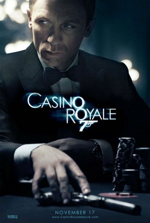
Okay, I stand corrected. Aside from the fantastic artwork of The Living Daylights the poster of Bond at the poker table in Casino Royale is truly outstanding. I really do hate the regular one sheet of SKYFALL.
#115
AMC Hornet
-
- Veterans
-
- 5857 posts
Commander
Posted 18 September 2012 - 11:01 PM
The CR teaser does show us the face of the new man and the atmosphere of the new movie, no argument there.
So, since we know the name and the number, what should Skyfall's poster tell us?
So, since we know the name and the number, what should Skyfall's poster tell us?
#116
Leon
-

- Veterans
-
- 1574 posts
Lt. Commander
- Location:England
Posted 19 September 2012 - 01:33 AM
The CR teaser does show us the face of the new man and the atmosphere of the new movie, no argument there.
So, since we know the name and the number, what should Skyfall's poster tell us?
I suppose it should have some strong imagery from the film and, given the general style of this film, a somewhat retro touch of James Bond is Back! I think the idea of having Craig's 007 in full dinner suit, looking pro and wielding the Walther with a gunbarrel background was a good one, it's just been poorly done.
Oh and by the way, a potential response to the line in your signature:
"I admire your cleavage, Miss...?"
"Carte...Boobs a la Carte"
(I thought of a better one but it would certainly not be allowed!)
#117
roger no more
-

- Crew
- 28 posts
Midshipman
Posted 19 September 2012 - 03:22 AM
Those 2 seems more rubbish once compared to yours , your job better than that 10 times, creative and chic, thats what we say James Bond movie poster, thxxxxx!!!Let me state here that I don't think this poster looks bad. It looks okay, but as I expressed in the "Skyfall Image Thread", it is almost worse than the poster being bad. The previous laying down one sheet was poorly recieved (generally) but at least it was somewhat unconventional and conveyed a sense of action and some sort of "motion" if you will. This doesn't really convey anything. You look at it and think "Oh, new Bond movie. Okay." In that sense, it does it's job, but being the 50th anniversary, I expected a little bit more. Now, I'm not even calling for a painted poster with all sorts of explosions and characters all over the place, as I feel that's not really appropriate for this new era of Bond, I just want something that we can look at and see that some level of attention and creativity was paid. For instance, even the teaser, which is essentially the same idea, had an atmosphere to it, a grit. It subtly gave you a "vibe." For a movie event of this scale, they have REALLY slacked off, especially considering that whoever made that poster has a paid salary and is a professional at making movie posters. Frankly, if you're being paid to do something you really need to do a better job than that.
Even look at this poster here. Simple, not a whole lot going on, but makes 10x more of a statement than the official.
#118
TheSilhouette
-
- Crew
-
- 183 posts
Sub-Lieutenant
Posted 19 September 2012 - 06:37 AM
Those 2 seems more rubbish once compared to yours , your job better than that 10 times, creative and chic, thats what we say James Bond movie poster, thxxxxx!!!
Let me state here that I don't think this poster looks bad. It looks okay, but as I expressed in the "Skyfall Image Thread", it is almost worse than the poster being bad. The previous laying down one sheet was poorly recieved (generally) but at least it was somewhat unconventional and conveyed a sense of action and some sort of "motion" if you will. This doesn't really convey anything. You look at it and think "Oh, new Bond movie. Okay." In that sense, it does it's job, but being the 50th anniversary, I expected a little bit more. Now, I'm not even calling for a painted poster with all sorts of explosions and characters all over the place, as I feel that's not really appropriate for this new era of Bond, I just want something that we can look at and see that some level of attention and creativity was paid. For instance, even the teaser, which is essentially the same idea, had an atmosphere to it, a grit. It subtly gave you a "vibe." For a movie event of this scale, they have REALLY slacked off, especially considering that whoever made that poster has a paid salary and is a professional at making movie posters. Frankly, if you're being paid to do something you really need to do a better job than that.
Even look at this poster here. Simple, not a whole lot going on, but makes 10x more of a statement than the official.
That isn't actually mine, I found that on Google. Kudos to whoever did make that, they should be the ones being paid.
#119
SecretAgentFan
-
- Commanding Officers
-
- 9055 posts
Commander
- Location:Germany
Posted 19 September 2012 - 07:29 AM
Don´t think so. Sure, this one is elegant, subtle and different. But once again: the mass audience would hardly think this is a poster for a new James Bond movie. And not having Craig on it would also suggest that he is not Bond anymore. (Remember the poster designs for OHMSS which also only showed a generic silhouette with no face?)
The official designs, while not particularly inventive (yet), sell Craig as Bond and SKYFALL as the new film. They do not cater to the hardcore fans (which will be aware of the film anyway at this point).
The official designs, while not particularly inventive (yet), sell Craig as Bond and SKYFALL as the new film. They do not cater to the hardcore fans (which will be aware of the film anyway at this point).
#120
Simon
-

- Veterans
-
- 5884 posts
Commander
- Location:England
Posted 19 September 2012 - 08:36 AM
An intelligent observation but the flame girl, the ice gun, the QoS shadow all left Bond and the actor off the posters and conveyed their messages with alacrity.
And even if Craig is required on the poster, some framing, some lighting, some design is but a small thing to expect - especially in light of Mr Deakins' work exemplifying the moving artistc image if not the still.
And even if Craig is required on the poster, some framing, some lighting, some design is but a small thing to expect - especially in light of Mr Deakins' work exemplifying the moving artistc image if not the still.