


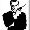
This also represents one of my only worries with Skyfall as a whole; from Fleming’s books through the films, it’s always best when the individual entry has a major motif or two that sets it apart. Something from the story that can stand on a poster or book cover that makes it jump out of the series as its own thing
Something that triggers “The one with the…. Gold, tarot cards, heraldry, diamonds, rockets, scuba divers or whatever.”
Nobody working on Skyfall's iconography has shown us anything like that yet. Why?
Well, there is one thing in the film I can think of. And it might have been quite fun to see Bond holding one of them in the poster instead of the PPK.
Possible spoiler.


