A poster and then the trailer March 28, wheels are in motion. This is awesome!
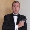
The LALD gun holster is cool, suppose we'll never see him with a revolver again at least compared to Moore...

Commander


Posted 17 March 2015 - 06:05 PM
A poster and then the trailer March 28, wheels are in motion. This is awesome!
The LALD gun holster is cool, suppose we'll never see him with a revolver again at least compared to Moore...
Commander RNVR
Posted 17 March 2015 - 06:16 PM
The LALD gun holster is cool, suppose we'll never see him with a revolver again at least compared to Moore...
Any gun in a storm with 007, but remember that with Roger, they were really trying to keep him Bond yet anti-Sean Bond. Nickle plated Magnum, Bollinger over Dom, Bourbon instead of martini's, few gadgets, no tuxedo.
Do like the old weathered leather holster though.
Lt. Commander

Posted 17 March 2015 - 06:16 PM
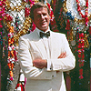
Hard to believe that slightly longer hair can make someone look 15 years younger. I am pretty sure they have done some PS on his face.
It is a nice pose, but underwhelming as a teaser poster IMO.PS?
Photoshop.
Craig's face has looked "lived in" post CR (I'm sure that's one reason why EON selected him to be Bond). That said, too many creases and sharp edges on his face may now work against him, given how hypercritical folk are on social media. So if the folks at Sony want his features softened for this poster, someone's using the Liquefy tool to do just that.
This film is going to cost in upwards of $200 million to produce, the last thing EON and Sony wants are folk saying Craig looks old.
Commander
Posted 17 March 2015 - 06:20 PM
Well spotted! Nice stuff.Trailer confirmed for March 28.
https://mobile.twitt...883961961103360
Commander
Posted 17 March 2015 - 06:37 PM
Whaddaya think - does Dan have one more mission in him?
(He's only as old as Roger was while making TMWTGG)
Lt. Commander

Posted 17 March 2015 - 06:47 PM
Easily. I can see EON revamping the tropes so that Craig gets several more films.
Lt. Commander

Posted 17 March 2015 - 06:57 PM
Knowing the love that both Craig and Mendes have for LALD makes this even better, imo.
Commander

Posted 17 March 2015 - 06:58 PM
Commander
Posted 17 March 2015 - 06:59 PM
It does what it sets out to do - tease the return of James Bond!
He looks great, better than 'SF' at the moment. DC just looks so much like the Bond we wanted him to be, and I love the 'LALD' vibe.
Brilliant stuff. 
Sub-Lieutenant

Posted 17 March 2015 - 07:17 PM
Commander

Posted 17 March 2015 - 07:26 PM
Even though it's a similar setup to the garbage they were throwing out there for Skyfall, this is much better executed. Still, someone went way overboard on the photoshop.
The font is still horrendous.
Edited by tdalton, 17 March 2015 - 07:29 PM.
Commander
Posted 17 March 2015 - 07:34 PM
What photoshop?? 
Commander
Posted 17 March 2015 - 07:37 PM
What photoshop??
Indeed. It's almost like someone dared the graphics guy to see if he could make Craig look younger than he did in Casino Royale.
Lt. Commander
Posted 17 March 2015 - 07:37 PM
There he is!The font is still horrendous.
Commander
Posted 17 March 2015 - 07:40 PM
No I seriously mean what photoshop...It looks perfectly natural to me..
Commander
Posted 17 March 2015 - 07:43 PM
No I seriously mean what photoshop...It looks perfectly natural to me..
Sorry. I thought you were being sarcastic because of the emoticon. My bad.
But, I still stand by the critique that they've photoshopped the heck out of Craig's face.
It's still a good teaser poster, though. Certainly the best since Casino Royale.
Lt. Commander
Posted 17 March 2015 - 07:46 PM
I stand with you on this.It's still a good teaser poster, though. Certainly the best since Casino Royale.
Commander
Posted 17 March 2015 - 07:47 PM
LOL..No worries..Well if they did do any touch ups they did do a decent job..besides how many movie posters and such DON'T get touched up before they are released.. Glad you approve and I agree that its certainly a lot better than the Skyfall stuff and QoS posters. Now if we could get a final release poster that's like the CR one with Bond walking down the steps of the casino and Vesper in the background that would be sweet.
Commander

Posted 17 March 2015 - 07:58 PM
I quite agree. Casino Royale certaintly did have the best publicity campaign out of all of Craigs films. The character posters weren't too bad either. Mind you, I didn't mind the Skyfall teaser poster, and I really like the poster that eventually became the Blu Ray cover. (Bond lying down shooting). The final theatrical posters however. Wow. Everytime I walk into a shop, my friend and I have a joke where we turn the DVD cover around if we come across it because that image of Craig is just terrible. Airbrushed to hell, and although his hair wasn't by all means awful in the film it made him look weird in the final posters. Spectre however, publicity wise, is knocking it out of the park. Lovely teaser poster and I love how stripped back and bold it is. Craig nails that look completely. Never been this satisfied with an image since the Casino Royale teaser poster was released.
Commander RNVR
Posted 17 March 2015 - 08:19 PM
No I seriously mean what photoshop...It looks perfectly natural to me..
Sorry. I thought you were being sarcastic because of the
But, I still stand by the critique that they've photoshopped the heck out of Craig's face.
It's still a good teaser poster, though. Certainly the best since Casino Royale.
I wouldn't go as far as saying that it is over-photoshopped when it comes to Craigs looks. Most of it can be achieved by good use of make-up, proper lighting and first and foremost a good photographer. At least two of those components went missing on the Skyfall theatrical poster.
The Photoshop work on this one is much more about colour correction, and maybe some extra graining. The better the picture, the less photoshopping is necessary. And this one is excellent.
Lt. Commander

Posted 17 March 2015 - 08:24 PM
I love how simple it is. Daniel Craig IS james Bond. They really don't need anything else but Daniel with a Walther PPK. The fact that he's channeling Roger Moore in Live and Let Die just takes it to a whole other level. Just pure Bond. I love it.
Commander
Posted 17 March 2015 - 08:27 PM
No I seriously mean what photoshop...It looks perfectly natural to me..
Sorry. I thought you were being sarcastic because of the
But, I still stand by the critique that they've photoshopped the heck out of Craig's face.
It's still a good teaser poster, though. Certainly the best since Casino Royale.
I wouldn't go as far as saying that it is over-photoshopped when it comes to Craigs looks. Most of it can be achieved by good use of make-up, proper lighting and first and foremost a good photographer. At least two of those components went missing on the Skyfall theatrical poster.
The Photoshop work on this one is much more about colour correction, and maybe some extra graining. The better the picture, the less photoshopping is necessary. And this one is excellent.
I would have to disagree, but I'm not going to continue arguing the point because I do like the poster. Craig just looks significantly younger in this than he does in the first official still they released and than he just generally does in real life, and I can't imagine that there hasn't been a good amount of photoshop involved with that.
Commander

Posted 17 March 2015 - 08:57 PM
I love how simple it is. Daniel Craig IS james Bond. They really don't need anything else but Daniel with a Walther PPK. The fact that he's channeling Roger Moore in Live and Let Die just takes it to a whole other level. Just pure Bond. I love it.
This is my opinion too.
And it's great to have a trailer just around the corner.
Commander RNVR
Posted 17 March 2015 - 09:01 PM
No I seriously mean what photoshop...It looks perfectly natural to me..
Sorry. I thought you were being sarcastic because of the
But, I still stand by the critique that they've photoshopped the heck out of Craig's face.
It's still a good teaser poster, though. Certainly the best since Casino Royale.
I wouldn't go as far as saying that it is over-photoshopped when it comes to Craigs looks. Most of it can be achieved by good use of make-up, proper lighting and first and foremost a good photographer. At least two of those components went missing on the Skyfall theatrical poster.
The Photoshop work on this one is much more about colour correction, and maybe some extra graining. The better the picture, the less photoshopping is necessary. And this one is excellent.
I would have to disagree, but I'm not going to continue arguing the point because I do like the poster. Craig just looks significantly younger in this than he does in the first official still they released and than he just generally does in real life, and I can't imagine that there hasn't been a good amount of photoshop involved with that.
The first still was shot on location, whereas this one is was made in the course of an elaborate studio shooting - which makes a big difference. People tend to forget that there were enough means to make people look good in photographs long before the age of digital images and Photoshop (and unfortunately, there are many who call themselves professional photographers among them - you wouldn't believe the amount of crap I get on my desk every day).
Of course, I could be all wrong. One can never really tell for sure. See it more as an educated guess from someone who's been in this business for more than 20 years 
I hasten to add, while I was slightly disappointed at first, the teaser grows on me each time I look at it.
Commander

Posted 17 March 2015 - 09:12 PM
Yeah - the weight of the expectations of the 'truly interested' vs the reality as experienced by the passers by. An ongoing conflict, I fear. Certainly for me.
Only when the furore has died down and the product has become a fully embedded part of the canon, can we, the interested, decide whether we like it - or not. (I still can't enjoy Skyfall)
A friend of mine who is as interested in all this as I am has now distanced himself from the day-to-day developments and he says he finds he enjoys the final film all the more.
Must admit while this sounds fine in principle, I can't stay away. I take his word for it.
Lieutenant

Posted 17 March 2015 - 09:14 PM
The first thing that came to mine, is Roger Moore in Live And Let Die. I'm sure others that posted on this before me already said that.
Lt. Commander

Posted 17 March 2015 - 09:59 PM
Rubbish!
This guy doesn't even look like James Bond. Blonde? Big ears? WTF!!!!
Just kidding - thought I go all 2005 just to mix things up a bit.......
Seriously, it looks cool. All that said, I think the quality of the posters across the board for the last 20 years have been ho-hum at best - I personally think some of the fan art has been better. That said, as teasers go, these are as good as the QoS ones in terms of flattering the star.
Everyone keeps mentioning LALD - oh for some posters of that quality.
Lieutenant
Posted 17 March 2015 - 10:16 PM
No I seriously mean what photoshop...It looks perfectly natural to me..
Sorry. I thought you were being sarcastic because of the
But, I still stand by the critique that they've photoshopped the heck out of Craig's face.
It's still a good teaser poster, though. Certainly the best since Casino Royale.
I wouldn't go as far as saying that it is over-photoshopped when it comes to Craigs looks. Most of it can be achieved by good use of make-up, proper lighting and first and foremost a good photographer. At least two of those components went missing on the Skyfall theatrical poster.
The Photoshop work on this one is much more about colour correction, and maybe some extra graining. The better the picture, the less photoshopping is necessary. And this one is excellent.
I would have to disagree, but I'm not going to continue arguing the point because I do like the poster. Craig just looks significantly younger in this than he does in the first official still they released and than he just generally does in real life, and I can't imagine that there hasn't been a good amount of photoshop involved with that.
The first still was shot on location, whereas this one is was made in the course of an elaborate studio shooting - which makes a big difference. People tend to forget that there were enough means to make people look good in photographs long before the age of digital images and Photoshop (and unfortunately, there are many who call themselves professional photographers among them - you wouldn't believe the amount of crap I get on my desk every day).
Of course, I could be all wrong. One can never really tell for sure. See it more as an educated guess from someone who's been in this business for more than 20 years
I hasten to add, while I was slightly disappointed at first, the teaser grows on me each time I look at it.
You're both very right of course. It's pretty obvious some photoshopping's going on in the official stills so far (see the Empire cover too) but it's good PS and, hey, it's not exactly unusual...

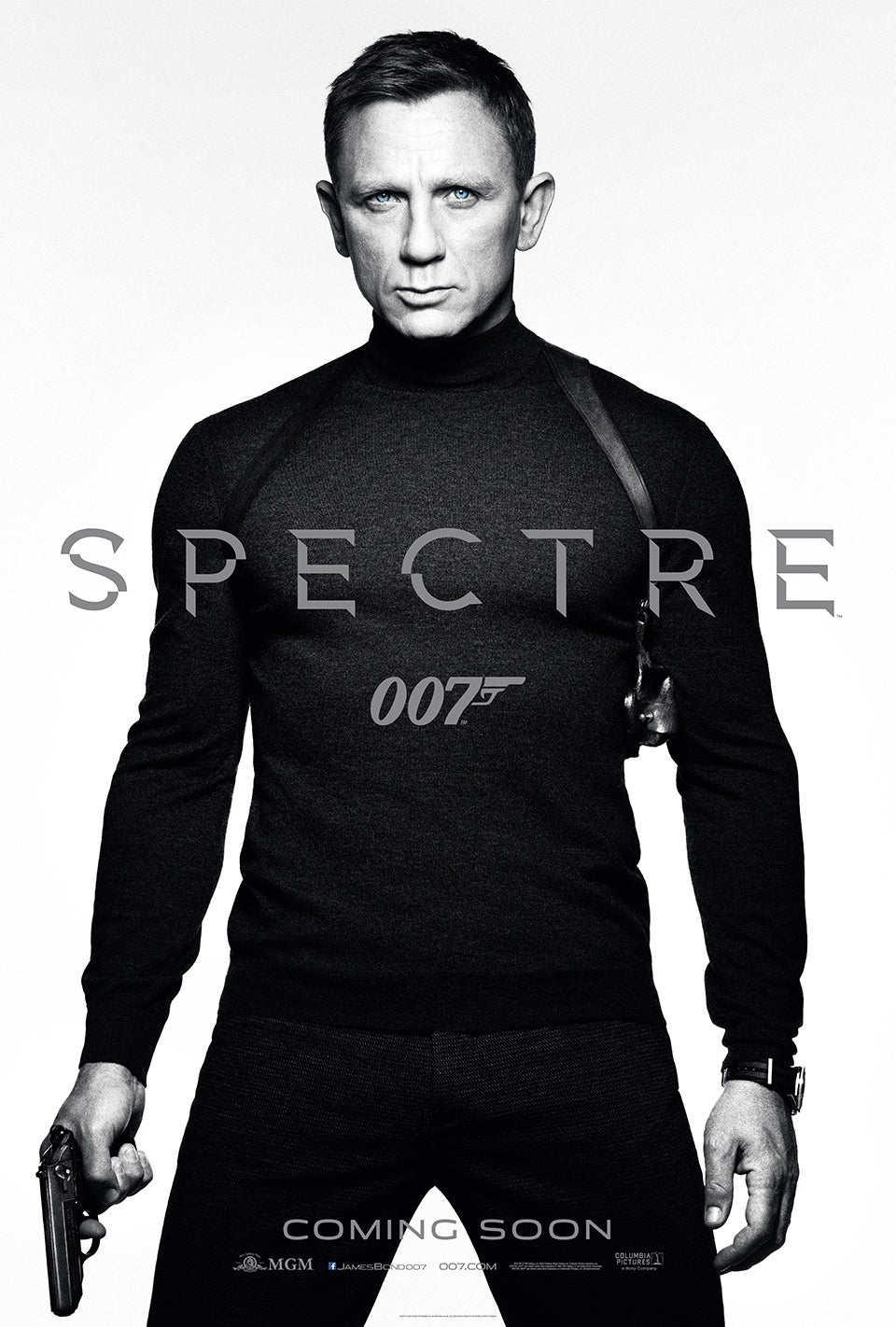
Regardless, I love this new teaser poster. So far the SPECTRE marketing has been amazing. This is going to be one of the most stylish Bond films ever.
EDIT: woops, those images came out a lot larger than I intended. Anyone know how to fix that?
Edited by RMc, 17 March 2015 - 10:16 PM.
Commander RNR
Posted 17 March 2015 - 10:21 PM
If it's representative of the film it's teasing for then FANTASTIC.
Commander

Posted 17 March 2015 - 10:35 PM
I like it - Daniel looks great, and that is the point of the poster. He certainly looks like James Bond!
Sam Mendes and Daniel himself have both said how much they love LALD and it's one of the movies they sit down to watch together before making a movie, so it's not a bit surprise that we get a LALD vibe here, which is fine with me.
I think the movie will have a LALD-GF-OHMSS vibe.
________________________________________________________________________________________________________________