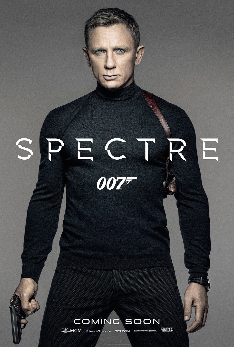
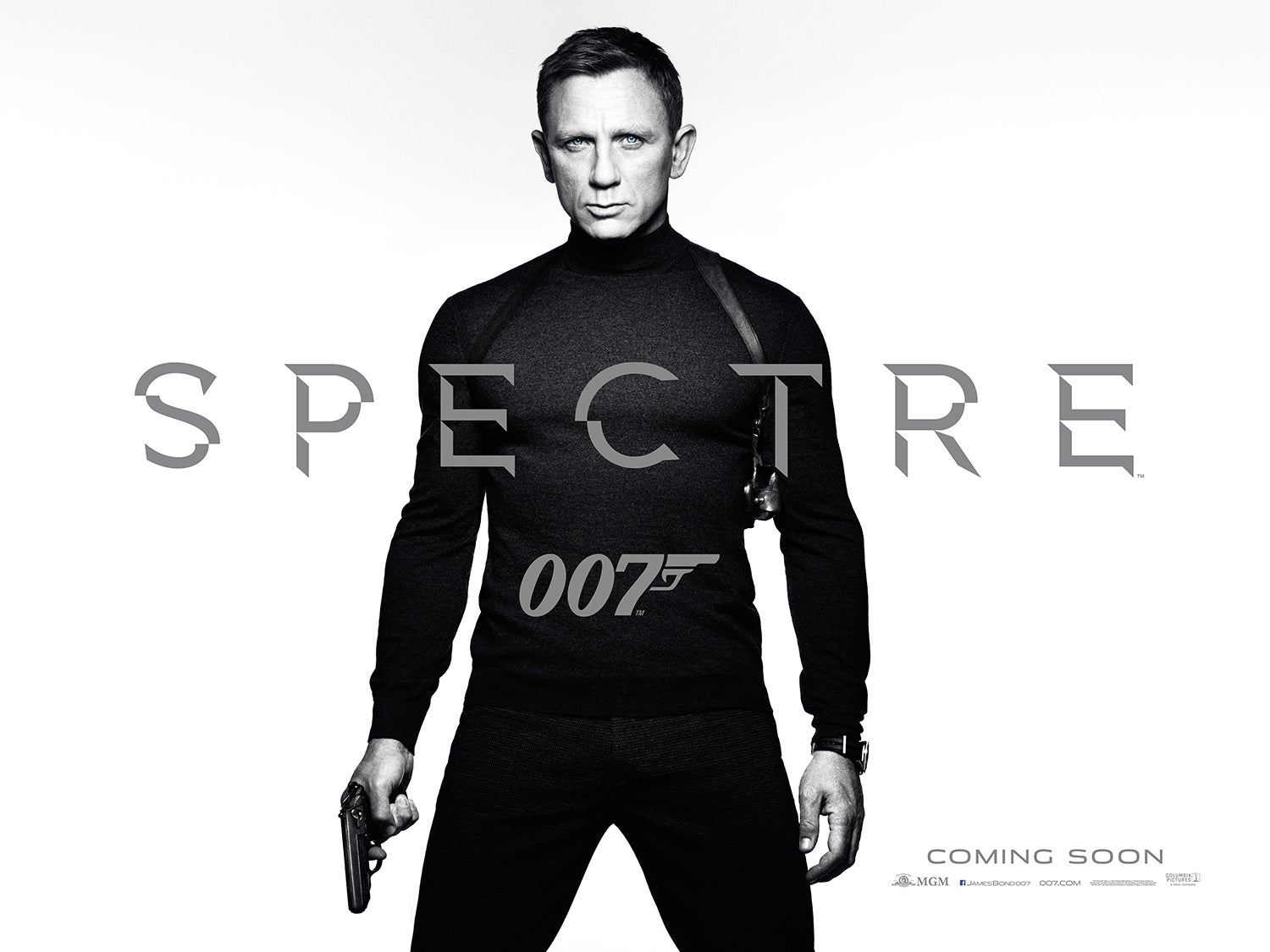
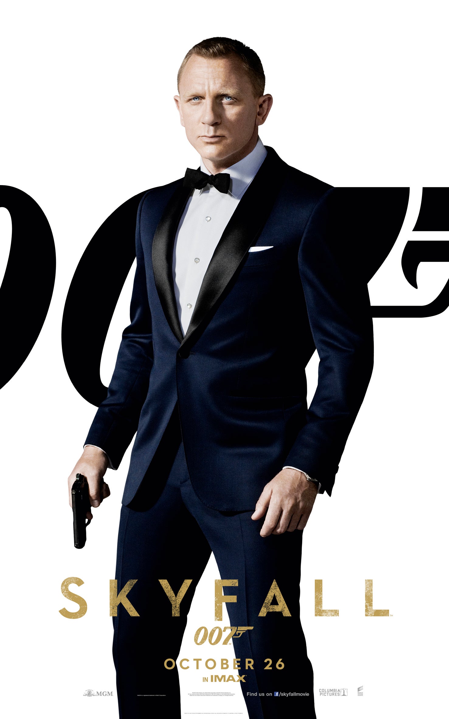
On first glance I have to agree with Mr Wint. There's nothing in it - a symbol, a clue, linking the film to SPECTRE the crime syndicate. The image of Bond could have fitted into any previous Craig film.

SPECTRE Teaser Poster
Started by
Vauxhall
, Mar 16 2015 09:04 PM
211 replies to this topic
#61

Guy Haines
-
- Veterans
-

- 3075 posts
Commander
- Location:"Special envoy" no more. As of 7/5/15 elected to office somewhere in Nottinghamshire, England.
Posted 17 March 2015 - 05:07 PM
#62
DamnCoffee
-

- Executive Officers
-
- 24459 posts
Commander
- Location:England
Posted 17 March 2015 - 05:07 PM
Craig looks SO hot. God damn.
#63
JCRendle
-
- Veterans
-
- 3639 posts
Commander
- Location:Her Majesty's England
Posted 17 March 2015 - 05:07 PM
#64
chriso
-

- Crew
-
- 583 posts
Lieutenant
- Location:Vienna, Austria
Posted 17 March 2015 - 05:08 PM
Is it Connery or McQueen, don't know?!
Just awesome!!
Just awesome!!
#65
The Dove
-

- Veterans
-
- 16671 posts
Commander
- Location:Colorado Springs, Colorado
Posted 17 March 2015 - 05:09 PM
Boy if this doesn't scream images of Bond in Live and Let Die..cool!! Still, I wasn't expecting too much as it's only a teaser and they're saving the good stuff for the final release poster no doubt..
#66
PeteNeon
-

- Crew
-
- 406 posts
Sub-Lieutenant
- Location:UK
Posted 17 March 2015 - 05:10 PM
He has hair again! It's much better than this: http://www.007.com/w...958-Skyfall.jpg
I know it was in the earlier poster, but I quite like how they're using the same font from QoS for "COMING SOON". Reminds me of Blood Stone's menus, if they weren't using Century Gothic, they had that QoS font for everything else. 
Edited by PeteNeon, 17 March 2015 - 05:15 PM.
#67
Simon
-

- Veterans
-
- 5884 posts
Commander
- Location:England
Posted 17 March 2015 - 05:11 PM
True to Empire Design's form.
'Man in dead centre of poster' and erm, well that's it.
Preferred the abstract bullet hole octopus design.
#68
AgenttiNollaNollaSeitsemän
-

- Crew
-
- 493 posts
Sub-Lieutenant
- Location:Oulu, Finland
Posted 17 March 2015 - 05:12 PM
I like the LALD vibe. Daniel looks great and definitely classically Bondian.
#69
Mr_Wint
-

- Veterans
-
- 2406 posts
Lt. Commander
- Location:Sweden
Posted 17 March 2015 - 05:16 PM
Hard to believe that slightly longer hair can make someone look 15 years younger. I am pretty sure they have done some PS on his face.
It is a nice pose, but underwhelming as a teaser poster IMO.
It is a nice pose, but underwhelming as a teaser poster IMO.
#70
Simon
-
- Veterans
-
- 5884 posts
Commander
- Location:England
Posted 17 March 2015 - 05:18 PM
Yeah - in terms of the poll, there is really nothing to like or dislike, LALD vibe aside.
I 'popped by to say Hello.'
#71
Shrublands
-

- Veterans
-
- 4012 posts
Commander
- Location:Conveniently Near the NATO Base
Posted 17 March 2015 - 05:18 PM
#72
PeteNeon
-
- Crew
-
- 406 posts
Sub-Lieutenant
- Location:UK
Posted 17 March 2015 - 05:18 PM
True to Empire Design's form.
'Man in dead centre of poster' and erm, well that's it.
Preferred the abstract bullet hole octopus design.
They did CR and QoS though.
#73
Vauxhall
-
- Executive Officers
-
- 10744 posts
Commander
- Location:London, UK
Posted 17 March 2015 - 05:19 PM
I don't dislike it. Not sure what else I'd prefer - perhaps keeping the smashed glass octopus in there somewhere. A 7, for me.
#74
stromberg
-

- The Admiralty
-
- 6841 posts
Commander RNVR
- Location:Saarland / Germany
Posted 17 March 2015 - 05:20 PM
True to Empire Design's form.
'Man in dead centre of poster' and erm, well that's it.
Preferred the abstract bullet hole octopus design.
But there's not as much space around him like they usually have - in the upright format, that is (which is much better than the quad format).
Like it better on repeat views. Maybe a bit simplistic, biut our man looks extremely good. Notice that SPECTRE now goes with a little ™....
#75
Fairbanks
-

- Crew
- 55 posts
Midshipman
Posted 17 March 2015 - 05:20 PM
He looks like he's about to inflate my couch. I like it.
#76
Matt_13
-

- Veterans
-
- 5969 posts
Commander
- Location:USA
Posted 17 March 2015 - 05:20 PM
Dead simple, very clean, and a very nice LALD homage...it gets the job done. I'm actually surprised by how overt the reference is.
#77
Simon
-
- Veterans
-
- 5884 posts
Commander
- Location:England
Posted 17 March 2015 - 05:23 PM
Yes, but if you look at the Empire Design site and all their more recent posters, the sheer number that are as per 'man in centre' pose, I do wonder where the 'design' comes in...
He does look better than the horrendous job they did on him for Skyfall though. The shorn look (not the designers' fault admittedly) and the insecure pose they had him in.
Can I ask, are there two different designs of this poster then? The white and grey backgrounds being alternate offerings?
#78
stromberg
-
- The Admiralty
-
- 6841 posts
Commander RNVR
- Location:Saarland / Germany
Posted 17 March 2015 - 05:26 PM
Can I ask, are there two different designs of this poster then? The white and grey backgrounds being alternate offerings?
Looks like it, they're both on the official site. But it's not white and grey background, its colour and b/w.
#79
Call Billy Bob
-

- Veterans
-
- 2917 posts
Lt. Commander
- Location:Lawrence, Kansas, USA
Posted 17 March 2015 - 05:28 PM
Well, I go out to lunch and then come back to this! I gave it an 8 - it pushes my nostalgia buttons and is a damn cool pose for Craig. It's a bit plain, which keeps it from a 10, but no real complaints from me!
#80
Simon
-
- Veterans
-
- 5884 posts
Commander
- Location:England
Posted 17 March 2015 - 05:28 PM
Ah!
(Am bloody hopeless!)
#81
Harmsway
-

- Veterans
-
- 13293 posts
Commander
Posted 17 March 2015 - 05:34 PM
I like it. It's efficient and cool.
#82
Agent 76
-

- Veterans
-
- 7080 posts
Commander
- Location:Portugal
Posted 17 March 2015 - 05:39 PM
Simple, effective, stylish and cool.
Great poster
thumbs up!

#84
The Shark
-

- Veterans
-
- 4650 posts
Commander
- Location:London
Posted 17 March 2015 - 05:41 PM
A solid 7. Very McQueen in BULLITT/Rog in LALD.
#86
JohnnyWalker
-
- Crew
-
- 272 posts
Sub-Lieutenant
Posted 17 March 2015 - 05:51 PM
Hard to believe that slightly longer hair can make someone look 15 years younger. I am pretty sure they have done some PS on his face.
It is a nice pose, but underwhelming as a teaser poster IMO.
PS?
#87
JCRendle
-
- Veterans
-
- 3639 posts
Commander
- Location:Her Majesty's England
Posted 17 March 2015 - 05:59 PM
Hard to believe that slightly longer hair can make someone look 15 years younger. I am pretty sure they have done some PS on his face.
It is a nice pose, but underwhelming as a teaser poster IMO.PS?
Photoshop
#88
stromberg
-
- The Admiralty
-
- 6841 posts
Commander RNVR
- Location:Saarland / Germany
Posted 17 March 2015 - 05:59 PM
Hard to believe that slightly longer hair can make someone look 15 years younger. I am pretty sure they have done some PS on his face.
It is a nice pose, but underwhelming as a teaser poster IMO.PS?
Photoshop. It's still amazing what one can do with it these days.
#89
The Dove
-
- Veterans
-
- 16671 posts
Commander
- Location:Colorado Springs, Colorado
Posted 17 March 2015 - 06:02 PM
Trailer confirmed for March 28.
https://mobile.twitt...883961961103360
Excellent!' Looks like our man, Marketto was spot on with his initial report!
#90
Bryce (003)
-

- Commanding Officers
-
- 10110 posts
Commander RNVR
- Location:West Los Angeles, California USA
Posted 17 March 2015 - 06:04 PM
A solid 7. Very McQueen in BULLITT/Rog in LALD.
Indeed! The talk of Craig doing a McQueen bio-pic has been floating around since shortly after CR. You can't deny it here or the LALD Roger reference (if it is a reference - aside for Bond fans). It works and once it circulates into a few theaters along with the impending teaser trailer, the fuse will be lit and burning hot.
When Craig finishes up his tenure, I'll bet that's when we get the McQueen BP. Last I glanced over at FB, that connection per this poster is getting some buzz in a few groups. I may need to get myself over to Sunset in Hollywood. It's way too early, but I wouldn't be terribly surprised if they got a billboard of this up for a short stint.
I doubt it, but you never know...Besides, I'll be headed over to my usual source nearby to pick up my copy within the week anyway, so I'll just plan to cruise back along the strip. 