Hear hear!An intelligent observation but the flame girl, the ice gun, the QoS shadow all left Bond and the actor off the posters and conveyed their messages with alacrity.
And even if Craig is required on the poster, some framing, some lighting, some design is but a small thing to expect - especially in light of Mr Deakins' work exemplifying the moving artistc image if not the still.

The Posters
Started by
Shrublands
, Sep 17 2012 11:18 AM
261 replies to this topic
#121

univex
-
- Veterans
-

- 2310 posts
Lt. Commander
Posted 19 September 2012 - 09:03 AM
#122
Shrublands
-
- Veterans
-
- 4012 posts
Commander
- Location:Conveniently Near the NATO Base
Posted 19 September 2012 - 10:10 AM
It’s the utter lack of effort that gets me. They might not be to everyone’s taste, but just compare these Skyfall posters to those for other event movies from this year.
Dynamic, evocative and professional...


Dynamic, evocative and professional...
#123
SecretAgentFan
-

- Commanding Officers
-
- 9055 posts
Commander
- Location:Germany
Posted 19 September 2012 - 10:24 AM
Weeeeellll, "THE HOBBIT" looks great, I agree.
"Spidey" looks okay but not really inspired, rather been there done that.
And "TDKR", although a logical companion piece to "TDK", lacks fresh ideas as well.
"Spidey" looks okay but not really inspired, rather been there done that.
And "TDKR", although a logical companion piece to "TDK", lacks fresh ideas as well.
#124
x007AceOfSpades
-

- Veterans
-
- 4369 posts
Commander
- Location:Sunny Southern California
Posted 19 September 2012 - 10:28 AM
The fact the marketing team behind TDKR used the Teaser poster, re-colored it, and pasted Batman and credits over it is pretty sad. I was expecting a pretty good poster for the last in the series, but instead given that. All the posters were terrible for TDKR, except the Teaser, which looked nice as my desktop background for a while.
#125
Shrublands
-
- Veterans
-
- 4012 posts
Commander
- Location:Conveniently Near the NATO Base
Posted 19 September 2012 - 10:29 AM
Weeeeellll, "THE HOBBIT" looks great, I agree.
"Spidey" looks okay but not really inspired, rather been there done that.
And "TDKR", although a logical companion piece to "TDK", lacks fresh ideas as well.
As I say, they might not be to everyone’s taste but they display some effort and are professional designs.
And when it comes to a lack of fresh ideas – I refer you to the Skyfall poster campaign in its entirety.
#126
Simon
-

- Veterans
-
- 5884 posts
Commander
- Location:England
Posted 19 September 2012 - 10:50 AM
As you say, not necessarily to everyone's taste but absolutely showing effort and creativity.
The 'been there, done that' argument in reference to SF is solid. And the Spidey poster is still better than plastering a rather gimpy Craig (not his fault, but the photographer) image on to a very well worn gun barrell.
The 'been there, done that' argument in reference to SF is solid. And the Spidey poster is still better than plastering a rather gimpy Craig (not his fault, but the photographer) image on to a very well worn gun barrell.
#127
Stainless Steel Teeth INC
-

- Crew
-
- 145 posts
Sub-Lieutenant
- Location:London
Posted 19 September 2012 - 11:37 AM
The other thing that has surprised me has been the failure to capitilize on the whole 50th Anniversary aspect with regard to the Skyfall advertising campaign.
While it has no direct relevence to the actual film it is nevertheless a unique marketing opportunity that seems to have been overlooked but deserves to be celebrated. I'm not advocating anything too blatant but a subtle use of the annivesary logo and a neat strapline underneath the credit block would have been a nice touch.
Afterall, how many other franchises will reach this milestone and how many others will ever have the potential to surpass it?
#128
Satorious
-

- Crew
-
- 470 posts
Sub-Lieutenant
Posted 19 September 2012 - 12:33 PM
A few well reasoned arguments against the Batman, Spidey, Hobbit posters - I don't necessarily disagree either. But it doesn't change the fact that they are ALL still much better posters. To be honest I've pretty well given up on the Bond posters and film posters generally since the introduction of all these cut and paste photoshop montages.
#129
HellIsHere
-

- Crew
-
- 310 posts
Sub-Lieutenant
Posted 19 September 2012 - 12:34 PM
"I don't give a damn" to that stupid idea that they only wanna sell the movie and capitalize on James Bond and 007. It was very unprofessional to say the least. It's a trashy poster that is.
#130
S K Y F A L L
-

- Veterans
-
- 6889 posts
Commander
- Location:CANADA
Posted 19 September 2012 - 12:49 PM
I don't like the new poster that much either but as long as its not the finale one I'm fine if they want to try new things.
#131
SecretAgentFan
-
- Commanding Officers
-
- 9055 posts
Commander
- Location:Germany
Posted 19 September 2012 - 03:21 PM
Having the recent poster feature the beloved gun barrel so prominently (as the teaser did) should earn SONY/EON some points with us fans. But no...
#132
Shrublands
-
- Veterans
-
- 4012 posts
Commander
- Location:Conveniently Near the NATO Base
Posted 19 September 2012 - 03:58 PM
Having the recent poster feature the beloved gun barrel so prominently (as the teaser did) should earn SONY/EON some points with us fans. But no...
I think most fans think it belongs at the start of the film and are eager to see it there.
I’ve not seen many fans demand to see a low quality, badly framed version in the background of a clumsy, amateurish poster. If Sony/Eon think that’s the way to curry favour and win points, then they’re quite wrong.
#133
Simon
-
- Veterans
-
- 5884 posts
Commander
- Location:England
Posted 19 September 2012 - 07:31 PM
Bearing in mind now there are whole divisions devoted to new media and online social interaction, I wonder if anyone is monitoring threads such as this for feedback.
If so, I hope the reaction to such is one of, " I think we f'kd up guys.'
If so, I hope the reaction to such is one of, " I think we f'kd up guys.'
#134
Messervy
-

- Veterans
-
- 1369 posts
Lt. Commander
- Location:ZZ9 Plural Z Alpha
Posted 19 September 2012 - 09:39 PM
No offense, but this is quite puzzling.Who's 'we,' paleface?
Shall I take it that you're quite comfortable with average, below-standard posters as long as they "get the job done"?
"The only thing worse than being talked about is not being talked about."
(Oscar Wilde)
The posters are doing their job:
"There's a new James Bond film coming out in November. It's called 'Skyfall'."
Whether you like the poster or not, the message got through.
See you all opening night.
Isn't this Bond we're talking about here? Shoudn't we aim high, instead of just passively welcoming what's coming along?
Are you offended that EON didn't seek our approval before finalizing this poster? What if they had and we'd rejected it, but everyone else hated our final choice? Wasn't there a focus group that chose this design, either over the one we would have chosen, or because it was actually the best of the lot - a judgement we might have agreed with, had we been there?
If you like the fan art better, by all means get your favorite submission blown up to poster size and enjoy it. Having no artistic talent meself, I am unable to aim higher than EON, so yes, I'll passively welcome what they offer - it's less frustrating than complaining about something over which I had no input.
By "we", I meant us Bond fans. Of course I'm not stupid enough as to claim EON should have called us... I'm just saying that we, as Bond fans, have every right to expect the very best and not to be satisfied with something that, to many, looks dull.
But I get your point: as long as you're fed something, you'll welcome it. Please forgive me if I dare ask my dish to be tasty.
#135
AMC Hornet
-

- Veterans
-
- 5857 posts
Commander
Posted 19 September 2012 - 10:11 PM
I don't want to pick a fight either, Miles, and I agree, 'we' do have the right to expect the best from those who have been producing our favorite entertainment for the past 50 years.No offense, but this is quite puzzling.
By "we", I meant us Bond fans. Of course I'm not stupid enough as to claim EON should have called us... I'm just saying that we, as Bond fans, have every right to expect the very best and not to be satisfied with something that, to many, looks dull.
But I get your point: as long as you're fed something, you'll welcome it. Please forgive me if I dare ask my dish to be tasty.
And granted, to many - but not all - the new poster does look dull. I just happen to be one of the few willing to pipe up and say that I see something different when I look at it, and that I'm willing to accept something from EON - made with original artwork, but which looks like fan art - over fan art made with EON's original artwork.
As for preferring a tasty dish over what we're fed, that's an excellent analogy. However, when I want a particularly tasty dish I'll shop around until I find it (and I mean that literally - it took me a couple of years to find a restaurant that makes salt & pepper squid the way I like after my favorite old restaurant closed). But there's only one source for authentic EON posters, and that's EON. I'm sorry that so many at this site hate the poster, but my attitude towards that is like my attitude towards the reboot idea for Casino Royale, which was: if I don't like it, I'm bound to like the next one better (okay, I wasn't expecting QoS either, but now that the whole novice 00 thing is over, I'm sure I'll like Skyfall).
Remember, there's at least one more poster coming - one which will include 'Title song performed by
Anyway, I'm a compulsive collector of 007 posters, so I have to have the latest one, before it becomes a rarity.
#136
coco1997
-

- Veterans
-
- 2821 posts
Lt. Commander
- Location:Chicago
Posted 20 September 2012 - 12:29 AM
Anyone seen this yet?

#137
x007AceOfSpades
-
- Veterans
-
- 4369 posts
Commander
- Location:Sunny Southern California
Posted 20 September 2012 - 12:42 AM
Perhaps if it had Craig in the tux it would be more interesting, but very well done whoever made that.
#138
AMC Hornet
-
- Veterans
-
- 5857 posts
Commander
Posted 20 September 2012 - 01:17 AM
That's a fine poster, and more appropriate for the times than is this one, which rather reminds me of one of the Japanese posters for NSNA:
EDIT: Actually, I'm really starting to like the one Coco1997 posted...
EDIT: Actually, I'm really starting to like the one Coco1997 posted...
#139
Shrublands
-
- Veterans
-
- 4012 posts
Commander
- Location:Conveniently Near the NATO Base
Posted 20 September 2012 - 06:25 AM
We have a thread for fan art - we should keep this one for the official posters.
#140
Messervy
-
- Veterans
-
- 1369 posts
Lt. Commander
- Location:ZZ9 Plural Z Alpha
Posted 20 September 2012 - 07:40 AM
I see what you mean: since the posters have to come from EON, we're bound to take what they give us. We can't shop around and find another provider.I don't want to pick a fight either, Miles, and I agree, 'we' do have the right to expect the best from those who have been producing our favorite entertainment for the past 50 years. And granted, to many - but not all - the new poster does look dull. I just happen to be one of the few willing to pipe up and say that I see something different when I look at it, and that I'm willing to accept something from EON - made with original artwork, but which looks like fan art - over fan art made with EON's original artwork. As for preferring a tasty dish over what we're fed, that's an excellent analogy. However, when I want a particularly tasty dish I'll shop around until I find it (and I mean that literally - it took me a couple of years to find a restaurant that makes salt & pepper squid the way I like after my favorite old restaurant closed). But there's only one source for authentic EON posters, and that's EON. I'm sorry that so many at this site hate the poster, but my attitude towards that is like my attitude towards the reboot idea for Casino Royale, which was: if I don't like it, I'm bound to like the next one better (okay, I wasn't expecting QoS either, but now that the whole novice 00 thing is over, I'm sure I'll like Skyfall). Remember, there's at least one more poster coming - one which will include 'Title song performed byNo offense, but this is quite puzzling. By "we", I meant us Bond fans. Of course I'm not stupid enough as to claim EON should have called us... I'm just saying that we, as Bond fans, have every right to expect the very best and not to be satisfied with something that, to many, looks dull. But I get your point: as long as you're fed something, you'll welcome it. Please forgive me if I dare ask my dish to be tasty.
Adele...", so if someone from EON/Sony's publicity department is monitoring the boards, then there's a glimmer of hope that the final sheet will be killer. Anyway, I'm a compulsive collector of 007 posters, so I have to have the latest one, before it becomes a rarity.
Yet I still think they could/should have come up with something more inspired.
But you're right anyway; it's not like if we had any other choice.
#141
Simon
-
- Veterans
-
- 5884 posts
Commander
- Location:England
Posted 20 September 2012 - 07:57 AM
Me too.Anyway, I'm a compulsive collector of 007 posters, so I have to have the latest one, before it becomes a rarity.
However with this outing, I have begun to question my sanity and whether 'completism' is all it's cracked up to be.
#142
SecretAgentFan
-
- Commanding Officers
-
- 9055 posts
Commander
- Location:Germany
Posted 20 September 2012 - 10:36 AM
Well... if you look at the recent SKYFALL poster and compare it to previous Bond posters (NOT the final one sheets) then you will find lots of similarities.
#143
Pussfeller
-

- Veterans
-
- 4089 posts
Commander
- Location:Washington, D.C.
Posted 20 September 2012 - 02:56 PM
That's one source of hope. Early promotional images have often been bland and uninspired.
#144
tdalton
-

- Veterans
-
- 11680 posts
Commander
Posted 20 September 2012 - 02:59 PM
That's one source of hope. Early promotional images have often been bland and uninspired.
Hopefully that's the case. The only problem is, since THE LIVING DAYLIGHTS (perhaps excluding GOLDENEYE), the final posters have been pretty bland as well.
#145
SecretAgentFan
-
- Commanding Officers
-
- 9055 posts
Commander
- Location:Germany
Posted 20 September 2012 - 03:32 PM
THE LIVING DAYLIGHTS really has one of the best posters of the entire series. Featuring the gun barrel as well, by the way.
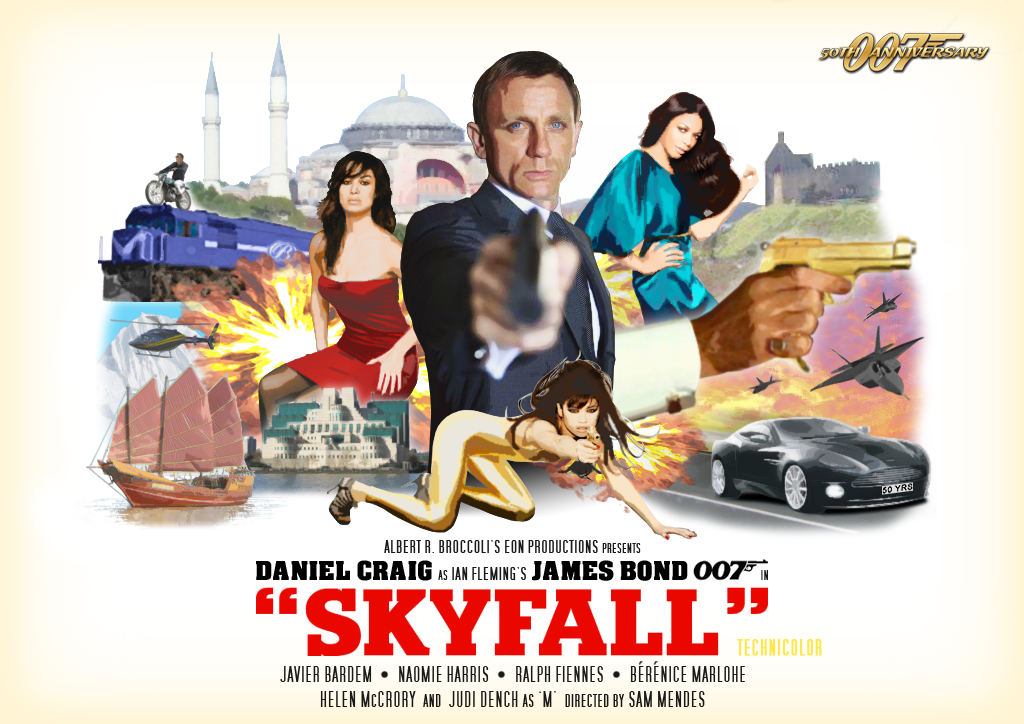
I´m hoping for one final poster which will feature Bond, Silva, both ladies and glimpses of the major locations (London, of course).
I´m hoping for one final poster which will feature Bond, Silva, both ladies and glimpses of the major locations (London, of course).
#146
tdalton
-
- Veterans
-
- 11680 posts
Commander
Posted 20 September 2012 - 03:38 PM
The problem with the SKYFALL posters isn't the inclusion of the gunbarrel, though. It's the fact that it, along with Craig looking like he's posing for the worst prom photo ever, are the sole focal points. Looking at the two LIVING DAYLIGHTS posters that feature the gunbarrel, the gunbarrel really isn't the focal point of either. In the blue one, the focal points are the woman in the white dress with the pistol and then Dalton. In the other one, the focal point is Dalton and then all of the artwork they've put inside and around the transparent gunbarrel, which is really just there to frame everything rather than be the sole focus of the poster.
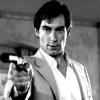
The SKYFALL poster is just the gunbarrel and a very poor photograph of Craig, who couldn't look more bored if he tried.
The SKYFALL poster is just the gunbarrel and a very poor photograph of Craig, who couldn't look more bored if he tried.
#147
SecretAgentFan
-
- Commanding Officers
-
- 9055 posts
Commander
- Location:Germany
Posted 20 September 2012 - 03:48 PM
I understand what you mean. But I believe Craig did not try to look bored but... Bond-like.
#148
marktmurphy
-

- Veterans
-
- 9055 posts
Commander
- Location:London
Posted 20 September 2012 - 04:32 PM
The problem with the SKYFALL posters isn't the inclusion of the gunbarrel, though. It's the fact that it, along with Craig looking like he's posing for the worst prom photo ever, are the sole focal points. Looking at the two LIVING DAYLIGHTS posters that feature the gunbarrel, the gunbarrel really isn't the focal point of either. In the blue one, the focal points are the woman in the white dress with the pistol and then Dalton. In the other one, the focal point is Dalton and then all of the artwork they've put inside and around the transparent gunbarrel, which is really just there to frame everything rather than be the sole focus of the poster.
I found that painted montage Daylights poster pretty unimaginative, to be honest. The teaser one with just TIm and the sniper girl's legs is excellent.
#149
tdalton
-
- Veterans
-
- 11680 posts
Commander
Posted 20 September 2012 - 04:36 PM
It's not the best of the Bond posters, no, but it's far superior to everything EON has given us since then, with the exception of the CASINO ROYALE teaser.
#150
marktmurphy
-
- Veterans
-
- 9055 posts
Commander
- Location:London
Posted 20 September 2012 - 04:56 PM
I liked the TWINE posters.