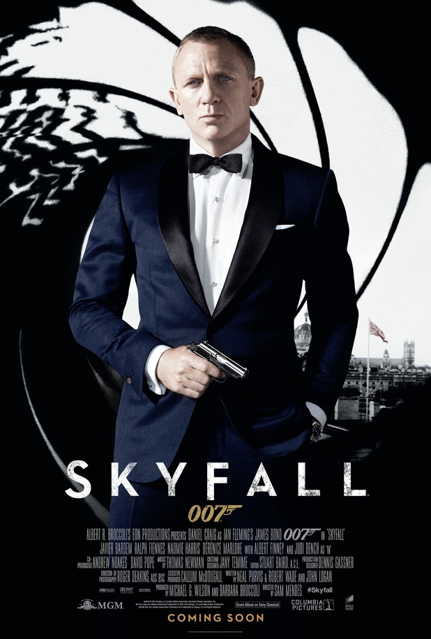
It certainly looks like a piece of fan art, except that fan art tends to be less generic.
But that's not surprising, or it shouldn't be. It's pointless to judge this image as if it were a piece of artwork. No one is meant to admire a cereal box. For a few months, people will see this image and think "Bond movie".
I doubt if a single creatively inclined person had a hand in the design of this image. This is the sort of thing produced by "branding experts". You'll notice that literally every visual element is a piece of Bond branding: the gunbarrel, the Craig photo, the tux, the gun, the Union Jack, the Skyfall logo, and the 007 logo. There's nothing else on the poster. You could switch the title to Casino Royale and it would function the same.
This is so generic, it's morbidly fascinating. It almost crosses the line from advertising into signage. This is a Bond sign, not a Bond poster.
This also represents one of my only worries with Skyfall as a whole; from Fleming’s books through the films, it’s always best when the individual entry has a major motif or two that sets it apart. Something from the story that can stand on a poster or book cover that makes it jump out of the series as its own thing
Something that triggers “The one with the…. Gold, tarot cards, heraldry, diamonds, rockets, scuba divers or whatever.”
Nobody working on Skyfall's iconography has shown us anything like that yet. Why?
As a suggestion, Skyfall could well become known as “the one with lots of London” but that small crumb on this poster is simply not doing the job. A great bit of graphic design showing Bond at large above and/or below the streets of the capital would.


