Jump to content


This is a read only archive of the old forums
The new CBn forums are located at https://quarterdeck.commanderbond.net/

 
Photo

Skyfall Teaser Poster released


437 replies to this topic

Poll: Teaser Poster (141 member(s) have cast votes)

Do you like it?

You cannot see the results of the poll until you have voted. Please login and cast your vote to see the results of this poll.

Does your liking or disliking it actually matter?

You cannot see the results of the poll until you have voted. Please login and cast your vote to see the results of this poll.
Vote Guests cannot vote

#331 DABOY

DABOY

    Sub-Lieutenant

  • Crew
  • Pip
  • 130 posts
  • Location:VA

Posted 18 May 2012 - 07:03 PM

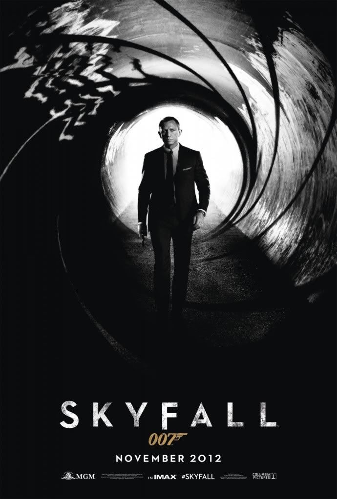
I would prefer it if the poster had some color, ala this variation from a fella that goes by the tag of AgentJamesBond007:

Posted Image


I see you found my artwork. I'm 'AgentJamesBond007' on MI6 but DABOY here :)

#332 iexpectu2die

iexpectu2die

    Lieutenant

  • Crew
  • PipPip
  • 646 posts

Posted 18 May 2012 - 07:29 PM

Guys, I think I've figured out what the poster was missing! Posted Image

#333 zencat

zencat

    Commander GCMG

  • Commanding Officers
  • PipPipPipPip
  • 25814 posts
  • Location:Studio City, CA

Posted 18 May 2012 - 07:34 PM

Finally confirmation (in the copyright) that it's Skyfall and not SkyFall. This has been driving me nuts.

Nice poster. :)

#334 JCRendle

JCRendle

    Commander

  • Veterans
  • PipPipPipPip
  • 3639 posts
  • Location:Her Majesty's England

Posted 18 May 2012 - 09:31 PM

I noticed the tail of the F was a little longer, maybe its just stylistic.

#335 Leon

Leon

    Lt. Commander

  • Veterans
  • PipPipPip
  • 1574 posts
  • Location:England

Posted 19 May 2012 - 12:53 PM

I would prefer it if the poster had some color


Eh...

The black and white is clearly supposed to be referencing the Bond origin - it makes me think of the original gunbarrel sequences, and I prefer that, rather than just splashing any old colour on it for the sake of it. I also think it will stand out more because of the fact it's monochrome - all the other film posters around it in cinemas etc will be the usual colour jobbies.

#336 The Shark

The Shark

    Commander

  • Veterans
  • PipPipPipPip
  • 4650 posts
  • Location:London

Posted 19 May 2012 - 02:27 PM

it's more that the last couple of theatrical and teaser posters have been lacking in colour (most of them desaturated). Since SKYFALL's supposed to be "classic Bond with a capital B", it would make sense to have something in the style of the colourful, classic posters. Bond was never in monochrome.

#337 univex

univex

    Lt. Commander

  • Veterans
  • PipPipPip
  • 2310 posts

Posted 19 May 2012 - 04:25 PM

B&W is classy. Always. Period.

#338 tdalton

tdalton

    Commander

  • Veterans
  • PipPipPipPip
  • 11680 posts

Posted 19 May 2012 - 04:56 PM

it's more that the last couple of theatrical and teaser posters have been lacking in colour (most of them desaturated). Since SKYFALL's supposed to be "classic Bond with a capital B", it would make sense to have something in the style of the colourful, classic posters. Bond was never in monochrome.


Agreed.

While I'm all for going for a retro look and using black and white within the films and all of that, I don't think it's a good idea for the teaser poster. Of course the only way to know for sure is to go to the cinema to check it out amongst the other posters, but I wonder if this poster will stand out much when it's sitting between other, more colorful and/or more exciting, posters. It just doesn't seem to me like something that would catch my eye if I wasn't already looking for it.

#339 Pussfeller

Pussfeller

    Commander

  • Veterans
  • PipPipPipPip
  • 4089 posts
  • Location:Washington, D.C.

Posted 19 May 2012 - 04:59 PM

Are we trying to attract kindergarteners? Surely the art of the advertisement is more sophisticated than just "bright colors and shiny things". A bold monochrome composition can have a more striking effect, and it's less likely to be mistaken for a Chipmunks sequel.

#340 tdalton

tdalton

    Commander

  • Veterans
  • PipPipPipPip
  • 11680 posts

Posted 19 May 2012 - 05:07 PM

Are we trying to attract kindergarteners? Surely the art of the advertisement is more sophisticated than just "bright colors and shiny things". A bold monochrome composition can have a more striking effect, and it's less likely to be mistaken for a Chipmunks sequel.


No, of course we're not trying to attract kindergarteners.

Yes, black and white can be striking, but I don't think it works here. Maybe if the contrast was a bit greater between the black and the white it might be more striking, but the image to me simply looks flat and uninteresting. The manipulation that someone poster earlier in the thread with the gold tint to the gunbarrel is a decent example of how the poster could have been done in a way that doesn't make it look like a "chipmunks sequel" while still providing enough contrast so that the image pops a little bit.

I think considering that there's supposed to be some kind of depth to the poster (as in a visual or 3D sense rather than philosophical), having a greater contrast in the black/white scheme would have aided that a bit and, as a result, made it pop a little more. My main problem is that the poster just seems flat and uninteresting. Simply tweaking some things here and there, either through a higher contrast in the black/white scheme or adding a tiny bit of color like in the manipulation posted here, then it would have gone a long way towards making the poster at least somewhat decent.

#341 Harmsway

Harmsway

    Commander

  • Veterans
  • PipPipPipPip
  • 13293 posts

Posted 19 May 2012 - 05:07 PM

You want something that's going to draw the eye when it's seen in someone's peripheral vision.

#342 The Shark

The Shark

    Commander

  • Veterans
  • PipPipPipPip
  • 4650 posts
  • Location:London

Posted 19 May 2012 - 05:08 PM

B&W is classy. Always. Period.


Classy but it can be drab too.

Surely the art of the advertisement is more sophisticated than just "bright colors and shiny things".


Sure, but look at some of the classic hand-drawn Bond posters of yesteryear: They're tell you're in for a fun, thrilling, colourful, pulpy ride. "Bond with a capital B."

This look likes a sales exec walking into a sewer.

#343 thecasinoroyale

thecasinoroyale

    Commander

  • Veterans
  • PipPipPipPip
  • 14358 posts
  • Location:Basingstoke, UK

Posted 19 May 2012 - 05:38 PM

Can't believe we now compare Bond in the gunbarrel to a bloke in a sewer! We're never happy as a collective fan-base really, are we?


I love the B&W..simple enough to tease and reflect the possible connotations of the film.

The golden 007 does me just fine!

#344 univex

univex

    Lt. Commander

  • Veterans
  • PipPipPip
  • 2310 posts

Posted 19 May 2012 - 05:57 PM

Truth is, as always, opinions diverge and we, as a collective fan-base - as you say -, are never truly happy. Take the QOS teaser, now that was drab. A shadow of a man with a machine gun? in B&W? Drab. And the poster was even worse, and that was colourful. This, to me at least, speaks of a better quality film, made by a better quality director/team. And something that harkens back to the symbology of Bond. Gunbarrel, suit, ppk. Done. With so much talk about missing the gunbarrel, it´s not that odd they´d give us exactly what we wanted for the teaser.

I don´t expect another B&W/simple poster for the main thing, but, as a Bond fan, this truly is quality in print. Would I prefer a drawn poster, old fashion way? For the teaser? no. For the actuall poster? Hell yes! Everything so far as been quite retro. Give us even more retro: a big bold hand drawn colourful Istambul/orient themed poster with Dan-the-man and some hot Bond women riding komodo dragons! That´ll make my day.

But for a teaser, I must say, I love this one. Wouldn´t want it any other way.

#345 Royal Dalton

Royal Dalton

    Commander

  • Veterans
  • PipPipPipPip
  • 4542 posts

Posted 19 May 2012 - 05:59 PM

Can't believe we now compare Bond in the gunbarrel to a bloke in a sewer!


Well, that's unfortunately what it looks like in this particular interpretation.

They could have had the gunbarrel image as a swirling grey and white cloud against a blue sky, with Bond falling through the centre of it, or something like that. At least that would have been eye-catching. This is just drab.

#346 univex

univex

    Lt. Commander

  • Veterans
  • PipPipPip
  • 2310 posts

Posted 19 May 2012 - 06:15 PM

Tell ya what. They could have had the gunbarrel morph into a London underground tunnel with the Tube signs and the all lot. Could have been cool as well.

But again, as it is, it´s fine.

#347 Nicolas Suszczyk

Nicolas Suszczyk

    Commander

  • Veterans
  • PipPipPipPip
  • 3735 posts
  • Location:Buenos Aires, Argentina

Posted 19 May 2012 - 09:48 PM

Posted Image

Mexican variation of the poster, announcing the trailer!

#348 Dustin

Dustin

    Commander

  • Commanding Officers
  • PipPipPipPip
  • 5786 posts

Posted 19 May 2012 - 09:58 PM

It's always this way with fans, whatever we get - we bitch, even if we get what we were asking for. I for one like it as it is. But of course here's always room for improvement, nothing wrong with that.

#349 iexpectu2die

iexpectu2die

    Lieutenant

  • Crew
  • PipPip
  • 646 posts

Posted 19 May 2012 - 10:09 PM

It is a TEASER poster. It's simple and effective. The 'gold' iteration that someone posted earlier is a nice piece of photshopping but ultimately less striking - it looks like an advert for Goldeneye Reloaded.

Think of the Casino Royale Theatrical poster - THAT was the one that adjourned busses, cinemas, the soundtrack album, the DVD, everything.

Skyfall's theatrical poster is the one that Joe Public will see. Teasers are inevitably for fanboys. So let's enjoy the gunbarrel and be done with it. Trailer ahoy!

Edited by iexpectu2die, 19 May 2012 - 10:12 PM.


#350 PPK_19

PPK_19

    Lt. Commander

  • Veterans
  • PipPipPip
  • 1312 posts
  • Location:Surrey, England.

Posted 19 May 2012 - 11:54 PM

Not at all related but i've just watched my beloved Chelsea win the Champion's League. This, plus the Skyfall teaser coming on Monday has been the best week in my 25 years of life.

#351 Marketto007

Marketto007

    Lt. Commander

  • Veterans
  • PipPipPip
  • 2487 posts
  • Location:Brasil

Posted 20 May 2012 - 03:00 AM

A slightly different version of the poster, with the NOVEMBER 2012 instead of the COMING SOON below the title of the movie.

Posted Image

Courtesy from IMP Awards.

xxx

#352 Pussfeller

Pussfeller

    Commander

  • Veterans
  • PipPipPipPip
  • 4089 posts
  • Location:Washington, D.C.

Posted 20 May 2012 - 03:02 AM

So this is an official, i.e. real, poster? This is something they've put out?

#353 Marketto007

Marketto007

    Lt. Commander

  • Veterans
  • PipPipPip
  • 2487 posts
  • Location:Brasil

Posted 20 May 2012 - 03:05 AM

It's official Pussfeller. The website even credits the Design company responsible for the Poster, on this case, EMPIRE DESIGN, which has already made several Bond movie posters.

xxx

#354 Pussfeller

Pussfeller

    Commander

  • Veterans
  • PipPipPipPip
  • 4089 posts
  • Location:Washington, D.C.

Posted 20 May 2012 - 03:08 AM

Excellent. Much better than "coming soon".

#355 PierceConneryMoore

PierceConneryMoore

    Midshipman

  • Crew
  • 82 posts
  • Location:Las Vegas, Nevada

Posted 20 May 2012 - 09:49 AM

Things I love about the poster:

1.The gunbarrel looks fantastic, is a flashback to the old school Bond films & slick.

2.Daniel Craig in the middle holding the Walther looks fully established as Bond.

3.Perhaps the best thing in my view, the way the middle of the gunbarrel is lit behind Craig combined with the way he walks toward the viewer is "Saint-;like" in the sense of in movies or in dreams, either ghosts or loved ones come from the light to return after a long period of time. By this I mean that we it's been 4 years since we got a Bond movie & Bond has just come out of the light & returned to us. And the look on Craig's face says "I'm back & ready to get to business!"

As for the trailer, I'm devilishly excited & am starting to get back into Bond mode. Been catching glimpses of films on TV & even watching all the Bond trailers in order. The fact the trailer is debuting in mid-May like CR & not at the beginning of July like QOS tells me this will be a great Bond film.

#356 marktmurphy

marktmurphy

    Commander

  • Veterans
  • PipPipPipPip
  • 9055 posts
  • Location:London

Posted 20 May 2012 - 10:40 AM

I find it slightly underwhelming, but it's fine. Casino Royale's teaser is still the one to beat: classy and very fresh.

#357 Simon

Simon

    Commander

  • Veterans
  • PipPipPipPip
  • 5884 posts
  • Location:England

Posted 20 May 2012 - 10:56 AM

So this is an official, i.e. real, poster? This is something they've put out?

I am sure both versions will find their way on to the market. Coming Soon and dated versions.

As there is already a vinyl reporoduction something or other for sale on ebay, collectors should probably wait until double sided posters are made available.

#358 x007AceOfSpades

x007AceOfSpades

    Commander

  • Veterans
  • PipPipPipPip
  • 4369 posts
  • Location:Sunny Southern California

Posted 20 May 2012 - 12:27 PM


So this is an official, i.e. real, poster? This is something they've put out?

I am sure both versions will find their way on to the market. Coming Soon and dated versions.

As there is already a vinyl reporoduction something or other for sale on ebay, collectors should probably wait until double sided posters are made available.


Good point, I was going to check eBay and order one, but I was also thinking it was too soon to order, probably a few months closer to the release date wouldn't you say?

#359 Messervy

Messervy

    Lt. Commander

  • Veterans
  • PipPipPip
  • 1369 posts
  • Location:ZZ9 Plural Z Alpha

Posted 20 May 2012 - 07:38 PM

The more I look at it, the more I find his head looks odd. Maybe it has to do with the light, but it looks like it's popping up like a devil-in-the-box. Weird.

#360 SecretAgentFan

SecretAgentFan

    Commander

  • Commanding Officers
  • PipPipPipPip
  • 9055 posts
  • Location:Germany

Posted 21 May 2012 - 04:18 AM

Congratulations to the member who did the wonderful fan teaser with Big Ben drawing blood. Deadline Hollywood just featured it in their article: http://www.deadline....al/#more-275586