Here's my picks for the Bond posters (all U.S. versions):
The best -- Thunderball (Look up! Look down! Look out!), Moonraker (Now outer space belongs to 007), and GoldenEye. All look great and have lots of action. The creme de la creme of all Bond posters.
The worst -- Licence To Kill and Die Another Day. I'm sure at least half of the members on this site could have up with better posters than EON/MGM came up with on those efforts.

Best/Weakest Bond posters?
Started by
Kingdom Come
, Oct 27 2003 07:00 PM
91 replies to this topic
#62

tdalton
-

- Veterans
-

- 11680 posts
Commander
Posted 21 February 2006 - 02:50 PM
The worst -- Licence To Kill and Die Another Day. I'm sure at least half of the members on this site could have up with better posters than EON/MGM came up with on those efforts.
You're 100% right, those are easily the two worst posters in the series. LTK was a great film, but the posters for it (as well as every other form of advertisement) was poor, and DAD was just bad all around, including the posters.
#63
Mr_Wint
-

- Veterans
-
- 2406 posts
Lt. Commander
- Location:Sweden
Posted 21 February 2006 - 03:21 PM
TB and YOLT had the absolute best marketing campaing ever IMO. But my two favourite posters has to be:
http://www.moviegood...1468.1020.A.jpg
http://www.moviegood...2351.1020.A.jpg
Worst is the LTK-poster and the final US DAD-poster.
http://www.moviegood...1468.1020.A.jpg
http://www.moviegood...2351.1020.A.jpg
Worst is the LTK-poster and the final US DAD-poster.
#64
Kingdom Come
-
- Discharged
-
- 3572 posts
Discharged
Posted 21 February 2006 - 05:31 PM
What's with Roger's hair?!
#65
Number 6
-

- Veterans
-
- 6555 posts
Commander
- Location:Born & raised in N.Y.C., lives in Dallas
Posted 21 February 2006 - 09:55 PM
I felt that Eon put NO EFFORT into the Die Another Day poster. Just pathetic...
#66
Red Barchetta
-
- Veterans
-
- 1161 posts
Lt. Commander
- Location:Seattle, WA, USA
Posted 21 February 2006 - 11:10 PM
Is it possible to post the posters so we can see which ones you're refering to?
#67
Qwerty
-

- Commanding Officers
-
- 85605 posts
Commander RNVR
- Location:New York / Pennsylvania
Posted 22 February 2006 - 04:23 AM
Is it possible to post the posters so we can see which ones you're refering to?
Due to possible copyright infringement, putting such images into [IMG] tags on the forums isn't allowed - but you can naturally post a link to each poster when referring to specific one.
#68
Harmsway
-

- Veterans
-
- 13293 posts
Commander
Posted 22 February 2006 - 04:32 AM
The best campaigns were the campaigns of old - THUNDERBALL and YOU ONLY LIVE TWICE were magnificent, and GOLDFINGER also had the instantly memorable "golden girl" image.
The absolute pits was LICENCE TO KILL. Slapping the 007 logo on a poster with nothing else would have been more inspiring than that piece of junk.
The absolute pits was LICENCE TO KILL. Slapping the 007 logo on a poster with nothing else would have been more inspiring than that piece of junk.
#69
Double-Oh Agent
-

- Veterans
-
- 4325 posts
Commander
Posted 22 February 2006 - 09:54 AM
The worst -- Licence To Kill and Die Another Day. I'm sure at least half of the members on this site could have up with better posters than EON/MGM came up with on those efforts.
You're 100% right, those are easily the two worst posters in the series. LTK was a great film, but the posters for it (as well as every other form of advertisement) was poor, and DAD was just bad all around, including the posters.
I didn't like the British poster either for LTK but I thought the British poster for DAD one was okay, certainly better than the American one. I remember seeing the second teaser poster for DAD (with Brosnan and Berry pointing their guns) and being disappointed with that but believing and hoping the final poster would be better. My disappointment was multiplied tenfold when I saw the final U.S. poster and stunned that it was exactly the same with only the credits added--and not only was I disappointed, but I was disgusted too. After an extra year wait for a Bond film--and the 20th film in the 40th year of the series on top of that--and this is what we got? Simply pathetic. I thought 2002 was supposed to be a special year for Bond. It certainly wasn't from the poster's standpoint. Inexcusable.
The best posters are those that are hand-drawn artwork such as Dr. No through A View To A Kill and incorporate elements and themes from the movie. Very classy while adding a sense of adventure. They are far better than the photo montage stuff that we've gotten since the Dalton era. Hopefully, EON will go back to their original way of doing posters--it would be appropriate in that it would be a back to basics approach for the back to basics film. (But since they've done virtually the opposite of everything I've wanted on Casino Royale so far, I'm not holding my breath.)
#70
Kingdom Come
-
- Discharged
-
- 3572 posts
Discharged
Posted 22 February 2006 - 08:14 PM
For the 1st video release of LTK they changed the poster to having just Dalton in firing pose with a stark red background.
#71
Colossus
-
- Veterans
-
- 1490 posts
Lt. Commander
- Location:SPECTRE Island
Posted 23 February 2006 - 08:25 AM
My favorite is FRwL, it exudes adventure and danger, the Russian castle, seductive women, SPECTRE bubble-dome helicopter, and Connery smiling slyly.
YOLT is a second, its poster echoes the mysterious and danger filled adventures of the film.
YOLT is a second, its poster echoes the mysterious and danger filled adventures of the film.
#72
Blue07
-

- Crew
-
- 288 posts
Sub-Lieutenant
Posted 23 February 2006 - 10:29 PM
It seems the majority of us fans want the old artwork style to come back.
 The best posters in my opinion were from TB through to TSWLM.
#73
Qwerty
-
- Commanding Officers
-
- 85605 posts
Commander RNVR
- Location:New York / Pennsylvania
Posted 24 February 2006 - 03:45 AM
It seems the majority of us fans want the old artwork style to come back.
What did you think of the Moonraker one[s]?
#74
Bring Back Valentin
-

- Crew
-
- 100 posts
Sub-Lieutenant
- Location:Wherever the assignments put me...
Posted 24 February 2006 - 04:27 AM
I've always liked this one:
http://www.moviegood.....movie_id=7098
http://www.moviegood.....movie_id=7098
Edited by Bring Back Valentin, 24 February 2006 - 04:28 AM.
#75
Flash1087
-

- Veterans
-
- 1070 posts
Lt. Commander
- Location:Michigan
Posted 24 February 2006 - 04:46 AM
TB and YOLT had the absolute best marketing campaing ever IMO. But my two favourite posters has to be:
http://www.moviegood...1468.1020.A.jpg
http://www.moviegood...2351.1020.A.jpg
Worst is the LTK-poster and the final US DAD-poster.
I totally forgot about that AVTAK poster. I'm pretty sure that's my all-time favorite.
#76
Mamadou
-

- Crew
-
- 305 posts
Sub-Lieutenant
- Location:Chicago, USA
Posted 24 February 2006 - 07:42 PM
In no particular order
#77
FelixLeiterCIA
-

- Crew
- 58 posts
Midshipman
Posted 24 February 2006 - 07:57 PM
Any discussion of the best Bond posters begins and ends with this masterpiece.
http://www.obsession....uk/con art.jpg
Look at it! Suitable for framing! (Speaking of which, if any one knows where I can get a print of this, please let me know...Thanks)
http://www.obsession....uk/con art.jpg
Look at it! Suitable for framing! (Speaking of which, if any one knows where I can get a print of this, please let me know...Thanks)
#78
doublenoughtspy
-

- Commanding Officers
-
- 4122 posts
Commander RNVR
- Location:USA
Posted 24 February 2006 - 08:24 PM
While it is a wonderful image - it does suffer from a serious lack of babeage.
#79
Qwerty
-
- Commanding Officers
-
- 85605 posts
Commander RNVR
- Location:New York / Pennsylvania
Posted 24 February 2006 - 08:42 PM
or is Gloria Hendry totally topless in her card?
Definitely not.
#80
double-O-Durg
-

- Crew
-
- 262 posts
Sub-Lieutenant
- Location:halifax, UK
Posted 28 February 2006 - 10:56 PM
I really rate the teaser one from TWINE - the flaming woman, and the 'Accept No Substitutes' teaser prior to GoldenEye, i thought it generated interest in Bond again after the 6 year lay off
#81
K1Bond007
-
- Commanding Officers
-
- 4932 posts
Commander RNVR
- Location:Illinois
Posted 28 February 2006 - 11:04 PM
LTK is definitely the worst.
I seem to like a lot of the early posters though. Very simplisitc yet stylish.
I seem to like a lot of the early posters though. Very simplisitc yet stylish.
#82
Double-Oh Agent
-
- Veterans
-
- 4325 posts
Commander
Posted 01 March 2006 - 09:16 AM
LTK is definitely the worst.
I seem to like a lot of the early posters though. Very simplisitc yet stylish.
I'd actually lean to Die Another Day as being the worst. At least Licence To Kill had a full, front-on shot of Timothy Dalton pointing a gun at the viewer, both Bond girls, and a half-shadow of the villain Robert Davi in the background. All DAD had was a side view of less than half of Pierce Brosnan and Halle Berry pointing guns at the opposite end of the poster. BORRRRING!!! All one needs to do is compare LTK and DAD with the classic Bond posters of the '60s--shoot, the early '80s--to see how far the mighty 007 posters have fallen. Bonds used to have the best posters. Now they are no longer a sure thing. Those two efforts literally disgust me.
#83
K1Bond007
-
- Commanding Officers
-
- 4932 posts
Commander RNVR
- Location:Illinois
Posted 01 March 2006 - 06:20 PM
LTK is definitely the worst.
I seem to like a lot of the early posters though. Very simplisitc yet stylish.
I'd actually lean to Die Another Day as being the worst. At least Licence To Kill had a full, front-on shot of Timothy Dalton pointing a gun at the viewer, both Bond girls, and a half-shadow of the villain Robert Davi in the background. All DAD had was a side view of less than half of Pierce Brosnan and Halle Berry pointing guns at the opposite end of the poster. BORRRRING!!! All one needs to do is compare LTK and DAD with the classic Bond posters of the '60s--shoot, the early '80s--to see how far the mighty 007 posters have fallen. Bonds used to have the best posters. Now they are no longer a sure thing. Those two efforts literally disgust me.
It's not good, I'll agree, but LTK's has considerably depreciated since it was released. I'm no master at Photoshop, but LTK's poster looks like something I could make. It looks terrible.
I love the "Licence Revoked" work though. Speaking of which. It kind of looks similar to some of the stuff in the trailer for V for Vendetta. At least that's what I thought of when I first saw it.
http://k1bond007.sha...forVendetta.jpg
That would kind of be a cool teaser photo for Casino Royale. Craig in the shadows with some wording to the side....
#84
Blue07
-
- Crew
-
- 288 posts
Sub-Lieutenant
Posted 02 March 2006 - 10:44 PM
Yeah the Moonraker ones were pretty good and FYEO was also pretty iconic, but I think the overall quality began to slowly slide after TSWLM. TLD was a noteable exception. Laterly the posters have left a lot to be desired.
It seems the majority of us fans want the old artwork style to come back.
What did you think of the Moonraker one[s]?
Edited by Lappaman, 02 March 2006 - 10:45 PM.
#85
Qwerty
-
- Commanding Officers
-
- 85605 posts
Commander RNVR
- Location:New York / Pennsylvania
Posted 03 March 2006 - 02:57 AM
#86
Donovan
-

- Crew
-
- 974 posts
Lieutenant
Posted 05 March 2006 - 08:22 AM
My favorites are:
The Living Daylights UK release
A View To A Kill UK teaser
Live And Let Die
You Only Live Twice (jacuzzi)
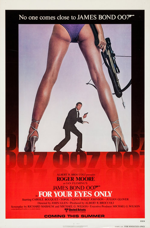
For Your Eyes Only--demonstrating that you can still acheive style with simplicity
I never really liked any of Brosnan's posters. And yes, Licence To Kill is the bottom of the gunbarrel. BUT the Bob Peak concept being considered for Licence Revoked was great. Should have used it.
The Living Daylights UK release
A View To A Kill UK teaser
Live And Let Die
You Only Live Twice (jacuzzi)
For Your Eyes Only--demonstrating that you can still acheive style with simplicity
I never really liked any of Brosnan's posters. And yes, Licence To Kill is the bottom of the gunbarrel. BUT the Bob Peak concept being considered for Licence Revoked was great. Should have used it.
#87
henchman_hussle
-

- Crew
- 25 posts
Midshipman
- Location:Indiana
#88
Kingdom Come
-
- Discharged
-
- 3572 posts
Discharged
Posted 08 March 2006 - 07:10 PM
On my the back cover dvd of both LALD and GF both contain photos that are from other films in the series.
#89
SecretAgentFan
-

- Commanding Officers
-
- 9055 posts
Commander
- Location:Germany
Posted 16 March 2006 - 06:09 PM
I really rate the teaser one from TWINE - the flaming woman, and the 'Accept No Substitutes' teaser prior to GoldenEye, i thought it generated interest in Bond again after the 6 year lay off
Same here. And CR needs such a good poster, too.