Skull-Bond is a very Flemingesque image. I just don't think either of these posters have gotten the composition quite right.

SPECTRE Theatrical Poster (now with Poll)
Started by
antovolk
, Sep 03 2015 04:00 PM
254 replies to this topic
#152
: post #152")
Guy Haines
-
- Veterans
-

- 3075 posts
Commander
- Location:"Special envoy" no more. As of 7/5/15 elected to office somewhere in Nottinghamshire, England.
Posted 05 September 2015 - 09:01 PM
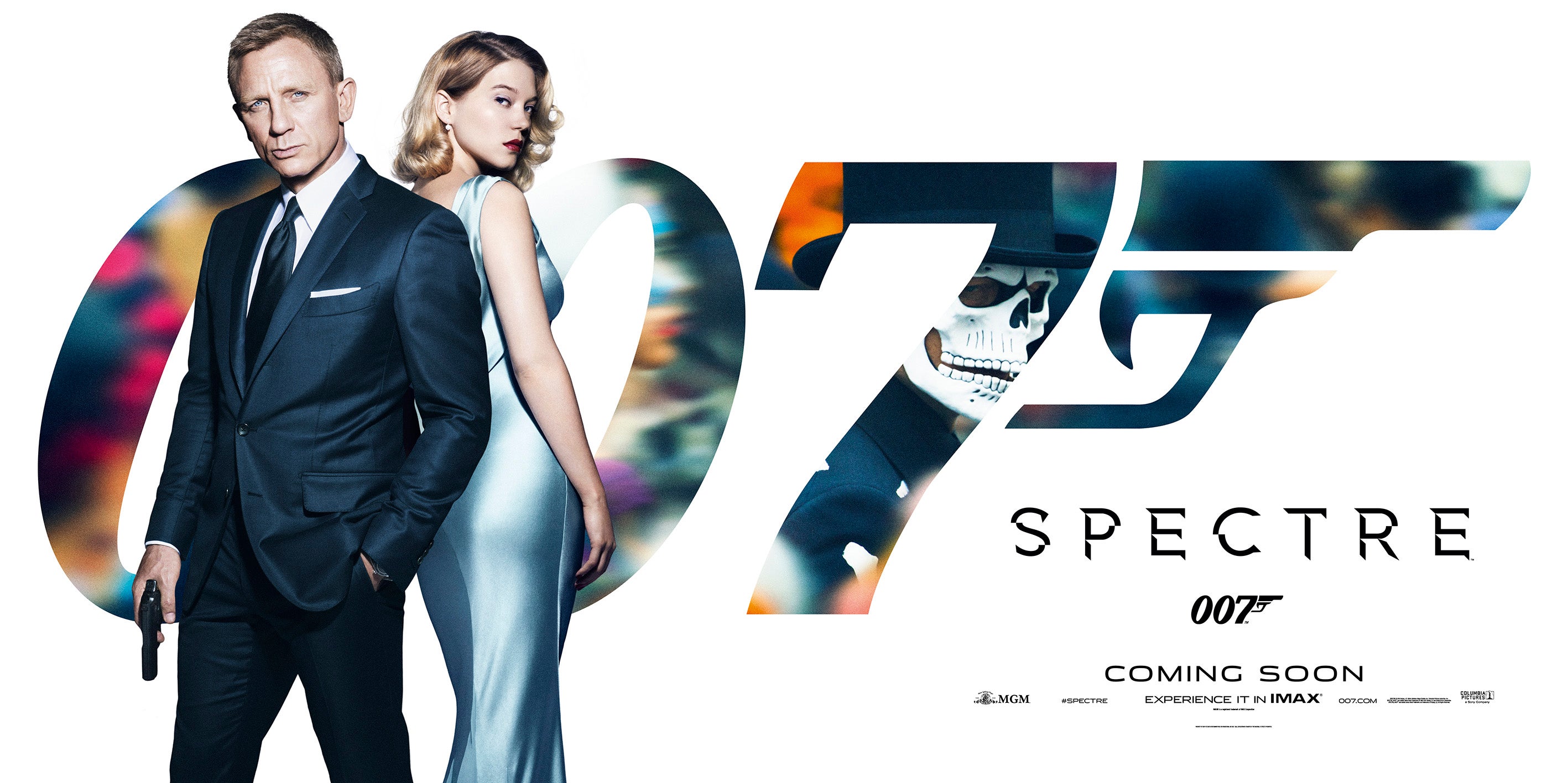
Regarding the plot, the title, never mind the octopus logo, gives the game away for Bond fans at least - SPECTRE is back, rebooted. What it is up to in this film we'll have to wait and see. So the octopus logo would have told nothing beyond who the villains are.
The skeleton image in the background? A reminder that a spectre always stalks Bond - death, which he avoids but which he inflicts on his adversaries, and which occasionally inflicts itself on those too close to him.
The skeleton image in the background? A reminder that a spectre always stalks Bond - death, which he avoids but which he inflicts on his adversaries, and which occasionally inflicts itself on those too close to him.
#153
Simon
-

- Veterans
-
- 5884 posts
Commander
- Location:England
Posted 05 September 2015 - 09:19 PM
I understand in this day and age, the principle actor has to be marketed to the full, but I did, and still do, prefer the abstract as opposed to the 'in yuh face' renditions of the last two designs. Not, not the posters per se.
For me, the octopus design, that never made it to printed format, was delicious in the abstract and mysterious sense. I would have hoped for variations on that theme through to final design.
As for the death of the modern poster, did anyone catch the full series of designs for the Black Swan film. The only commonality between each of them being the black, red and white colours. Thereafter, all the designs and title fonts were completely different, and yet so clearly part of the uniform marketing thrust. This to me, was real design and creativity for the modern age.
http://www.debutart....dia/10777/large
#154
sharpshooter
-

- Executive Officers
-
- 8996 posts
Commander
Posted 05 September 2015 - 11:49 PM
I like both posters. The new one with Lea possibly more so. They've chosen the right wardrobe for them. Their train sequence attire is very stylish, and it makes the poster feel that way too. Elegance and death is one of the basic juxtapositions of Bond, and the skull provides that.
Edited by sharpshooter, 05 September 2015 - 11:50 PM.
#155
tdalton
-

- Veterans
-
- 11680 posts
Commander
Posted 05 September 2015 - 11:52 PM
For me, the octopus design, that never made it to printed format, was delicious in the abstract and mysterious sense. I would have hoped for variations on that theme through to final design.
I would have preferred that as well. That was a decent image that had a bit of mystery to it and could have been worked into the marketing throughout the promotion of the film.
Also agreed on the Black Swan posters.
#156
univex
-
- Veterans
-
- 2310 posts
Lt. Commander
Posted 06 September 2015 - 12:00 AM
I understand in this day and age, the principle actor has to be marketed to the full, but I did, and still do, prefer the abstract as opposed to the 'in yuh face' renditions of the last two designs. Not, not the posters per se.
For me, the octopus design, that never made it to printed format, was delicious in the abstract and mysterious sense. I would have hoped for variations on that theme through to final design.
As for the death of the modern poster, did anyone catch the full series of designs for the Black Swan film. The only commonality between each of them being the black, red and white colours. Thereafter, all the designs and title fonts were completely different, and yet so clearly part of the uniform marketing thrust. This to me, was real design and creativity for the modern age.
Yes, they are lovely. Perfect, actually. I do wish we had more Saul Bass going on in this imagery business, but alas we don´t. You´re quite right, if they made that kind of poster for Bond I´d be very happy. Mind you, I´d still want something like this Skull one for the character posters. But yeah, I love that kind of simple iconic poster. Just like the ones Bass did for Hitchcock. Take the Vertigo one, lovely. One of my book covers is pretty much in that style and I still love it more than any other. But then again, Bond posters were never "Bassian", were they? If they took the Mexican skull motif and then maybe mixed it with Bond´s silhouette or with the spectre itself, maybe it would've looked interesting. But like I said, I´d still like to have both types of posters.
I like both posters. The new one with Lea possibly more so. They've chosen the right wardrobe for them. Their train sequence attire is very stylish, and it makes the poster feel that way too. Elegance and death is one of the basic juxtapositions of Bond, and the skull provides that.
Exactly!
It's simple and stylish. pure Bond
Yes, and miles ahead anything the Brosnan era had, IMO. Take the final TND, TWINE and DAD posters. Awful, all of them. And the SF ones were just embarrassing.
#157
x007AceOfSpades
-

- Veterans
-
- 4369 posts
Commander
- Location:Sunny Southern California
Posted 06 September 2015 - 01:43 AM
So they gave Bond a smile and tilted his head and included Seydoux.
It's still underwhelming and still awful.
#158
Double-Oh Agent
-

- Veterans
-
- 4325 posts
Commander
Posted 06 September 2015 - 07:31 AM
I don't mind the addition of Lea Seydoux in the new poster, but there's too much blue on the sides and Daniel Craig's tilted head just looks odd. The first skeleton poster was better.
Regardless of whether posters were too busy from the '60s through the Roger Moore era (I don't think so), they were better. They were eye-catching and exciting and they screamed James Bond 007. Since Licence To Kill, way more often than not, that has not been the case. LTK, the US Die Another Day, Quantum Of Solace, and Skyfall absolutely do not scream Bond or even talk Bond. If they did not have the logo 007 on the posters, one could have easily just assumed it was just the next Timothy Dalton, Pierce Brosnan, or Daniel Craig film--not the next James Bond film.
Simplistic posters work for teasers, they shouldn't be used for the final posters. Those need to be eye-catching and exciting and the old ones were. The newer, final ones are not. Octopussy's final poster was fairly simple, yet was still better than anything we've had in the Craig era. And look at A View To A Kill. That is a great poster. It's not busy, it just shows a scene and it captures it beautifully. Even if they didn't go back to the style of Thunderball or On Her Majesty's Secret Service, I could be happy if they did more stuff like A View To A Kill.
#159
univex
-
- Veterans
-
- 2310 posts
Lt. Commander
Posted 06 September 2015 - 09:18 AM
The Moore era poster were awesome! Bond under the legs, Maud Adams arms like an octopus, Bond on the Golden Bridge,... All very iconographic.
#160
Simon
-
- Veterans
-
- 5884 posts
Commander
- Location:England
Posted 06 September 2015 - 05:20 PM
These are good points.
From the very first poster, Dr No, there was the iconography, but then, if one wished to stay to look further, there was detail to be gained from the further look. Dr No had Bond looking at you with a wink, but then there was the pencil sketches of detail.
With Octopussy, the eye was arrested with the multi-armed Adams, and then there was smaller detail to keep one's attention.
The current run is just, uninteresting point of focus, and then....nothing.
I am back to the '007 logo and title' thrust of marketing at present.
#161
Hansen
-
- Crew
-
- 431 posts
Sub-Lieutenant
- Location:Paris
Posted 06 September 2015 - 05:42 PM
I also have to admit that this white tux has always been awful to me and makes Bond look like a waiter.
It was barely OK on Sean in Goldfinger, awful on Roger in AVTAK and today, it makes Daniel look like a chippendale (Magic Bond XXL)
#162
tdalton
-
- Veterans
-
- 11680 posts
Commander
Posted 06 September 2015 - 05:44 PM
The current run is just, uninteresting point of focus, and then....nothing.
I am back to the '007 logo and title' thrust of marketing at present.
Agreed. These new posters, pretty much since the new regime at EON took over for Cubby, have been decidedly poor. Now, there have been some exceptions. The Casino Royale teaser is one of the best posters the franchise has ever produced. The teasers for The World Is Not Enough and Die Another Day were also pretty good. Aside from those, however, the end results have been rather poor.
While there are some that are calling for the busier theatrical posters, I think simply looking at something like the Casino Royale teaser is evidence that you don't need to make things busy. Had they released that shot of Craig sitting at the poker table with gun as the theatrical poster, I would have been rather happy with that. That poster conveyed just about everything you needed in a Bond poster. It feels almost as though there's a bit too much wasted space when we're getting what amounts to a full-body shot of the actor(s) with virtually nothing else going on around them.
#163
Hansen
-
- Crew
-
- 431 posts
Sub-Lieutenant
- Location:Paris
Posted 06 September 2015 - 06:12 PM
tdalton, I am all the way long with you on this
#164
Simon
-
- Veterans
-
- 5884 posts
Commander
- Location:England
Posted 06 September 2015 - 06:17 PM
I am ready to admit culpability to an over presence of comments to all-things-poster related, but, within the niche world of Bond, an ever deeper intra-niche interest would be the marketing.
Perhaps that goes some way to providing context to those whose immediate reaction to seeing my next comment is, Oh no, not Him again!
From a purely atmospheric photographic rendition of a poster, the CR teaser of Bond at casino table is wonderful. Dark, moody, dangerous, without shouting Man With Big Gun. So quite clearly, this effect can be cleverly and artistically done.
If you go to the Empire Design site though, you will see that 'Man in the middle of poster' is pretty much all they can do. There is the odd blip for the Oblivion posters where there was Wonder and Mystery incorporated. But that must have been done by a temporary intern as it is nowhere else evident in their oeuvre.
#165
SecretAgentFan
-

- Commanding Officers
-
- 9055 posts
Commander
- Location:Germany
Posted 07 September 2015 - 02:58 PM
I´m actually changing my mind about the poster.
Sure, it´s minimalistic and does not look as if it had been very difficult to create.
But it´s definitely key art that sticks with viewers. I heard many people (who are not obsessive fans, just - you know - people who would probably want to see a Bond movie if they knew it was coming), and they like the poster very much.
"Impressive", "cool", "scary but in a good way", "oh, yeah Daniel Craig", "Spectre... hmmm... is that the guy behind Craig?", "That color of the background definitely is creepy" up to "Yeah, I saw that one on the internet already - a new Bond film, right?"
Times have changed. So have film posters.
I accept.
#166
antovolk
-
- Crew
-
- 406 posts
Sub-Lieutenant
Posted 07 September 2015 - 03:06 PM
HQ version of the standee art
#167
univex
-
- Veterans
-
- 2310 posts
Lt. Commander
Posted 07 September 2015 - 06:45 PM
Oh, thank you! Very nice. Could someone put the lettering into the picture itself?  Please?
#168
Silva25
-

- Crew
- 32 posts
Midshipman
Posted 07 September 2015 - 07:34 PM
Everything is better with more Lea. Seriously, she looks stunning in that dress, not matter what image I see. And Daniel pulls off the white jacket better than I was expecting.
#169
rubixcub
-
- Crew
-
- 752 posts
Lieutenant
- Location:Michigan
Posted 08 September 2015 - 04:19 PM
Perhaps not the right place for it, but with Jez Butterworth getting screen credit, reports of dissatisfaction with Logan's first draft, and P&W being brought in relatively late in the game after having announced they were done with Bond, does anyone else think Butterworth will get the gig to write Bond 25 from page one? I'm inclined to think changing of the guard, esp. if his other film out this year, true-life crime thriller "Black Mass" with Johnny Depp as the infamous Boston gangster Whitey Bulger, is a success.
Dave
#170
antovolk
-
- Crew
-
- 406 posts
Sub-Lieutenant
Posted 10 September 2015 - 11:33 AM
Alternate theatrical poster, and two new banners
Edited by antovolk, 10 September 2015 - 11:37 AM.
#171
PPK_19
-

- Veterans
-
- 1312 posts
Lt. Commander
- Location:Surrey, England.
Posted 10 September 2015 - 11:35 AM
Just saw these pop up on Facebook. Love them!
#172
Vauxhall
-

- Executive Officers
-
- 10744 posts
Commander
- Location:London, UK
Posted 10 September 2015 - 11:38 AM
I'm slightly surprised they haven't featured Waltz on any of the main posters. Sure he'll get a character poster, but still...
#173
dirtymind
-
- Crew
-
- 152 posts
Sub-Lieutenant
Posted 10 September 2015 - 11:47 AM
I like the second one.
#174
univex
-
- Veterans
-
- 2310 posts
Lt. Commander
Posted 10 September 2015 - 12:17 PM
I know I´ll get shot for this but here it goes: I still prefere the dinner jacket one, the first one and the one with Léa.
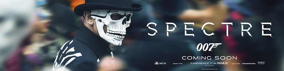
Also, if something, I love the banner with the Skull costume and the small 007 logo. Simple enough. Effective.
Oh, and I do hope they got that yellowish filter out of the Mexico scenes. This coloring looks way better.
#175
DamnCoffee
-

- Executive Officers
-
- 24459 posts
Commander
- Location:England
Posted 10 September 2015 - 12:22 PM
I agree. I think the White Tuxedo was a and lovely surprise in the poster. I genuinely assumed he would be just seen wearing it in the film and that was that. In the trailer it made my jaw drop so i'm pretty happy that they decided to dwell on thats again in that poster. I loved it, too!
Edited by DamnCoffee, 10 September 2015 - 12:23 PM.
#176
antovolk
-
- Crew
-
- 406 posts
Sub-Lieutenant
Posted 10 September 2015 - 12:30 PM
So...like Skyfall, there are two main release/theatrical posters after all. Like there were two versions of the March teaser poster too (the colour and the black and white one).
Since it's not specified if they're domestic, or international and whatnot, wonder how Sony will split them up. For the teaser poster, in the US they used the black/white one for the poster displays and the full colour one for the big banners.
TL;DR - this is one hell of a disorganised poster campaign
#177
Harmsway
-
- Veterans
-
- 13293 posts
Commander
Posted 10 September 2015 - 12:32 PM
I like these new ones a lot. The composition and coloring is better.
#178
stromberg
-
- The Admiralty
-
- 6841 posts
Commander RNVR
- Location:Saarland / Germany
Posted 10 September 2015 - 12:51 PM
Very nice. This and the fact that none of the recent artwork is availbale at Sony's German press site makes me think that we haven't seen the final theatrical poster, yet.
#179
sharpshooter
-
- Executive Officers
-
- 8996 posts
Commander
Posted 10 September 2015 - 12:54 PM
I know I´ll get shot for this but here it goes: I still prefere the dinner jacket one, the first one and the one with Léa.
I still prefer the white dinner jacket image too. But these are still good.
#180
Walecs
-
- Crew
-
- 789 posts
Lieutenant
- Location:Italy
Posted 10 September 2015 - 12:59 PM
@antonvolk Your work proves how to make minimalist yet beautiful posters.