I am glad that you like my work.

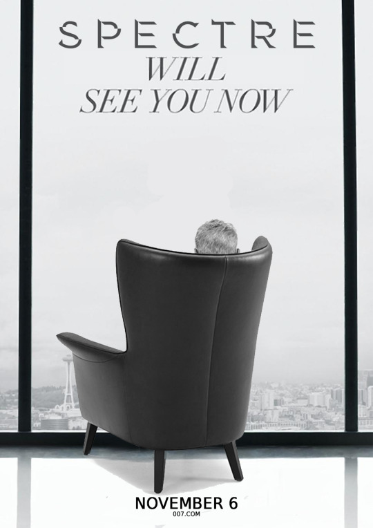
Now I will discuss the various versions of my artwork. I have used the properties of photography and the focus moved accordingly to the elements. Large aperture (F 2.8) and the focus on the ring. In the version with the big Spectre Ring in the foreground the focus should be on this. For this reason, the IceQ appears blurred in the background.
In the version with the small ring Spectre I have the Focus distributed to the foreground and background alike. Therefore, in this version the IceQ in the background was sharp.
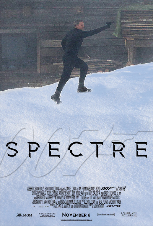
Now I have the teaser and theatrical poster with a sharp IceQ restaurant in the background. I have to admit that this was the first version of this poster. The thing with the blur came about because I have this image viewed through the viewfinder of my mentally D-SLR. Photoshop offers nice filter to put this photographic touch to the picture elements.
Since now have all the versions, I have to say that the first version (with the sharp IceQ and the large Spectre Ring) is the best.
Edited by Daniel_Craig, 23 January 2015 - 11:53 PM.
I wanted to add an "authentic" touch, and the plain black looked a little boring.
![]()

