"Just being disarming" (Apologies to Sir Roger Moore!)
#271

Posted 18 February 2015 - 04:16 PM
#272

Posted 18 February 2015 - 04:20 PM
"Well, I guess it's... a farewell to arms." ![]()
#273

Posted 18 February 2015 - 06:03 PM
#274

Posted 18 February 2015 - 11:00 PM
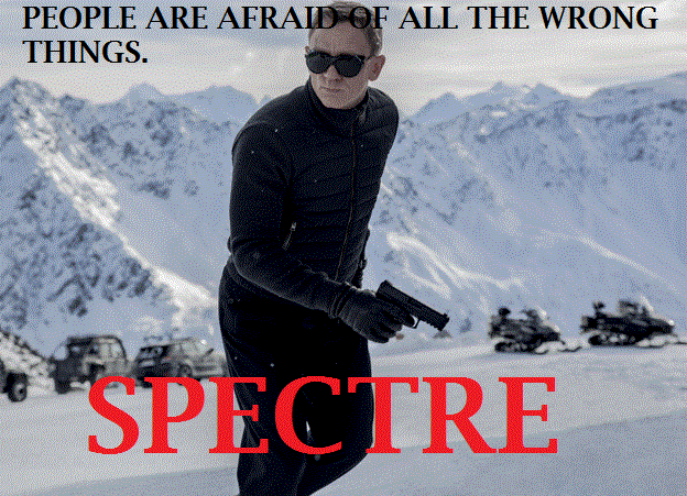
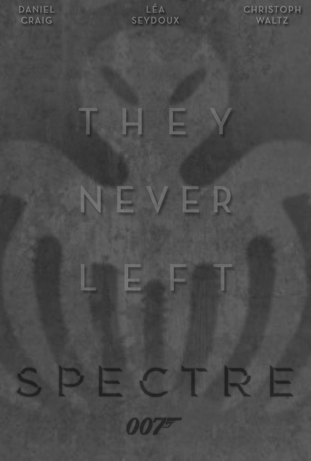
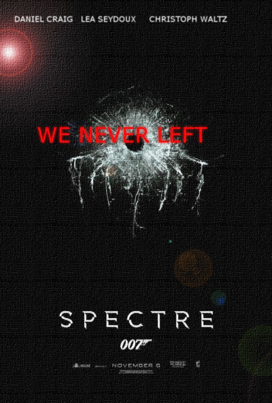
I Like to keep my edits simple,yes i did nick the tagline from A Walk Among The Tombstones but i think it fits.
#275

Posted 19 February 2015 - 10:56 AM
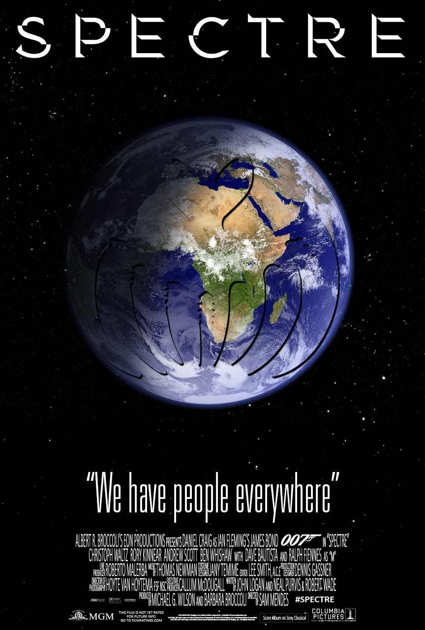
#276

Posted 19 February 2015 - 12:38 PM
Good work guys!
Nice one JC. Like that link to 'QOS' also with the quote. ![]()
#277

Posted 19 February 2015 - 04:05 PM
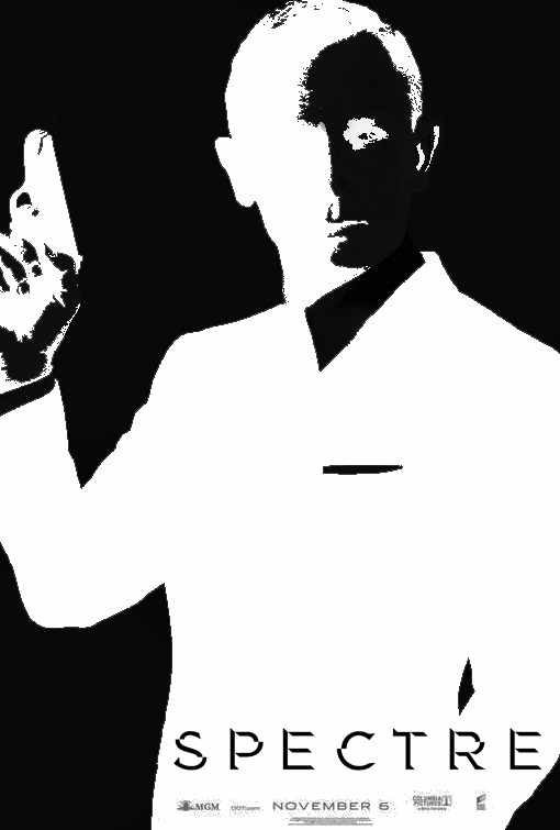
Just finished making this Saul Bass inspired poster. If you find any mistakes, I've been finishing this whilst half asleep so please excuse them
This is brilliant! Congratulations. If only they did something like this.
#278

Posted 24 February 2015 - 05:14 AM

#279

Posted 24 February 2015 - 04:50 PM
My attempt at one. Been struggling to attach this but after much swearing...

gifs upload
I used the Empire cover (both commercial and subscriber) as well we the Spectre teaser poster. I know it's become a bit of a cliché to emphasise those horrendously blue eyes Craig has, but I liked the effect.
#280

Posted 24 February 2015 - 09:04 PM

#281

Posted 25 February 2015 - 10:22 AM
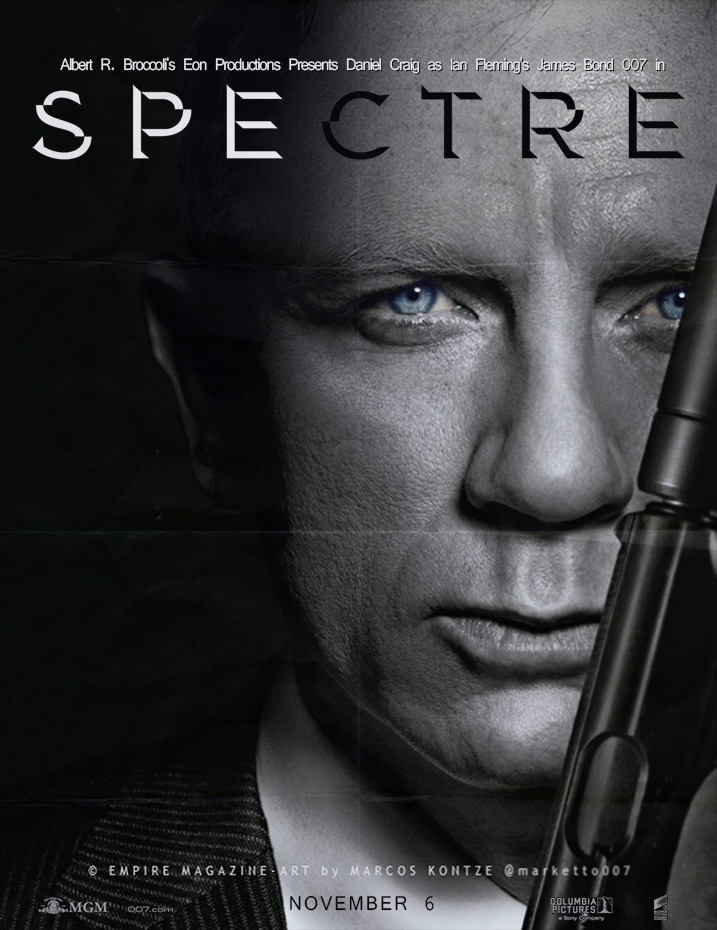
Made using the Empire cover clean-up by Marketto007 major credit to him!
#282

Posted 26 February 2015 - 01:12 AM
#283

Posted 27 February 2015 - 12:38 PM
#284

Posted 27 February 2015 - 10:03 PM
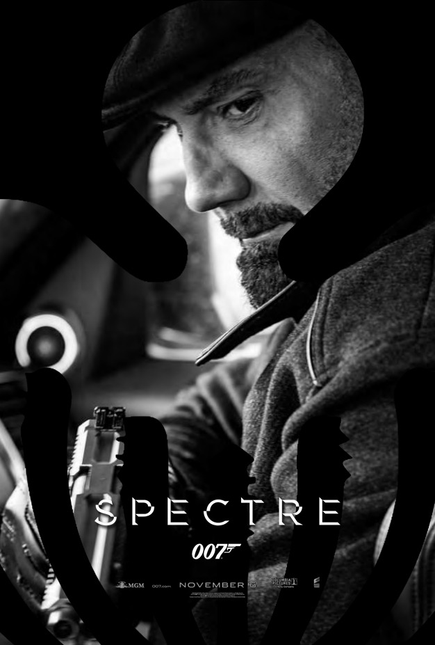
The black & white one is VERY good! Job well done, JCRendle!
#286

Posted 28 February 2015 - 11:49 AM
#287

Posted 28 February 2015 - 02:24 PM
#288

Posted 01 March 2015 - 12:55 AM
#289

Posted 01 March 2015 - 02:22 AM

#290

Posted 01 March 2015 - 03:07 AM
My attempt at one. Been struggling to attach this but after much swearing...
gifs upload
I used the Empire cover (both commercial and subscriber) as well we the Spectre teaser poster. I know it's become a bit of a cliché to emphasise those horrendously blue eyes Craig has, but I liked the effect.
This is amazing!
#291

Posted 01 March 2015 - 10:13 AM
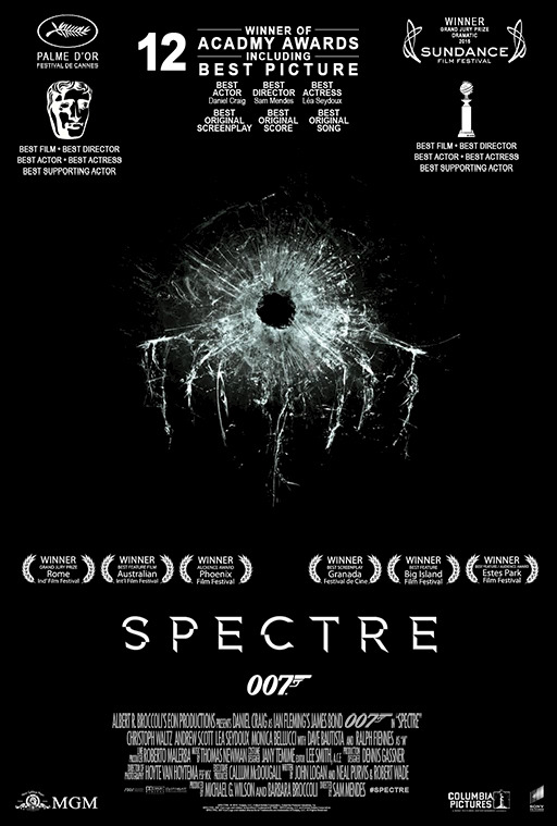
A man can hope...
Sundance is a little too much. The rest, I can perfectly see it... ![]()
![]()
![]()
#292

Posted 01 March 2015 - 12:51 PM
Here is my first contribution, this is my poster for "SPECTRE"
simple and classy. good work Robinson ![]()
#293

Posted 01 March 2015 - 01:00 PM
Yes, that's the best yet - very effective.
#294

Posted 01 March 2015 - 06:25 PM
Charles, could I suggest a change or two?
It looks a bit strange with a fully left justified title block against the left edge of the poster with then a centrally justified text block underneath it. Maybe the title block goes centrally over the text, or the text becomes left justified to line up with the title block...
Otherwise, very nice and clean.
#295

Posted 01 March 2015 - 07:01 PM
My new Bond 24 SPECTRE Poster as IMAX print:

On Deviantart: http://fav.me/d8ijd5x
From "Skyfall" to "SPECTRE" via Photoshop. Bond 24 SPECTRE IMAX Quad Poster:

On Deviantart: http://fav.me/d8jljan
Bond 24 SPECTRE "Rome" as Teaser Poster:

On Deviantart: http://fav.me/d8k1oco
Bond 24 SPECTRE "Rome" as Theatrical Poster:

On Deviantart: http://fav.me/d8k1oqe
Enjoy! ![]()
Edited by Daniel_Craig, 01 March 2015 - 10:35 PM.
#296

Posted 02 March 2015 - 01:55 PM
Good work all! ![]()
#297

Posted 02 March 2015 - 06:17 PM
Terrific work! I really like the quad design most!
#298

Posted 02 March 2015 - 08:42 PM
Good work all!
Terrific work! I really like the quad design most!
THX so much, guys! ![]() I´m glad you like my work.
I´m glad you like my work. ![]()
Edited by Daniel_Craig, 02 March 2015 - 08:42 PM.
#299

Posted 02 March 2015 - 11:31 PM
Charles, could I suggest a change or two?
It looks a bit strange with a fully left justified title block against the left edge of the poster with then a centrally justified text block underneath it. Maybe the title block goes centrally over the text, or the text becomes left justified to line up with the title block...
Otherwise, very nice and clean.
#300

Posted 08 March 2015 - 07:40 PM
Reload !!!
Unfortunately, I have a traffic problem with one of my Photobucket albums. Of course, these are visible after a certain period again. As long as I did not want to wait. A poster Topic without pictures displayed is useless in my eyes.
To ensure that images remain still visible I have loaded on a farther Photobucket account. The jpeg compression I now have increased significantly, so it does not immediately Traffic Problems.
The high-resolution versions are available on my Deviantart page.
Here are the last "final" posters as reload:
Bond 24 Teaser Poster:

On Deviantart: http://fav.me/d8e62mh
Bond 24 Spectre Teaser Poster:

On Deviantart: http://fav.me/d8f2w2n
Bond 24 Teaser Poster:

On Deviantart: http://fav.me/d8f3q0q
Bond 24 Spectre Theatrical Poster:

On Deviantart: http://fav.me/d8f3qcz
Bond 24 Theatrical Poster:

On Deviantart: http://fav.me/d8hxdn5
Bond 24 Teaser Poster:

On Deviantart: http://fav.me/d8hxdax
Bond 24 Theatrical Poster:

On Deviantart: http://fav.me/d8hxdjt
Bond 24 Spectre IMAX Print:

On Deviantart: http://fav.me/d8ijd5x
Bond 24 Spectre IMAX-Quad Print:

On Deviantart: http://fav.me/d8jljan
Bond 24 Spectre Teaser Poster:

On Deviantart: http://fav.me/d8k1oco
Also tagged with one or more of these keywords: SPECTRE
Film Eras →
Daniel Craig (2006 - ) →
SPECTRE (2015) →
Waltz on, BlofeldStarted by Dustin , 06 Sep 2016 |
|


