I didn't like Fahey or Gillette.
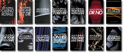
I only truly liked the Chopping Cape editions, and Triad Panther/Granada paperbacks.
The Panther/Granada covers are truly splendid. Though using just a minimalist theme they are quite distinctive and notably composed, amongst my very favourites.
For years and years I used to wonder what kind of gun that "Collins & Broecke 9mm" was supposed to be. I tried everything in my powers to find out, consulted reference books and archives, talked to gun people, shooters, policemen, all to no avail. Nobody had ever heard about it. I was about to give up and ask around here, when in a quirky turn of fate I decided to have one last try at Google, this time not with the gun but the publisher-cover connection. And all of a sudden there was the remarkable blog
Existential Ennui and answered all my questions about the thing
here. Interesting backstory.


