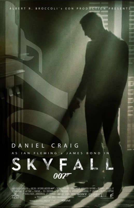
'SkyFall' Fan Art
#1051

Posted 15 September 2012 - 09:04 PM
I want MORE! DO another one!
#1052

Posted 15 September 2012 - 09:51 PM
Sorry, guys. I really am not trying to be mean, just offering an honest opinion.
#1053

Posted 15 September 2012 - 10:17 PM
#1054

Posted 16 September 2012 - 02:05 AM
#1055

Posted 16 September 2012 - 10:35 AM
It is with a heavy heart that I feel I must chime in and say that the most recent fan posters that have been put up here are no better than the official posters. I appreciate the work, effort, and love that goes into them, but in the end they are just photos with some text underneath. They don't look like movie posters. At all.
Sorry, guys. I really am not trying to be mean, just offering an honest opinion.
Yeah, I think we can praise fans' efforts without bashing the official versions. Which are professional jobs, and the lying-down quad is a striking, simple, dynamic and effective image. Bond sullenly looking down at his empty gun in a variety of hairstyles isn't as exciting. Sorry.
I think I should point out, to put my previous post into context, that the recent Skyfall posters are among the worst of the entire series. They look like leaflets for tuxedo hire shops.
#1056

Posted 16 September 2012 - 12:14 PM
I think I should point out, to put my previous post into context, that the recent Skyfall posters are among the worst of the entire series. They look like leaflets for tuxedo hire shops.
I think most people on this forum would agree with you.
I flicked through my James Bond poster book and can safely say they rank as the worst in the series. No imagination, no creativity. Daniel Craig is standing stiffly and staring coldly ahead, in his tuxedo which you rightly observed looks like it's being modelled for a shop. The poster of Bond lying prone pointing his gun is a nice idea but it's so naff-ly executed.
This is the 50th anniversary for crying out loud.
#1057

Posted 16 September 2012 - 01:27 PM
total agree..if sombody says its great, good..it should be a very die heart fans with blind heart too...I really wonder michael G have proved it or not..
It is with a heavy heart that I feel I must chime in and say that the most recent fan posters that have been put up here are no better than the official posters. I appreciate the work, effort, and love that goes into them, but in the end they are just photos with some text underneath. They don't look like movie posters. At all.
Sorry, guys. I really am not trying to be mean, just offering an honest opinion.Yeah, I think we can praise fans' efforts without bashing the official versions. Which are professional jobs, and the lying-down quad is a striking, simple, dynamic and effective image. Bond sullenly looking down at his empty gun in a variety of hairstyles isn't as exciting. Sorry.
I think I should point out, to put my previous post into context, that the recent Skyfall posters are among the worst of the entire series. They look like leaflets for tuxedo hire shops.
The poster just only like a B grade movie...
#1058

Posted 16 September 2012 - 05:40 PM


Edited by DABOY, 16 September 2012 - 06:02 PM.
#1059

Posted 16 September 2012 - 06:13 PM
It is with a heavy heart that I feel I must chime in and say that the most recent fan posters that have been put up here are no better than the official posters. I appreciate the work, effort, and love that goes into them, but in the end they are just photos with some text underneath. They don't look like movie posters. At all.
Sorry, guys. I really am not trying to be mean, just offering an honest opinion.
I have to disagree to some extent. While we do have a tendency to overpraise fan-made things around here as a means of putting down bad "official" images, I honestly would take several of the works found in this thread over the two posters that we've seen over the past couple of days for Skyfall. Both of them are exactly what you say, photos with text underneath them (or in the case of the one with Bond trying to literally shoot himself in the foot, above the photo), and both of them look like rather mediocre fan art.
#1060

Posted 16 September 2012 - 06:27 PM
"This certainly gives you a new slant."
Amazing, DABOY, how you made the same image so much more interesting.
#1061

Posted 16 September 2012 - 06:37 PM
I don't know why Empire gets the great Craig image they used on their cover, while the character poster gets the dud one. Hopefully the theatrical poster will have a completely different style.
#1062

Posted 16 September 2012 - 09:23 PM
The work of Daboy I liked very well. His version of the U.S. poster has something special. By the skew and the swirling sand more momentum coming into the picture.
#1063

Posted 16 September 2012 - 09:55 PM

Enjoy
#1064

Posted 16 September 2012 - 10:03 PM
Edited by PPK_19, 16 September 2012 - 10:03 PM.
#1065

Posted 16 September 2012 - 10:35 PM
Yes. I´m posting under the name Daniel V. on Twitter.
#1066

Posted 16 September 2012 - 11:29 PM
"This certainly gives you a new slant."
Amazing, DABOY, how you made the same image so much more interesting.
I think the angle rather kills the starkness of the original. And the crop eliminates the gun: it's perfectly horizontal in the original- you can't even see it in that version.
#1067

Posted 24 September 2012 - 05:51 PM

Edited by DABOY, 24 September 2012 - 05:52 PM.
#1068

Posted 24 September 2012 - 08:35 PM
#1069

Posted 25 September 2012 - 01:10 AM
#1070

Posted 26 September 2012 - 09:52 AM
#1071

Posted 26 September 2012 - 08:48 PM


#1072

Posted 27 September 2012 - 08:01 PM

#1073

Posted 29 September 2012 - 12:25 AM

#1074

Posted 29 September 2012 - 09:47 AM
#1075

Posted 29 September 2012 - 01:31 PM
I love this one, only thing I'd change is the background, to something "theatrical QoS"-esque with some key elements from the film in it.
#1077

Posted 02 October 2012 - 10:11 AM

#1078

Posted 02 October 2012 - 11:06 AM
#1079

Posted 02 October 2012 - 11:59 AM
#1080

Posted 02 October 2012 - 12:20 PM


