
[sthead=4697]

Commodore RNVR

Posted 03 December 2007 - 12:01 AM
Commander

Posted 03 December 2007 - 12:06 AM
Commander
Posted 03 December 2007 - 12:11 AM

Commander
Posted 03 December 2007 - 12:18 AM
Wow-wow-wee!

Lieutenant

Posted 03 December 2007 - 12:18 AM
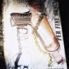
Was just about to post this news. The image certainly seems to be a nod to Maurice Binder's title sequences. Interesting that the front cover says "Sebastian Faulks writing as Ian Fleming".
Commander
Posted 03 December 2007 - 12:20 AM
Was just about to post this news. The image certainly seems to be a nod to Maurice Binder's title sequences. Interesting that the front cover says "Sebastian Faulks writing as Ian Fleming".
Yeah, I noticed that, too. Whose "brilliant" idea was that? What purpose does that serve?

Lt. Commander
Posted 03 December 2007 - 12:25 AM
Was just about to post this news. The image certainly seems to be a nod to Maurice Binder's title sequences. Interesting that the front cover says "Sebastian Faulks writing as Ian Fleming".
Yeah, I noticed that, too. Whose "brilliant" idea was that? What purpose does that serve?
Ian Fleming Publications, apparently.
Commander GCMG

Posted 03 December 2007 - 12:25 AM
Remember THIS thread?Was just about to post this news. The image certainly seems to be a nod to Maurice Binder's title sequences. Interesting that the front cover says "Sebastian Faulks writing as Ian Fleming".
Yeah, I noticed that, too. Whose "brilliant" idea was that? What purpose does that serve?
Ian Fleming Publications, apparently.
Lt. Commander

Posted 03 December 2007 - 12:29 AM

Discharged.

Posted 03 December 2007 - 12:51 AM

Sub-Lieutenant

Posted 03 December 2007 - 12:58 AM
Commander
Posted 03 December 2007 - 01:12 AM
Commander RNVR

Posted 03 December 2007 - 01:14 AM
Yeah, I noticed that, too. Whose "brilliant" idea was that? What purpose does that serve?
Ian Fleming Publications, apparently.
Commander RNVR
Posted 03 December 2007 - 01:31 AM
... I don't know anything about the plot of the book so we may come back here a year from now and wonder why the hell they chose this cover or the title (I love the title too, very Bondian), but I love it right now.
Commander

Posted 03 December 2007 - 01:38 AM
I was just thinking the same thing, Stromberg.The flower looks somewhat like a poppy. Could be a hint...
Commander RNVR
Posted 03 December 2007 - 01:46 AM
... I don't know anything about the plot of the book so we may come back here a year from now and wonder why the hell they chose this cover or the title (I love the title too, very Bondian), but I love it right now.
The flower looks somewhat like a poppy. Could be a hint...
Sub-Lieutenant

Posted 03 December 2007 - 02:51 AM
Commander

Posted 03 December 2007 - 03:00 AM

Commander RNVR

Posted 03 December 2007 - 03:36 AM
Nice artwork. Very boring and unsuitable typeface.
Commander

Posted 03 December 2007 - 03:51 AM
Lt. Commander

Posted 03 December 2007 - 04:33 AM
Edited by MicroGlobeOne, 03 December 2007 - 04:33 AM.
Sub-Lieutenant

Posted 03 December 2007 - 04:43 AM
Commander

Posted 03 December 2007 - 04:48 AM
Commodore RNVR
Posted 03 December 2007 - 04:58 AM
What more could one want from a typeface? It's simple, clear, and clean. I rather like the simplistic beauty of the cover's composition.
Commander

Posted 03 December 2007 - 06:42 AM
Commander

Posted 03 December 2007 - 06:42 AM
Lieutenant

Posted 03 December 2007 - 06:52 AM
Commander
Posted 03 December 2007 - 06:53 AM
Commander RNVR

Posted 03 December 2007 - 07:30 AM
