The upcoming art of Bond book says that the film was visually designed around the extremes of hot and cold. I think the drastic color grading is part of that initiative.
Oh Jesus. Have Mendes and Hoytema contracted Forsteritis?
To me all the films interiors are gorgeous, however, the Roman villa, the Spectre meeting, the train. Those look great. But as was posted above, I think it is also a very conscience
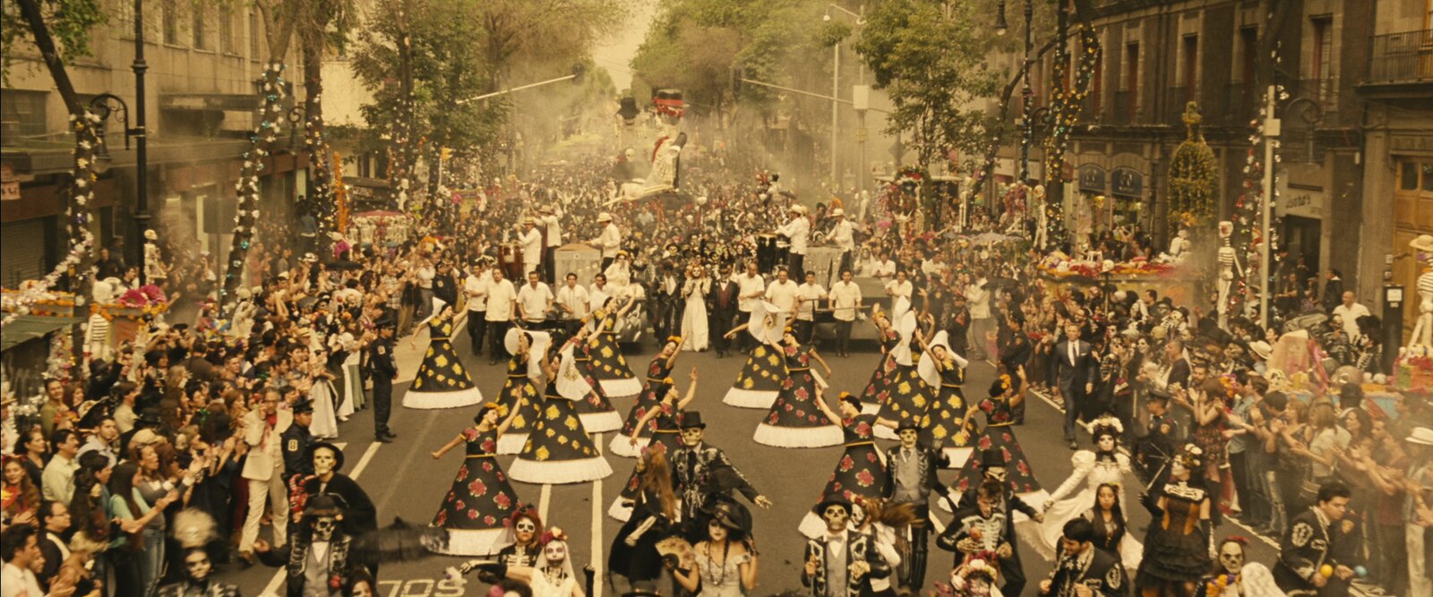
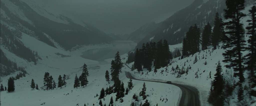
decision to contrast each of the locations. I have no doubt the color grading will fit the narrative and tone of each scene as well as have a good amount of saturation - just more color-coded so to speak: Yellow for Mexico, Sepia for Rome, cool color pallet for Austria and hopefully a more vibrant orange for Morocco.
Colour coding can look wonderful, but I just wish the choice of colours were less boring and predictable than a binary opposition yellow/amber and grey-blue, which has become an industry standard, homogenising the look of so many blockbusters.
Also, being compared to Storaro's work on Apacalypse Now is not a bad thing in my book. One of the best color films I have ever seen.
I'm a big Victor Storaro fan, especially of his work with Bertolucci (The Conformist is my favourite but The Last Emperor is one of the best uses of colour symbolism with the old photochemical methods). That said, Coppola and Storaro's Vietnam in Apocalypse Now is meant to look like hell on earth. I understand that Mendes and Hoytema are going for a menacing aesthetic, but Bond is supposed to have an element of travelogue. What's the point of taking us to all these beautiful locations if they're made to be as unappealing and dystopic as possible?
Looking at that, I'd rather visit Luton.
I say, after the film makes its way to home video, we all take a screen grab or a segment of the film, grade it ourselves and share our respective creations amongst ourselves.
I'd love to see what " looks" we could create on our own and hear the reasons why.
Sounds like a plan!