The Skyfall PTS is the best action sequence in the series since the tank chase in GoldenEye. Everything Vic Armstrong touched was poison and played like Universal Studios rides, the parkour chase in Royale is a little messy for my liking, and the horror show that was QOS speaks for itself.
I for one hope Mendes (or Alexander Witt, or whoever directed that scene) just keeps doing what he's doing! The shot from above, when Bond dives and tackles Patrice's legs, shows a real instinct for action movies.
Is it me or does SPECTRE's cinematography look...
#31

Posted 23 July 2015 - 09:55 PM
#32

Posted 24 July 2015 - 08:03 AM
The Skyfall PTS is the best action sequence in the series since the tank chase in GoldenEye. Everything Vic Armstrong touched was poison and played like Universal Studios rides, the parkour chase in Royale is a little messy for my liking, and the horror show that was QOS speaks for itself.
I for one hope Mendes (or Alexander Witt, or whoever directed that scene) just keeps doing what he's doing! The shot from above, when Bond dives and tackles Patrice's legs, shows a real instinct for action movies.
This is off-topic, but I disagree so much with what you just said that I have to reply. The tank chase in GE wasn't that good to begin with. It is too slow and excessive.
The parkour chase in CR is a really good example of how you can do modern Bond action. It just keeps building up and building up and has a total focus on Bond. Intense, great stunt work and music. The Skyfall PTS is dull in comparison. It never kicks in. Terrible music that would be more appropriate for a Bond game. Most of the time you see Bond driving/fighting from a long distance and how exciting is that? This action scene is also constantly interrupted by scenes from MI-6 that totally ruins the momentum. It's like the car chase in DAD where we are jumping between Bond and Jinx. I passionately hate that style with non-continuous action.
#33

Posted 24 July 2015 - 10:58 AM
For me, the Parkour chase is full of rubbish moments. It bogs itself down in the detail of Bond, say, breaking a hydraulic to lower a platform. It's draggy and pointless and slows things. And the extras (particularly that one that tries to fight off the bad guy with a welding torch) are awful. And Bond's wardrobe is ridiculous. And Arnold's music sucks any remaining dignity out of it. IMO Newman's music has a lot more pace & texture in comparison. It's fun, but I find Skyfall's chase much more impressive.
On the other hand, the Miami airport scene isn't just the most tedious action scene in the series - I'd rank it as the worst 15 minute stretch of any Bond movie. And I've sat through the Vulcan camouflaging in Thunderball!
Anyway, on topic. Based on latest trailer, the colours are drab and awful, but the composition is nice. Very Lewis Gilberty.
#34

Posted 24 July 2015 - 11:27 PM
I got the feeling they didn't have the budget to, or just didn't feel they had to, film the fight on top the train as well as they should. Set a tone.
Or maybe they filmed the final fight with the baddie in the empty building, against all that lovely blue with hardly any close shots/editing, and decided hey, it worked against giant jellyfish, let's see if it works on top of a train! (bad idea...)
Learning curve for Mendes? Here's hoping there's no more "lazy" action filming in SP!
It was my understanding that most of the train-top fight _wasn't_ blue screen work and was actually done on the moving train.
#35

Posted 25 July 2015 - 08:12 AM
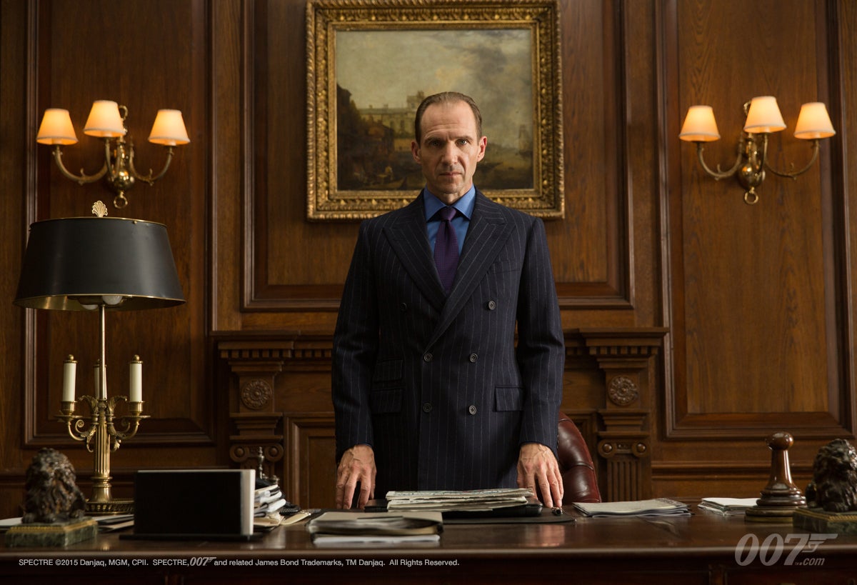
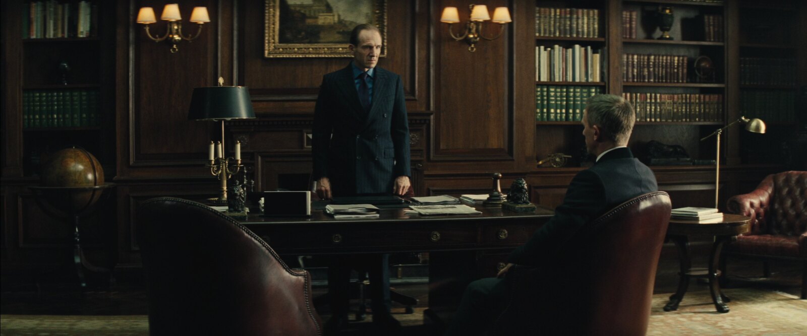
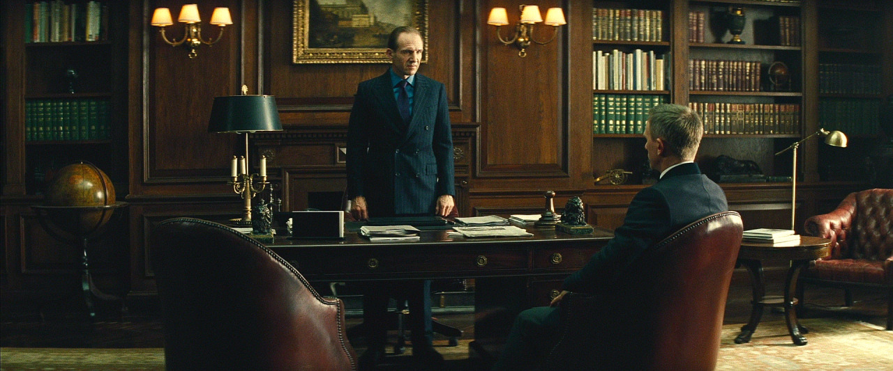
Look at this comparison. The use of a filter is quite obvious.
Set Still (François Duhamel)

Spectre Trailer (Hoyte van Hoytema)

Skyfall Film (Roger Deakins)

Looking at those pictures, the Deakins version and the still are much more "beautiful". Hoytema might have toned it down because the scene doesn't have a "warm" mood, meaning M's attitude isn't friendly while telling off Bond. I hope it really is for this reason and not because the DOP just doesn't like saturation.
#36

Posted 25 July 2015 - 09:39 AM
Then again, the quality of an internet version of a trailer print might not indicate the actual look of a film.
Every dp, however, definitely has a distinct look - and so far I also get the feeling that SPECTRE has been shot very differently from SKYFALL.
#37

Posted 25 July 2015 - 03:42 PM
Look at this comparison. The use of a filter is quite obvious.
Set Still (François Duhamel)
Spectre Trailer (Hoyte van Hoytema)
Skyfall Film (Roger Deakins)
Looking at those pictures, the Deakins version and the still are much more "beautiful". Hoytema might have toned it down because the scene doesn't have a "warm" mood, meaning M's attitude isn't friendly while telling off Bond. I hope it really is for this reason and not because the DOP just doesn't like saturation.
Here's the same snap from the downloaded HD Version. Could give more of an idea. ![]()

#38

Posted 25 July 2015 - 03:50 PM
Look at this comparison. The use of a filter is quite obvious.
Set Still (François Duhamel)
Spectre Trailer (Hoyte van Hoytema)
Skyfall Film (Roger Deakins)
Looking at those pictures, the Deakins version and the still are much more "beautiful". Hoytema might have toned it down because the scene doesn't have a "warm" mood, meaning M's attitude isn't friendly while telling off Bond. I hope it really is for this reason and not because the DOP just doesn't like saturation.
Here's the same snap from the downloaded HD Version. Could give more of an idea.
The HD version does look much better. Certainly no worse than the set still.
Edited by JohnnyWalker, 25 July 2015 - 03:57 PM.
#39

Posted 27 July 2015 - 09:59 PM
Here's the same snap from the downloaded HD Version. Could give more of an idea.
Cheers for that Mharkers!
Pleasantly surprised how the grainy the film stock is, although the lighting, framing and DI treatment reminds me slightly of Philip Meheux's work on Casino Royale, which drew inspiration from Otto Heller's cinematography in The Ipcress File--neither of which I'm a fan of.
My problem with the look of his trailer is how predominant teal and orange is. It's almost entirely murky blue-greens and greys from the Austrian Alps to Q's Lab and Oberhauser's lair, to the yellows and orange hues of Mexico City, the Moroccan train, Rome at night and various explosions.
It just makes me miss the wealth of colour Deakins captured in Skyfall, in particular the Yan'an highway and the Shanghai high-riser.
#40

Posted 27 July 2015 - 10:08 PM
But that shot running alongside Moneypenny's car as it bumps over rough ground alongside the train is perfect! While Bond and Patrice are fighting, as they enter the forest.
For me, the Parkour chase is full of rubbish moments. It bogs itself down in the detail of Bond, say, breaking a hydraulic to lower a platform. It's draggy and pointless and slows things. And the extras (particularly that one that tries to fight off the bad guy with a welding torch) are awful. And Bond's wardrobe is ridiculous. And Arnold's music sucks any remaining dignity out of it. IMO Newman's music has a lot more pace & texture in comparison. It's fun, but I find Skyfall's chase much more impressive.
On the other hand, the Miami airport scene isn't just the most tedious action scene in the series - I'd rank it as the worst 15 minute stretch of any Bond movie. And I've sat through the Vulcan camouflaging in Thunderball!
Anyway, on topic. Based on latest trailer, the colours are drab and awful, but the composition is nice. Very Lewis Gilberty.
Wonderfully said.
#41

Posted 28 July 2015 - 12:12 AM
This is off-topic, but I disagree so much with what you just said that I have to reply. The tank chase in GE wasn't that good to begin with. It is too slow and excessive.
The parkour chase in CR is a really good example of how you can do modern Bond action. It just keeps building up and building up and has a total focus on Bond. Intense, great stunt work and music. The Skyfall PTS is dull in comparison. It never kicks in. Terrible music that would be more appropriate for a Bond game. Most of the time you see Bond driving/fighting from a long distance and how exciting is that? This action scene is also constantly interrupted by scenes from MI-6 that totally ruins the momentum. It's like the car chase in DAD where we are jumping between Bond and Jinx. I passionately hate that style with non-continuous action.
Wonderfully said.
#42

Posted 28 July 2015 - 12:38 AM
That's... original. ![]()
#43

Posted 30 July 2015 - 12:45 PM
Is it possible they're both terrific?
#44

Posted 30 July 2015 - 05:21 PM
That's sheer madness!
#45

Posted 05 August 2015 - 12:59 AM
3.5 months to go. No telling what the film's "look" will be with the final DI pass.
I still haven't watched "Her" so I'm really forming my assumption of what SPECTRE will look like based on Van Hoytema's work on "Tinker, Tailor."


La mer....
#46

Posted 05 August 2015 - 01:22 AM
So my curiosity got the better of me and I decided to do some research. But first a prologue:
A lifetime ago, I used to work in film & video at various Post Production facilities in NYC. I primarily worked as a "dailies" producer on features and TV series. To say, transferring film to tape and digital medium for review and editing is an involved process, to say the least. One thing I learned at one facility, was despite the amount of time the dailies colorist would review the director and producers notes about what looks to create for the footage he/she would receive, it was a certainty that the look generated during dailies, would most likely be thrown out come the final DI process.
Since the look of SPECTRE is being discussed, I decided to play a hunch as to who could be doing the dailies/DI for this film. This facility is known for its work on blockbusters and hit TV series. In fact, they worked on the QOS title sequence from MK12 (and possibly more). A few clicks on their website and...
http://www.company3....videos/spectre/
I'm not saying what we've seen in the trailer (and teaser) will be radically different from the theatrical release but there will be changes.
#47

Posted 05 August 2015 - 02:52 AM
Good intuition and excellent sleuthing, Robinson!
#48

Posted 13 November 2015 - 02:30 AM
Bumping this thread because its significance has been thrown into sharp relief by the 'release print'.
The first thing that hit my senses, post-studio idents and gunbarrel, was the lack of dynamic in the image, which remained consistent through the film. As a former Editor, I desperately wanted access to a basic waveform-monitor so that I could bring the 'white levels' up to 100%. Conversely, black-levels were raised to a point where there were no true blacks, merely greys (that's 'grays' for our American chums).
In subjective terms, the visuals look like they were shot through one of Monica Bellucci's sheer black nylon stockings - which does indeed look particularly fantastic on one of Ms Bellucci's legs, but not over the lens of a 35mm film camera.
The 'look' of SPECTRE, to my eye, looks tailored for optimum presentation on an analogue monochrome CRT (that's 'analog black & white TV' for our American chums), rather than on a cinema screen.
Much was made of SPECTRE being filmed on 35mm film stock; but given the final 'look' of the movie, the Producers could have saved themselves a few 100k and shot it on a prosumer digi-cam.
That's my bit.
Edited by Blofelds Cat, 13 November 2015 - 02:30 AM.
#49

Posted 13 November 2015 - 05:29 AM
Bumping this thread because its significance has been thrown into sharp relief by the 'release print'.
The first thing that hit my senses, post-studio idents and gunbarrel, was the lack of dynamic in the image, which remained consistent through the film. As a former Editor, I desperately wanted access to a basic waveform-monitor so that I could bring the 'white levels' up to 100%. Conversely, black-levels were raised to a point where there were no true blacks, merely greys (that's 'grays' for our American chums).
In subjective terms, the visuals look like they were shot through one of Monica Bellucci's sheer black nylon stockings - which does indeed look particularly fantastic on one of Ms Bellucci's legs, but not over the lens of a 35mm film camera.
The 'look' of SPECTRE, to my eye, looks tailored for optimum presentation on an analogue monochrome CRT (that's 'analog black & white TV' for our American chums), rather than on a cinema screen.
Much was made of SPECTRE being filmed on 35mm film stock; but given the final 'look' of the movie, the Producers could have saved themselves a few 100k and shot it on a prosumer digi-cam.
That's my bit.
Thank you. Exactly what I thought - only put in cohesive, professional terms.
#50

Posted 13 November 2015 - 12:01 PM
I am using this public forum to call for the resignation of Hoyte Van Hoytema from the industry. Hope he reads it!
I sense the tide is turning in terms of audiences tolerating yellow and blue movies. If the COURSE CORRECTION theory holds true, and it ALWAYS DOES, Bond 25 will have crisper, more colourful photography.
#51

Posted 13 November 2015 - 05:15 PM
I am using this public forum to call for the resignation of Hoyte Van Hoytema from the industry. Hope he reads it
That´s exactly how things work.
#52

Posted 13 November 2015 - 06:20 PM
Don't blame Hoytema: blame Mendes.
#53

Posted 02 January 2016 - 05:09 PM
I finally watched Interstellar and found it amazing that anyone could doubt Hoytema's work. It looked incredible, cinematic and warm. I need to see Spectre at home to really know how good the cinematography is.
#54

Posted 02 January 2016 - 05:33 PM
Sorry to beat up that old horse again - but yeah, van Hoytema´s work on HER or INTERSTELLAR is wonderful. Whatever happened on SPECTRE... I am afraid it must be blamed on Mendes.
#55

Posted 02 January 2016 - 09:46 PM
Sorry to beat up that old horse again - but yeah, van Hoytema´s work on HER or INTERSTELLAR is wonderful. Whatever happened on SPECTRE... I am afraid it must be blamed on Mendes.
I've said this before - I actually really like the dominant-colour approach Mendes/HvH took with SPECTRE. I guess it's just the "Technicolor" expectation...
Edited by antovolk, 02 January 2016 - 09:48 PM.
#56

Posted 05 January 2016 - 01:28 PM
Sorry to beat up that old horse again - but yeah, van Hoytema´s work on HER or INTERSTELLAR is wonderful. Whatever happened on SPECTRE... I am afraid it must be blamed on Mendes.
I've said this before - I actually really like the dominant-colour approach Mendes/HvH took with SPECTRE. I guess it's just the "Technicolor" expectation...
I must agree. I liked the colour approach and didn't find anything disappointing with the whole look of SPECTRE at all. I also didn't find myself comparing it with Skyfall's cinematography either. Two of my favourite, and in my opinion most visually striking scenes for different reasons:


#57

Posted 06 January 2016 - 03:18 AM
#58

Posted 06 January 2016 - 07:46 AM
Actually, the first picture sums up everything that is wrong about that sequence. Bond and Madeleine waiting in the desert for something to happen, with no intelligent plan.
The second picture has only one idea: bright light washing out Madeleine, Blofeld in contrast bringing a bit darkness. The whole whitewashing of that sequence was, IMHO, boring, overdone and nothing any film student wouldn´t have accomplsihed.
#59

Posted 06 January 2016 - 10:09 AM
Actually, the first picture sums up everything that is wrong about that sequence. Bond and Madeleine waiting in the desert for something to happen, with no intelligent plan.
The second picture has only one idea: bright light washing out Madeleine, Blofeld in contrast bringing a bit darkness. The whole whitewashing of that sequence was, IMHO, boring, overdone and nothing any film student wouldn´t have accomplsihed.
For me, the cinematography used in the torture scene with the 3 characters was more a reflection on ESBs character. He's clinical, calculating and cold - whitewashing that scene makes a lot of sense to me. It makes Madeleine look vulnerable and insignificant, adding to his menace. But, that is just my opinion.
In terms of the Morocco desert scene - I think HvH and Mendes wanted the opportunity to show the extreme contrast of environments between Austria and Morocco. I think they succeeded well.
#60

Posted 08 January 2016 - 03:02 AM
SPECTRE seemed to be a case of the locations and setpieces being conceived before the plot, rather than the other way round. Scriptwriting by committee.


