Jump to content


This is a read only archive of the old forums
The new CBn forums are located at https://quarterdeck.commanderbond.net/

 
Photo

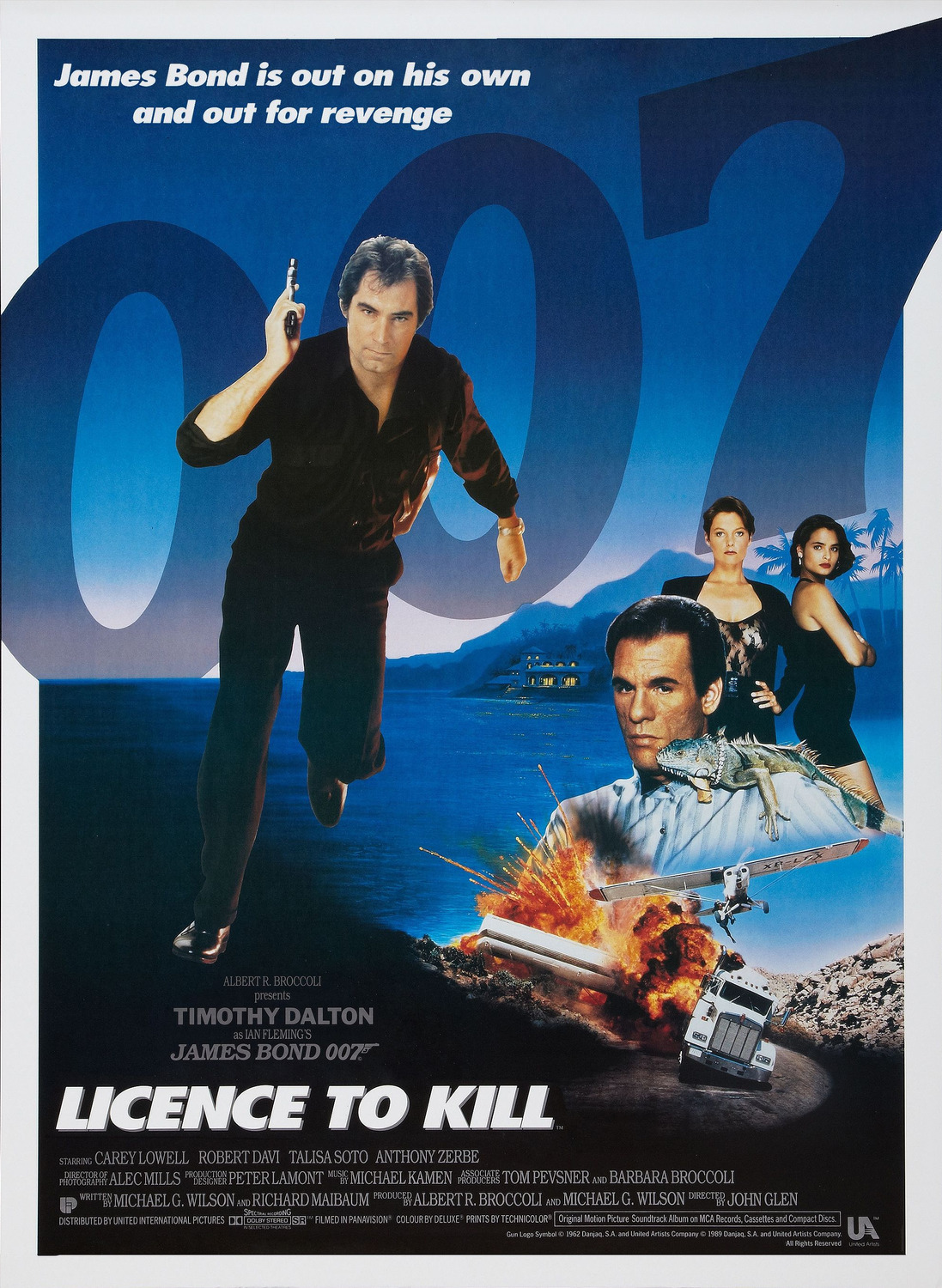
Licence to Kill ad campaign


14 replies to this topic

#1 iBond

iBond

    Lieutenant

  • Crew
  • PipPip
  • 599 posts
  • Location:Santa Monica, Ca

Posted 05 October 2013 - 08:53 PM

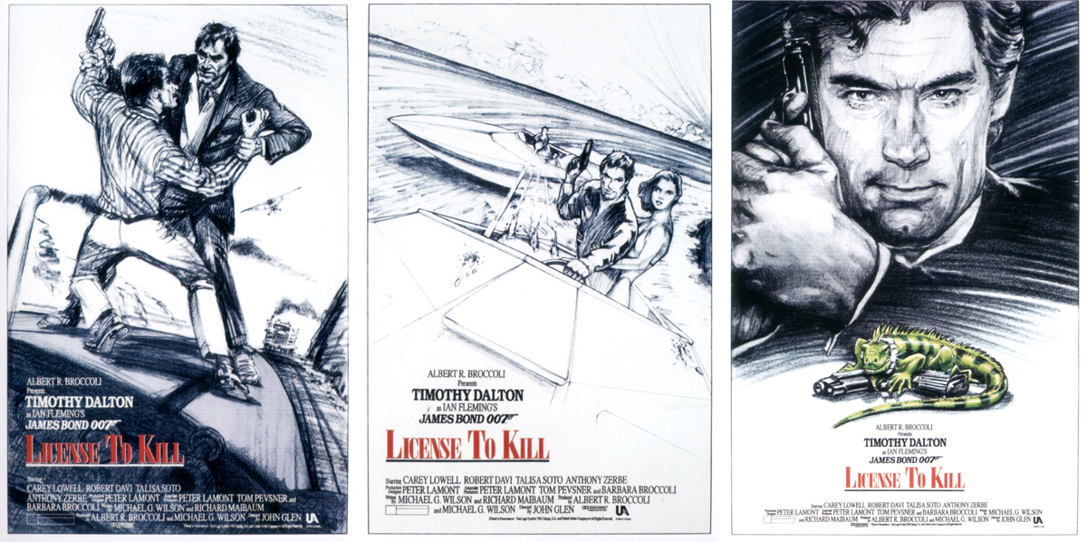
Okay, I understand that MGM changed the title from Licence Revoked to Licence to Kill, but did that mean they had to change the entire design of the posters? Why not just change the letterting from "Revoked" to "To Kill"? I mean, some of the early poster campaign artwork for the movie was pretty awesome in my opinion. It was by far better than that mess of a final campaign they had. Who knows.


#2 SecretAgentFan

SecretAgentFan

    Commander

  • Commanding Officers
  • PipPipPipPip
  • 9055 posts
  • Location:Germany

Posted 06 October 2013 - 12:53 PM

These early poster designs were simply magnificent.  I´d love to get one of those and hang it over my writing desk.


EON should make them available for fans to buy.


#3 iBond

iBond

    Lieutenant

  • Crew
  • PipPip
  • 599 posts
  • Location:Santa Monica, Ca

Posted 02 November 2013 - 06:20 PM

Yeah! They were great posters! I loved them! I had to search the net to find them but when I finally did, I was sold!

#4 tdalton

tdalton

    Commander

  • Veterans
  • PipPipPipPip
  • 11680 posts

Posted 03 November 2013 - 08:32 AM

These early poster designs were simply magnificent.  I´d love to get one of those and hang it over my writing desk.


EON should make them available for fans to buy.


Very much agreed.  I'd love to have the Licence Revoked poster featuring Dalton, Carey Lowell, and Talisa Soto posing in front of the palm trees.  Shame they didn't use that one, as it's one of my favorite posters of the entire series.


#5 ChickenStu

ChickenStu

    Lieutenant

  • Crew
  • PipPip
  • 608 posts
  • Location:South East

Posted 04 November 2013 - 10:27 AM

How come they were able to mess this up so badly? 


#6 iBond

iBond

    Lieutenant

  • Crew
  • PipPip
  • 599 posts
  • Location:Santa Monica, Ca

Posted 05 November 2013 - 01:14 AM

That's a very good question. It was a last minute title chance and I guess since they never had a poor add campaign in the Bond series until 1989, they had no idea the result.

Edited by iBond, 05 November 2013 - 01:15 AM.


#7 Rik

Rik

    Sub-Lieutenant

  • Crew
  • Pip
  • 109 posts
  • Location:Westcliff, Essex

Posted 18 November 2013 - 12:07 PM

Wait... There was an ad campaign for Licence to Kill??? All I remember from that Summer were Batman ads....


#8 iBond

iBond

    Lieutenant

  • Crew
  • PipPip
  • 599 posts
  • Location:Santa Monica, Ca

Posted 22 November 2013 - 04:42 PM

Lol There was an ad campaign for the film...albeit a very poor one due to the last-minute title change. But yeah, Batman was probably everywhere. You're right.

#9 hoagy

hoagy

    Sub-Lieutenant

  • Crew
  • Pip
  • 230 posts

Posted 22 November 2013 - 04:59 PM

The palm tree poster ?  Really ?  I have no idea whether those of you who like the palm tree poster are old enough to remember, but the palm tree poster is a copy-cat of Mami Vice television show promotional materials.  The problem with the film itself is that the plot is far too much like a made-for-tv drug cop movie or show, wasting a lot of goodwill and a terrific actor in the lead.  (Not to mention the teenage girl reactions of Pam when she realizes Bond got close and romantic with the bad guy's girlfriend.  So, that made it a combination of made-for-tv drug cop story with a 'tweener story about junior high romances.)  Changing the poster was a good idea, but not enough.  They should have changed the script.  It was far too dull and unremarkable to be a Bond movie, and inserting the religious-cult-really-a-front-for-drug-runners lair and drug factory was not enough to raise the movie above the tv-level fray.  Dalton could have done wonders with a Bondian script.  Oh, well...it was not the first or the last time the producers squandered hard-earned audience goodwill.


#10 The Krynoid man

The Krynoid man

    Sub-Lieutenant

  • Crew
  • Pip
  • 161 posts
  • Location:Newcastle Upon Tyne

Posted 24 November 2013 - 05:40 PM

The final poster makes it look like a generic action film. Nothing about it say's "James Bond".

#11 iBond

iBond

    Lieutenant

  • Crew
  • PipPip
  • 599 posts
  • Location:Santa Monica, Ca

Posted 07 January 2014 - 09:17 PM

The final poster makes it look like a generic action film. Nothing about it say's "James Bond".


I couldn't agree more.

#12 Professor Pi

Professor Pi

    Lt. Commander

  • Veterans
  • PipPipPip
  • 1430 posts

Posted 08 January 2014 - 05:57 AM

The international poster is pretty good, but the Bob Peak artwork was just awesome :

license_to_kill_ver3_xlg.jpgl_90878_0097742_7d830c0a.jpg


Does anyone remember that god awful TV commercial with the Bond rap song?


And check out the early artwork:

license+to+kill+poster+concept+artwork.j


Not sure who made the 20th anniversary poster but it's more in the Bond tradition:

ltk_anniversary_1.jpg


Edited by Professor Pi, 08 January 2014 - 06:01 AM.


#13 Turn

Turn

    Commander

  • Veterans
  • PipPipPipPip
  • 6837 posts
  • Location:Ohio

Posted 08 January 2014 - 03:14 PM

Never seen those three up top. Those are awesome. Makes you wonder why they can't come up with something like those these days. All about costs I guess.


#14 Chemateo

Chemateo

    Midshipman

  • Crew
  • 22 posts

Posted 08 January 2014 - 10:18 PM

Wow! I had never seen those three Professor Pi posted.  They look terrific! What was the first piece of artwork you shared, Professor Pi?  It is not showing. 


I had read somewhere the reason LTK got such underwhelming posters was because of the last minute change and MGM's fear over the attempt to take Bond in a new direction.  Apparently MGM was fighting with EON to play things safe and keep the formula going.  They were not keen on trying something new.  I agree it was time for a change but Lazy G. Wilson (and Glen!) were not the men to deliver the right type of harder edged Bond.


Still, everytime I see any of the Licence Revoked preliminary artwork I am impressed.


#15 iBond

iBond

    Lieutenant

  • Crew
  • PipPip
  • 599 posts
  • Location:Santa Monica, Ca

Posted 09 January 2014 - 05:49 PM

Never seen those three up top. Those are awesome. Makes you wonder why they can't come up with something like those these days. All about costs I guess.


Costs and lack of imagination.