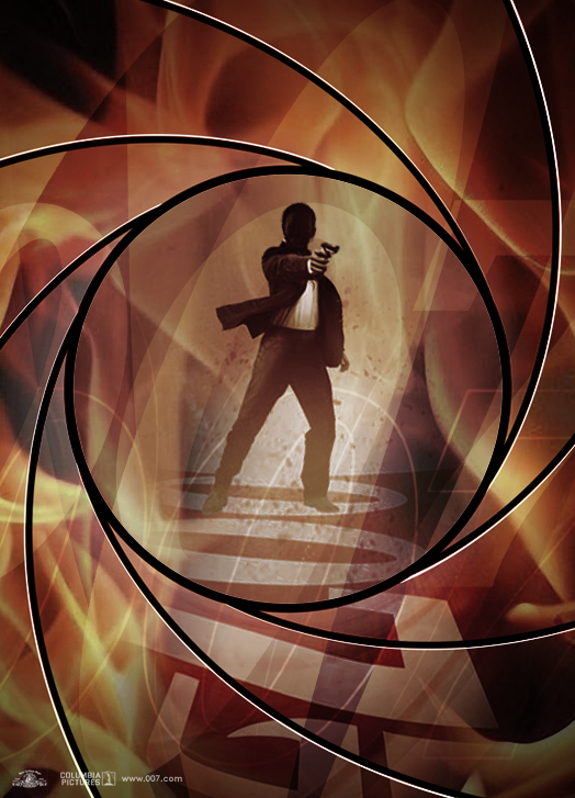
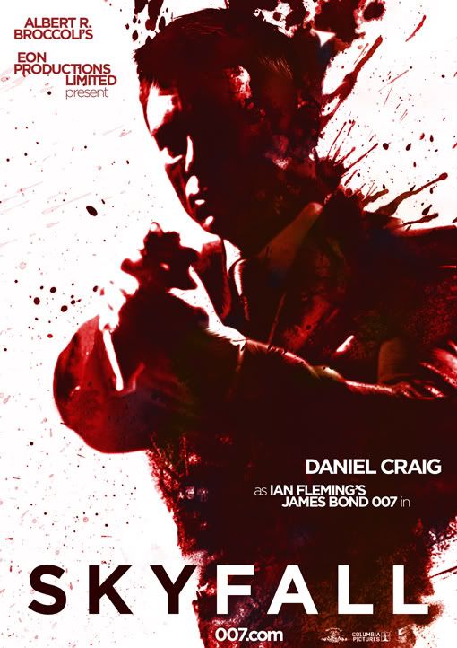
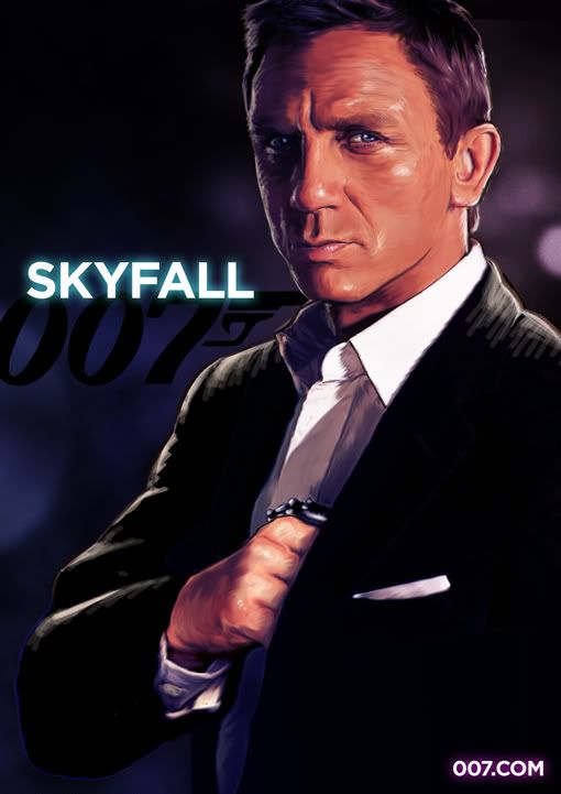
The only BOND 23 teaser fan art that is remotely any good is the Brazilian guy's cat motif. It is not perfect, but it gets the series, it gets poster design and it gets making something different. The rest are over-egged cliches. The title of the film needs to be clear, not lost amidst a blur of 1997 007 logos and design thinking.
Although a Bond film sells itself, the title needs to be visible - from across a cinema or shopping mall. It needs to say NOW! not two decades ago.
And no. I will not be putting any fan art up here. I think there is always too much of it to not step in at the best of times.
I disagree, I feel many of these were good (Maybe not to Bond standards, but pretty close), not to be too arrogant, but I feel mine was pretty good and almost as good as the Cat Motif. But I will agree that the Cat one is the only one that could pass for official.


