EW.com has exclusive sneak peek of cover

Edited by Righty007, 07 March 2008 - 12:25 AM.

Commander

Posted 03 March 2008 - 03:11 PM
EW.com has exclusive sneak peek of cover
Edited by Righty007, 07 March 2008 - 12:25 AM.
Commander

Posted 03 March 2008 - 03:26 PM

Sub-Lieutenant

Posted 03 March 2008 - 03:37 PM
Commander

Posted 03 March 2008 - 03:57 PM
Commander RNVR

Posted 03 March 2008 - 04:00 PM

Commander RNVR

Posted 03 March 2008 - 04:05 PM
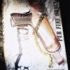
 but the gun wrong - unless Faulks has given Bond another weapon.
Commander GCMG

Posted 03 March 2008 - 04:07 PM
Lieutenant

Posted 03 March 2008 - 04:30 PM
Commander GCMG
Posted 03 March 2008 - 04:35 PM
Commander GCMG
Posted 03 March 2008 - 05:06 PM
Commander

Posted 03 March 2008 - 05:11 PM
Commander RNVR

Posted 03 March 2008 - 05:13 PM
Commander GCMG
Posted 03 March 2008 - 05:13 PM

Lt. Commander

Posted 03 March 2008 - 05:24 PM
Commander

Posted 03 March 2008 - 05:56 PM
Commander

Posted 03 March 2008 - 05:58 PM
That's a rather good idea. Surprisingly good for a US cover.
Commander RNVR
Posted 03 March 2008 - 06:31 PM
I like it.
They got the hair right
Commander

Posted 03 March 2008 - 06:33 PM
Commander

Posted 03 March 2008 - 06:38 PM
Lt. Commander

Posted 03 March 2008 - 06:42 PM
Commander RNVR

Posted 03 March 2008 - 06:49 PM
Discharged.

Posted 03 March 2008 - 06:50 PM
Doubleday had better market the hell out of it or else it'll turn out like Young Bond in the US as well as Gardner, Benson, etc.
Lt. Commander
Posted 03 March 2008 - 07:15 PM
Commander

Posted 03 March 2008 - 07:19 PM
Commander RNVR

Posted 03 March 2008 - 07:24 PM
Commander GCMG
Posted 03 March 2008 - 07:24 PM
That doesn't surprise me that much as I don't think Faulks is as well-known in the U.S. -- at least not a in wide commercial sense.I like it, not as much as the UK cover, but I like it. Although I still find it slightly odd that Ian Fleming has a larger font, and therefore a bigger billing, than Sebastian Faulks.
Commander
Posted 03 March 2008 - 07:52 PM
Lt. Commander
Posted 03 March 2008 - 08:16 PM
Sub-Lieutenant

Posted 03 March 2008 - 08:23 PM
Commander RNR

Posted 03 March 2008 - 08:29 PM