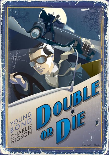
This is the first time that any 'fan art' has been good enough to actually be used on a Bond related product. All of the fan art signposted on fan sites tends to be fairly shoddy with its font choice and campy designs masquerading as graphic art. However, this YOUNG BOND effort is classy, energetic and completely "gets" the title and world it emerges from. All Bond fan art and fan music tends to not "get" the product and uses tired nostalgia and bored homage rather than class and style.
Thanks man; much appreciated. Of course there's a large element of nostalgia in there, but hopefully it works within the context of the book.
Have you the scope to properly run this by the right people? Having a collection of all the YOUNG BOND covers in this style may just help your cause too - as evidence of a unity of style might work wonders - especially if the books are to be re-branded in times to come.
Just a thought...
Well that's very flattering- I'd like to put some more together but I don't know how receptive they'd be to submissons like this. Don't ask, don't get, though I suppose!

Who knows- they might even look rather nice on the wall...
Stunningly fantastic cover, mtm. I prefer the more aged version. Could be the best Young Bond cover I’ve seen, fan or official.
Cheers fella- that means a lot.
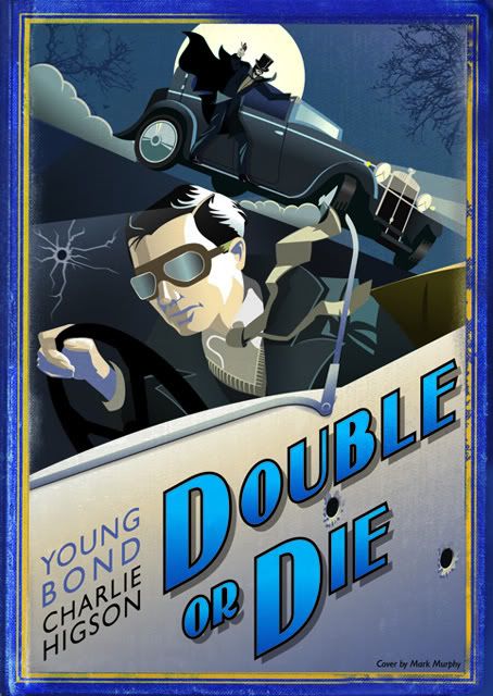
I know you'll understand this- I forgot to change the colour mode when I reposted the cleaner image: I uploaded a CMYK version to photobucket which seemed to convert it to RGB itself: hence the rather vivid blues which have appeared in it. It's not supposed to be quite so eye-bursting! Whoops!