SPECTRE seemed to be a case of the locations and setpieces being conceived before the plot, rather than the other way round. Scriptwriting by committee.
You are most likely right there!

Lieutenant


Posted 08 January 2016 - 09:25 AM
SPECTRE seemed to be a case of the locations and setpieces being conceived before the plot, rather than the other way round. Scriptwriting by committee.
You are most likely right there!
Lt. Commander

Posted 08 January 2016 - 11:58 AM


Commander

Posted 08 January 2016 - 01:05 PM
Boy. That is shocking!
Commander

Posted 08 January 2016 - 01:31 PM
Wow.It's sad when a fantastic set like this:
...ends up looking like this:
Commander
Posted 08 January 2016 - 03:17 PM
I really cannot understand why such an elaborate set with such a vibrant color scheme gets even constructed in that detail when it isn´t properly used.
The same goes for the colours of the Mexican Day of the Dead-sequence which look sharp and rich in contrast on set-photos - but bleached out in the film.
Mr. Mendes, what gives?
Commander

Posted 08 January 2016 - 06:25 PM
That's just a shame. The original set looks amazing.
Commander RNVR

Posted 08 January 2016 - 08:44 PM
Too be fair, such a large room in an old building wouldn't be so brightly lit like in the top image. The bottom one seems more in keeping with the location.
Sub-Lieutenant
Posted 08 January 2016 - 11:59 PM
That first image looks like a big budget BBC show.
Lt. Commander

Posted 09 January 2016 - 02:00 AM
Commander
Posted 09 January 2016 - 02:39 AM
Too be fair, such a large room in an old building wouldn't be so brightly lit like in the top image. The bottom one seems more in keeping with the location.
Hoytema's approach was to make every set feel like it was lit by practicals (real light sources) as opposed to studio lights, and to work within the "toe" of the negative (the deepest blacks and foggiest of greys). For an ordinary thriller or horror that would be fine, but Bond lives in his own world. Deakins understood that, which is why (save for the candlelit scenes in the chapel) he opted for a surreal rather than a purely realistic look.
Lt. Commander
Posted 09 January 2016 - 04:29 AM
The top pic looks like Bond should be dressed as a woman in Thunderball. Seen it. Give me something with atmosphere.Wow.It's sad when a fantastic set like this:
...ends up looking like this:
Edited by Hockey Mask, 09 January 2016 - 04:29 AM.
Commander
Posted 09 January 2016 - 09:33 AM
Give me something which does not drench two hours in the same washed-out colours.
Lt. Commander
Posted 09 January 2016 - 01:47 PM
Commander
Posted 09 January 2016 - 03:26 PM
True. Well, finally we have one of those.
Commander
Posted 10 January 2016 - 11:49 PM
I'm guessing you already have those in the form of Bond 1-23.
You Only Live Twice, Goldfinger, Skyfall, Moonraker and Casino Royale have washed out colours?
That upper pic of the SPECTRE hall alone is more horrifying than anything in the actual film, and it's just a frickin photo of a set.
Lieutenant
Posted 11 January 2016 - 02:54 PM
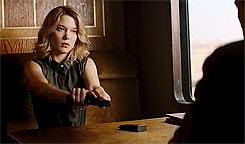 The cinematography during the Morocco and Train scene's are the best, IMO.
Sub-Lieutenant

Posted 13 January 2016 - 05:11 PM
Is it just me or does SPECTRE's cinematography look...
Muddy, muted, and generally awful? Yes. Yes it does. I was shocked when I saw it in the theater, even convinced something was off with the projection print. A second viewing confirmed that it's just not crisp and clear. The exact opposite of the gorgeous color and clarity of SF. I'm hoping it gets a tweak before hitting Blu-Ray, but I know I'm probably hoping in vain.
EDIT: Too much digital color correction is to blame for how muted it is. There are no crisp blacks either.
Edited by Yellow Pinky, 13 January 2016 - 05:12 PM.
Commander
Posted 13 January 2016 - 05:14 PM
I´m hoping, too, that the blu-ray will have a better look.
Commander
Posted 13 January 2016 - 09:26 PM
Is it just me or does SPECTRE's cinematography look...
Muddy, muted, and generally awful? Yes. Yes it does. I was shocked when I saw it in the theater, even convinced something was off with the projection print. A second viewing confirmed that it's just not crisp and clear. The exact opposite of the gorgeous color and clarity of SF. I'm hoping it gets a tweak before hitting Blu-Ray, but I know I'm probably hoping in vain.
EDIT: Too much digital color correction is to blame for how muted it is. There are no crisp blacks either.
You're definitely not the only one that feels that way. The look of Spectre is made even more disappointing due to the fact that it comes on the heels of Deakins' excellent work on Skyfall, but regardless it's still not particularly great work. The scenes in the film routinely looked better in still photographs than they did after all of the filters and color corrections and whatever else they ultimately did to the film to make it look the way that it does.
Lt. Commander

Posted 14 January 2016 - 01:42 AM
I'm guessing you already have those in the form of Bond 1-23.
You Only Live Twice, Goldfinger, Skyfall, Moonraker and Casino Royale have washed out colours?
Commander RNVR
Posted 22 January 2016 - 11:50 PM
While I don't condone or participate to P2P downloads a friend of mine brought to my attention of a fan regrading of SPECTRE....
When the blu-ray screencaps started cropping up for Spectre, I checked them out and noticed that a blanket yellow tint has been applied to the whole film.
With this release I have gone ahead and removed the blanket yellow tint across the whole film. I now feel that the film is far more pleasing to the eye, removing the blanket green tint brings all the other colours in the film back to life, making it a lot more enjoyable to watch. Also included are the chapter timings taken straight from the official blu-ray.
I have no idea what any of this means but it may interest members on this subject.
Commander
Posted 24 January 2016 - 04:14 PM
Sub-Lieutenant
Posted 26 January 2016 - 01:13 PM
The screencaps for that fan regrading aren't promising. Instead of the golden tint, everything is now bathed in a chilly blue.
How would someone find these screencaps?
Commander

Posted 27 January 2016 - 01:22 AM
The screencaps for that fan regrading aren't promising. Instead of the golden tint, everything is now bathed in a chilly blue.
I sort of disagree. I hadn't realized the yellow tint was that pronounced - I'm vastly preferring the regraded snaps. They actually look natural and rich.
Commander
Posted 27 January 2016 - 05:58 PM
Are there also caps that show either the original or the regraded version?
This way, both look weird to me.
Commander
Posted 27 January 2016 - 06:00 PM
Lt. Commander
Posted 28 January 2016 - 12:11 AM
Lieutenant
Posted 28 January 2016 - 09:20 AM
After seeing those screenshots I have to say I much prefer the regraded version!!
Commander

Posted 28 January 2016 - 11:26 AM