
At least Bond's tie is TIED as opposed to some of the previous film posters. Anyway, I won't be happy until they go back to a McGinnis or McCarthy styled oil painting.

New Skyfall Character Posters released.
Started by
DamnCoffee
, Aug 09 2012 03:14 PM
123 replies to this topic
#62

Trevelyan 006
-

- Crew
-

- 820 posts
Lieutenant
- Location:Antenna Cradle
Posted 10 August 2012 - 07:45 PM
Javier's outfit is what kills it the most for me. Just seems very typical 'villain'.
It reeks of Star Wars Sith Lord, the only thing missing is the red light-saber. I MUCH preferred the other attires we've seen him in.
It reeks of Star Wars Sith Lord, the only thing missing is the red light-saber. I MUCH preferred the other attires we've seen him in.
#63
Nicolas Suszczyk
-

- Veterans
-
- 3735 posts
Commander
- Location:Buenos Aires, Argentina
Posted 10 August 2012 - 07:52 PM
Javier's outfit is what kills it the most for me. Just seems very typical 'villain'.
I agree with you about that. BTW, I don't really like the black 007 logo background. It would have been nice a golden 007 instead, or a light grey 007, to contrast with the characters.
#64
Nicolas Suszczyk
-
- Veterans
-
- 3735 posts
Commander
- Location:Buenos Aires, Argentina
Posted 10 August 2012 - 08:32 PM
South American Versions:
BOND: http://3.bp.blogspot...yfall_cine1.jpg
EVE: http://2.bp.blogspot...skyfall_EVE.jpg
SEVERINE: http://4.bp.blogspot...ll_severine.jpg
SILVA: http://2.bp.blogspot...yfall_silva.jpg
BOND: http://3.bp.blogspot...yfall_cine1.jpg
EVE: http://2.bp.blogspot...skyfall_EVE.jpg
SEVERINE: http://4.bp.blogspot...ll_severine.jpg
SILVA: http://2.bp.blogspot...yfall_silva.jpg
#65
Simon
-

- Veterans
-
- 5884 posts
Commander
- Location:England
Posted 10 August 2012 - 08:32 PM
Have to agree with Shrublands.
On the one hand we have Deakins working his magic in the moving image, we have seen some incredible imagination (and some awful, but they are not professionally paid) in the fan poster thread,... saying that 'they are just character posters, or indeed 'just anything' is a disservice to the product that they are purported to be promoting.
These are utter bo11ox.
There is no framing, aspects are chopped off hither and thither. MGW is supposed to be an acclaimed amateur photographer - I wish his eye was on this in the way it is supposed to be on his main product. i.e. the bloody film.
Dreadful and criminally lacking in any imagination whatsoever. And I have zero hopes for the main marketing thrust - it will be as lack lustre as that which we have seen already.
#66
tdalton
-

- Veterans
-
- 11680 posts
Commander
Posted 10 August 2012 - 08:54 PM
I am sure the poster will be a cut above these, please don't forget as it said, they are cinema posters, so not global marketing material but simple indicators that James Bond is back in action. People will glance at them and see them as they're going about their own business in the cinema, so it will work to plant the seed. They're not going to break new ground with the character posters, they've no need to.
Hope we get the theatrical poster soon now then with these teasing images...!
I'm not so sure the final poster will be much better than anything we've already seen. As has already been demonstrated by the previous two films, aside from the brilliant Casino Royale teaser poster, the EON/SONY partnership has yet to yield a poster that could even qualify as mediocre. The final poster for Casino Royale was horrible, as were all of the posters for Quantum of Solace and the teaser for Skyfall.
#67
thecasinoroyale
-

- Veterans
-
- 14358 posts
Commander
- Location:Basingstoke, UK
Posted 10 August 2012 - 09:04 PM
....I know, I'm just hoping it would be as most of the marketing imagery for the Bond films recently does get slated and it's a shame.
I know it doesn't break new ground, but it's certainly still exciting when you see them up, you can't deny!
I know it doesn't break new ground, but it's certainly still exciting when you see them up, you can't deny!
#68
Simon
-
- Veterans
-
- 5884 posts
Commander
- Location:England
Posted 10 August 2012 - 10:36 PM
Wanna bet?...........but it's certainly still exciting when you see them up, you can't deny!
For me these have just Undone all the excellence of the trailers.
#69
JimmyBond
-

- Executive Officers
-
- 10559 posts
Commander
- Location:Washington
Posted 10 August 2012 - 11:07 PM
I am sure the poster will be a cut above these, please don't forget as it said, they are cinema posters, so not global marketing material but simple indicators that James Bond is back in action. People will glance at them and see them as they're going about their own business in the cinema, so it will work to plant the seed. They're not going to break new ground with the character posters, they've no need to.
Hope we get the theatrical poster soon now then with these teasing images...!
I'm not so sure the final poster will be much better than anything we've already seen. As has already been demonstrated by the previous two films, aside from the brilliant Casino Royale teaser poster, the EON/SONY partnership has yet to yield a poster that could even qualify as mediocre. The final poster for Casino Royale was horrible, as were all of the posters for Quantum of Solace and the teaser for Skyfall.
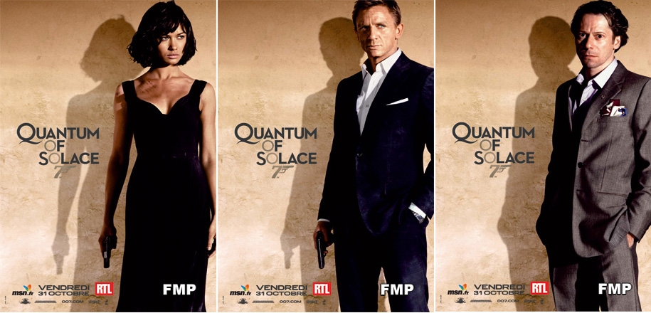
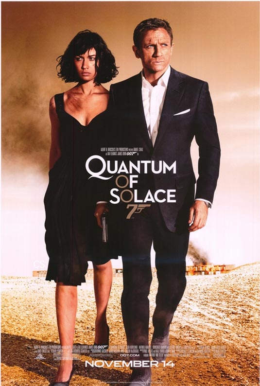
I must be the only one in the world who loves the final "Quantum of Solace" theatrical poster. I love the minimilistac look to it, withi Bond and Camille walking throgh the desert. Really conveys the feel of the film.
#70
Guy Haines
-

- Veterans
-
- 3075 posts
Commander
- Location:"Special envoy" no more. As of 7/5/15 elected to office somewhere in Nottinghamshire, England.
Posted 10 August 2012 - 11:22 PM
There has been a lot of speculation in the red top press about "Eve" being "the new Moneypenny". It doesn't look like it to me, although we only have a poster and a couple of trailers to go on so far.
On the other hand - suppose "Eve" ends up being the first female "Double-0" of the film series?
I'd be amused if this was the case, especially if she turns out to be "008" - the agent who, in the pre-Craig films, was never seen but always referred to by M as being on hand to replace 007. ;-)
On the other hand - suppose "Eve" ends up being the first female "Double-0" of the film series?
I'd be amused if this was the case, especially if she turns out to be "008" - the agent who, in the pre-Craig films, was never seen but always referred to by M as being on hand to replace 007. ;-)
#71
JimmyBond
-
- Executive Officers
-
- 10559 posts
Commander
- Location:Washington
Posted 10 August 2012 - 11:26 PM
In Thunderball, during the briefing with "Every double-o in Europe." A woman is clearly visible seated to Bond's left (006, one presumes).
#72
Guy Haines
-
- Veterans
-
- 3075 posts
Commander
- Location:"Special envoy" no more. As of 7/5/15 elected to office somewhere in Nottinghamshire, England.
Posted 10 August 2012 - 11:33 PM
In Thunderball, during the briefing with "Every double-o in Europe." A woman is clearly visible seated to Bond's left (006, one presumes).
Granted. I mean, though, the first one as a fully fledged character in a film rather than an extra for a scene. It wouldn't surprise me at all if "Eve" turns out to be a Double-0, or is on a mission to gain that rank.
#73
JCRendle
-
- Veterans
-
- 3639 posts
Commander
- Location:Her Majesty's England
Posted 11 August 2012 - 04:59 AM
So one of her "kills" could potentially have beenor is on a mission to gain that rank.
Spoiler
. I wonder if that would have counted towards the two 0s....
*tongue firmly in cheek*
#74
Guy Haines
-
- Veterans
-
- 3075 posts
Commander
- Location:"Special envoy" no more. As of 7/5/15 elected to office somewhere in Nottinghamshire, England.
Posted 11 August 2012 - 06:29 AM
So one of her "kills" could potentially have been
or is on a mission to gain that rank.Spoiler. I wonder if that would have counted towards the two 0s.
...
*tongue firmly in cheek*
That thought occurred to me as well. Too bad it won't count! ;-)
#75
Vauxhall
-

- Executive Officers
-
- 10744 posts
Commander
- Location:London, UK
Posted 11 August 2012 - 08:36 AM
Very surprised that Roger Deakins isn't even mentioned on the poster. He's a big name who I'd have thought the producers would have been keen to push in promotion.
#76
Simon
-
- Veterans
-
- 5884 posts
Commander
- Location:England
Posted 11 August 2012 - 08:51 AM
He probably will be mentioned on the main poster...
#77
SecretAgentFan
-

- Commanding Officers
-
- 9055 posts
Commander
- Location:Germany
Posted 11 August 2012 - 10:02 AM
I am sure the poster will be a cut above these, please don't forget as it said, they are cinema posters, so not global marketing material but simple indicators that James Bond is back in action. People will glance at them and see them as they're going about their own business in the cinema, so it will work to plant the seed. They're not going to break new ground with the character posters, they've no need to.
Hope we get the theatrical poster soon now then with these teasing images...!
I'm not so sure the final poster will be much better than anything we've already seen. As has already been demonstrated by the previous two films, aside from the brilliant Casino Royale teaser poster, the EON/SONY partnership has yet to yield a poster that could even qualify as mediocre. The final poster for Casino Royale was horrible, as were all of the posters for Quantum of Solace and the teaser for Skyfall.
I must be the only one in the world who loves the final "Quantum of Solace" theatrical poster. I love the minimilistac look to it, withi Bond and Camille walking throgh the desert. Really conveys the feel of the film.
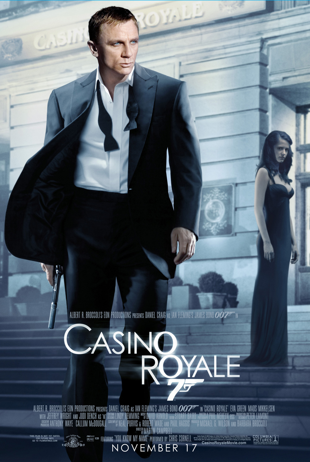
Not only do I love the final QOS-poster for the reasons you described - I also love the final CR-poster with Bond in front of the Casino and Vesper in the background, looking very sexy and haunted.
I have high hopes for the SKYFALL poster. The character posters are a separate entity.
#78
The Shark
-

- Veterans
-
- 4650 posts
Commander
- Location:London
Posted 11 August 2012 - 10:29 AM
The CR and QOS posters are just dreary and dull. If the purpose of a Bond film is to entertain, then those two posters them sell it as a trip to the morgue.
#79
Shrublands
-

- Veterans
-
- 4012 posts
Commander
- Location:Conveniently Near the NATO Base
Posted 11 August 2012 - 10:59 AM
I have high hopes for the SKYFALL poster. The character posters are a separate entity.
High hopes - not if the past is anything to go by.
Can we really call these …
'a separate entity' to this?
and

to this

#80
Simon
-
- Veterans
-
- 5884 posts
Commander
- Location:England
Posted 11 August 2012 - 11:32 AM
Precisely.
#81
SecretAgentFan
-
- Commanding Officers
-
- 9055 posts
Commander
- Location:Germany
Posted 11 August 2012 - 01:16 PM
Hey, hey, hey - the QOS poster might have equal colors and the characters in the same outfits. Yet, the main poster is different.
The final DAD poster is decidedly different from the character posters (and the teaser above).
As is the final CR poster compared to the teaser.
Let´s wait and see. The time for bitching will come and be plenty.
The final DAD poster is decidedly different from the character posters (and the teaser above).
As is the final CR poster compared to the teaser.
Let´s wait and see. The time for bitching will come and be plenty.
#82
Matt_13
-

- Veterans
-
- 5969 posts
Commander
- Location:USA
Posted 11 August 2012 - 01:32 PM
At least the actors don't look like they're made of plastic in those character posters. I actually like the one of Dan, despite how soul crushingly boring it is. I have nothing wrong with the concept of character posters, I'm just not too keen on the excessive airbrushing. Then again, I doubt general audiences care one way or the other. It conveys that Bond is back, and nothing more. The main poster won't be terribly different.
#83
thecasinoroyale
-
- Veterans
-
- 14358 posts
Commander
- Location:Basingstoke, UK
Posted 11 August 2012 - 01:36 PM
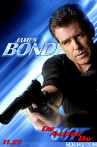
Isn't the 'DAD' poster this one...

If 'Skyfall' follows this, I'll be happy as this is a decent Bond poster for the tone of the film and love the ice graphics - you get shots of the main characters and nice action shots with the main stars bursting out the blocks.
Fingers crossed.
If 'Skyfall' follows this, I'll be happy as this is a decent Bond poster for the tone of the film and love the ice graphics - you get shots of the main characters and nice action shots with the main stars bursting out the blocks.
Fingers crossed.
#84
SecretAgentFan
-
- Commanding Officers
-
- 9055 posts
Commander
- Location:Germany
Posted 11 August 2012 - 01:37 PM
Exactly. Different from the teasers. And still a good Bond poster.
Do I want to see a Bond poster done in the 60´s or 70´s style again? Sure. But I don´t think this will ever happen again.
Any by the way, this was the final CR poster (a pretty good one IMO): http://lenabo.files....asino-royal.jpg
Do I want to see a Bond poster done in the 60´s or 70´s style again? Sure. But I don´t think this will ever happen again.
Any by the way, this was the final CR poster (a pretty good one IMO): http://lenabo.files....asino-royal.jpg
Edited by SecretAgentFan, 11 August 2012 - 01:39 PM.
#85
The Shark
-
- Veterans
-
- 4650 posts
Commander
- Location:London
Posted 11 August 2012 - 02:35 PM
Any by the way, this was the final CR poster (a pretty good one IMO): http://lenabo.files....asino-royal.jpg
And pretty damn boring, colour and composition-wise. Craig looks like a reptile.
David Icke would be proud.
#86
SecretAgentFan
-
- Commanding Officers
-
- 9055 posts
Commander
- Location:Germany
Posted 11 August 2012 - 03:44 PM
Sharky being snarky...
#87
Chief of SIS
-
- Crew
-
- 921 posts
Lieutenant
Posted 11 August 2012 - 03:54 PM
Sharky being right.
I don't understand when Bond became about selling actors instead of selling Bond. Though not much better, this CR one is slightly more enticing...

I don't understand when Bond became about selling actors instead of selling Bond. Though not much better, this CR one is slightly more enticing...
Edited by Chief of SIS, 11 August 2012 - 03:55 PM.
#88
SecretAgentFan
-
- Commanding Officers
-
- 9055 posts
Commander
- Location:Germany
Posted 11 August 2012 - 04:13 PM
IMO, the other CR poster does sell Bond very well with two fantastic actors in front of the most important setting of the film.
But, as I said, to each his own.
But, as I said, to each his own.
#89
MattofSteel
-

- Veterans
-
- 2482 posts
Commander
- Location:Waterloo, ON
Posted 11 August 2012 - 04:23 PM
Movie posters in general have gone straight downhill for 20 years. It's not just Bond.
Look, as the medium changes, so must the marketing collateral. A poster isn't intended to be "artistically beautiful and rich to satisfy online aficionados" no matter how much we wish they were. They're designed to grab the eye of the general cinema going crowd across a crowded theatre lobby, and communicate the brand an essence of a movie all within the span of one brief glance.
Upon closer inspection, yes, they can be cooler. But that's embellishment. It's not the objective. It's why the Skyfall teaser is, by modern standards, exactly what a poster is expected to be. In the old days, one would pack as much as possible into a Star Wars or James Bond poster because there were only 1 or 2 posters in a cinema, and you had to sell to an audience just how much bang they would get for their buck in this experience. "Oh, a flying helicopter! A volcano! We have to go see that Bond movie." Now, they throw up a single image of "Daniel Craig, unmistakable 007 gunbarrel, Skyfall" to communicate exactly that. Peoples' engagement tendencies and attention spans don't allow for any more.
The customer isn't swayed by specific content anymore so much as they're swayed by the promise of a brand. It's a sad reality, but a true one. We will never, ever see a 007 poster in the old style ever again. Much as I'd love for EON/Sony's marketing departments to prove me wrong in the coming weeks.
#90
univex
-

- Veterans
-
- 2310 posts
Lt. Commander
Posted 11 August 2012 - 06:45 PM
Have to agree with Shrublands.
On the one hand we have Deakins working his magic in the moving image, we have seen some incredible imagination (and some awful, but they are not professionally paid) in the fan poster thread,... saying that 'they are just character posters, or indeed 'just anything' is a disservice to the product that they are purported to be promoting.
These are utter bo11ox.
There is no framing, aspects are chopped off hither and thither. MGW is supposed to be an acclaimed amateur photographer - I wish his eye was on this in the way it is supposed to be on his main product. i.e. the bloody film.
Dreadful and criminally lacking in any imagination whatsoever. And I have zero hopes for the main marketing thrust - it will be as lack lustre as that which we have seen already.
^All of the above (+1) - I just hope these don´t reflect the final product as much as DUD´s did (plastic turds).