Jesus. They're character posters, people. They're not supposed to break amazing ground. It's James Bond, Bond girls, and a blatant Bond villain. It's fine.

New Skyfall Character Posters released.
Started by
DamnCoffee
, Aug 09 2012 03:14 PM
123 replies to this topic
#31

MattofSteel
-

- Veterans
-

- 2482 posts
Commander
- Location:Waterloo, ON
Posted 09 August 2012 - 05:02 PM
#32
_Ozu_
-

- Crew
-
- 226 posts
Sub-Lieutenant
- Location:Spain
Posted 09 August 2012 - 05:02 PM
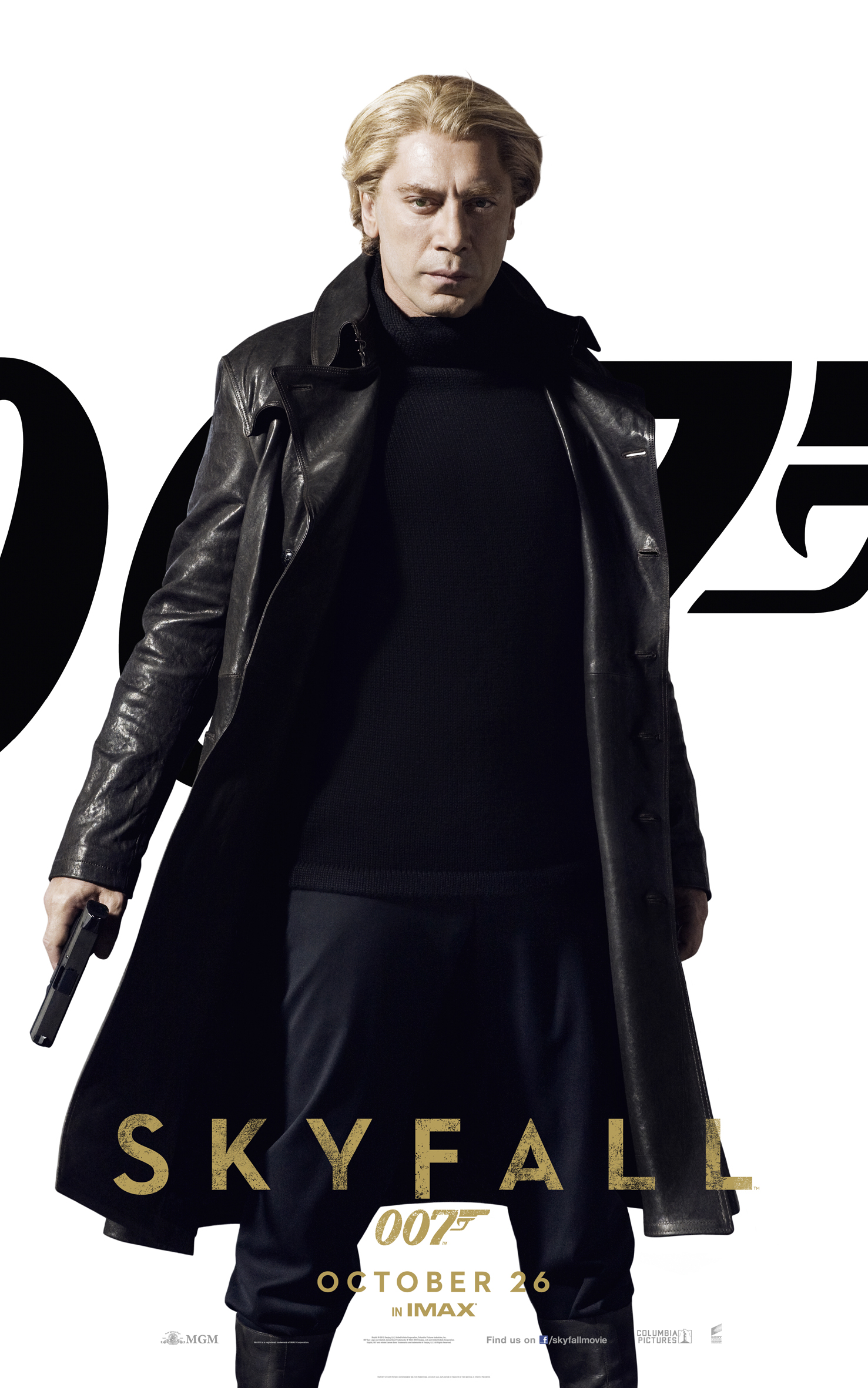
So in Hashima Silva looks like Scaramanga and in Scotland he looks like Zao from Die Another Day?.
Edited by _Ozu_, 09 August 2012 - 05:02 PM.
#33
Chief of SIS
-
- Crew
-
- 921 posts
Lieutenant
Posted 09 August 2012 - 05:04 PM
While I agree they're dull, may I remind the negative voices out there they are CHARACTER posters.
Quantum of Solace. The movie where guys put hands in their pockets
Quantum of Solace. The movie where guys put hands in their pockets
#34
MattofSteel
-
- Veterans
-
- 2482 posts
Commander
- Location:Waterloo, ON
Posted 09 August 2012 - 05:04 PM
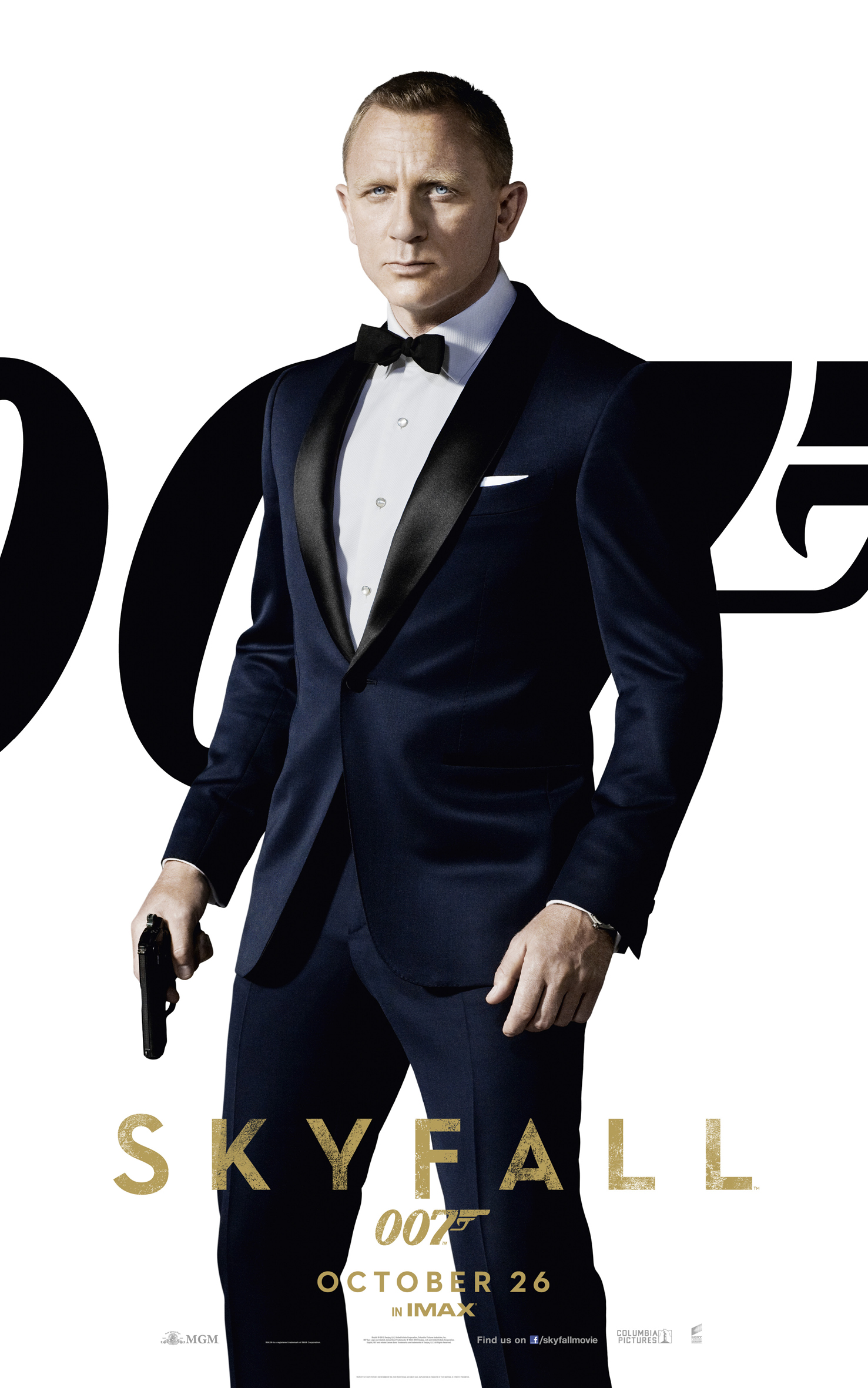
I'll grant that Silva's costume is particularly, almost unnecessarily, Zao-ish.
#35
Marketto007
-

- Veterans
-
- 2487 posts
Lt. Commander
- Location:Brasil
Posted 09 August 2012 - 05:05 PM
007.com is down here :/
Third world problems. Same here my friend.
xxx
#36
DominicGreene
-

- Crew
-
- 791 posts
Lieutenant
- Location:Ontario, Canada
Posted 09 August 2012 - 05:10 PM
Yeah... I mean, they're OKAY. When I saw them, I was just like meh. Not interesting at all. I could have done this is photoshop in 5 minutes. It would have been much better if they did an all black background and more serious poses. Bond looks like he's about to take a piss.
#37
Matt_13
-

- Veterans
-
- 5969 posts
Commander
- Location:USA
Posted 09 August 2012 - 05:13 PM
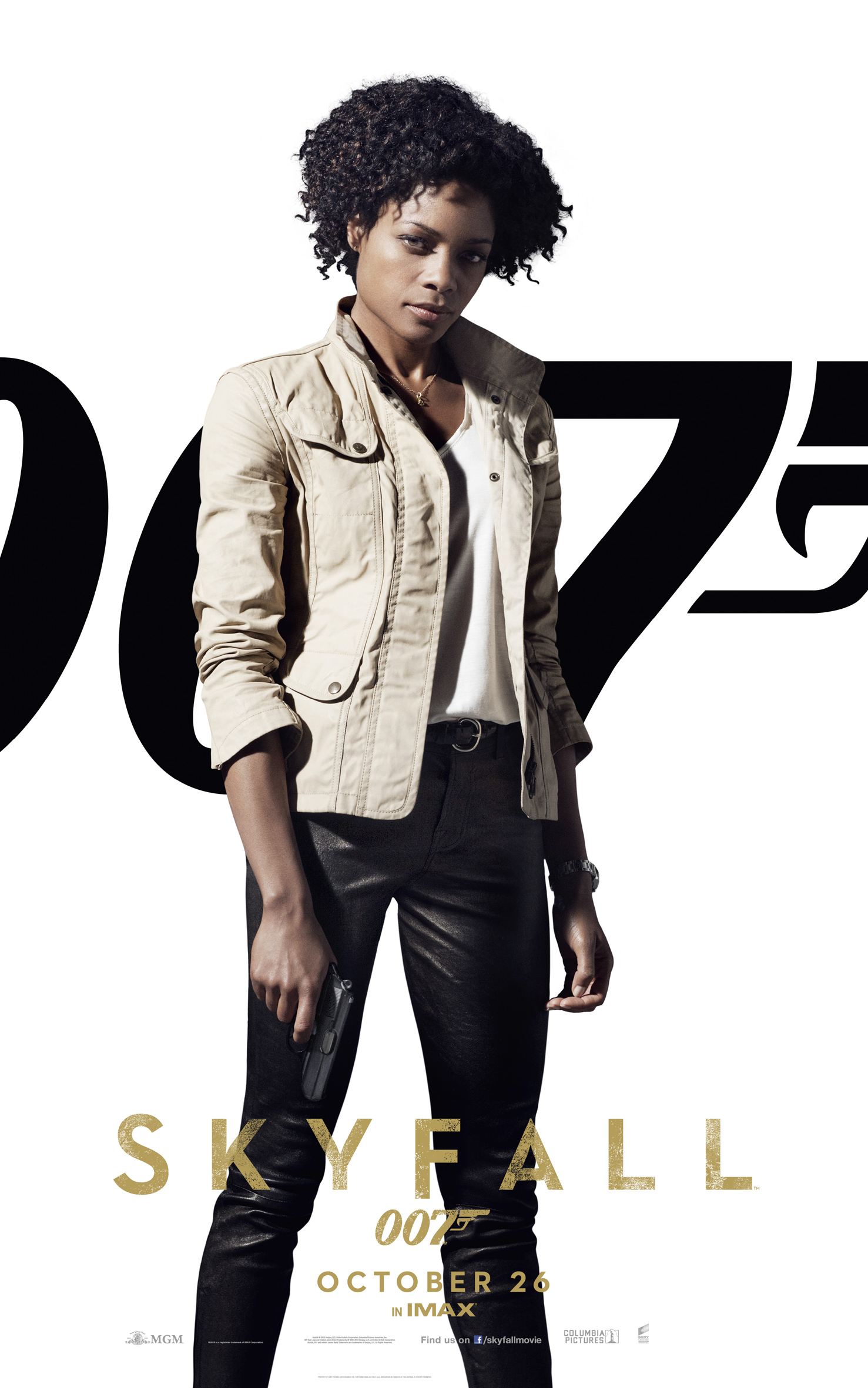
I have to say...of all the characters I'm looking forward to seeing, Eve has me the most excited. She looks very cool and very capable in a legitimate way. I'm sure they did he black coat thing just to underscore the fact that Bardem is the bad guy. I just wish they didn't airbrush the actors so much. Three films in a row now.
#38
DamnCoffee
-
- Executive Officers
-
- 24459 posts
Commander
- Location:England
Posted 09 August 2012 - 06:16 PM
I thought there would be an M poster, looks like there isn't. Since the plot is centered around her, they really should've released one with Dench. Ah well.
#39
x007AceOfSpades
-

- Veterans
-
- 4369 posts
Commander
- Location:Sunny Southern California
Posted 09 August 2012 - 06:27 PM
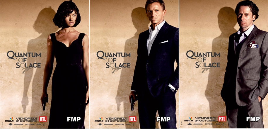
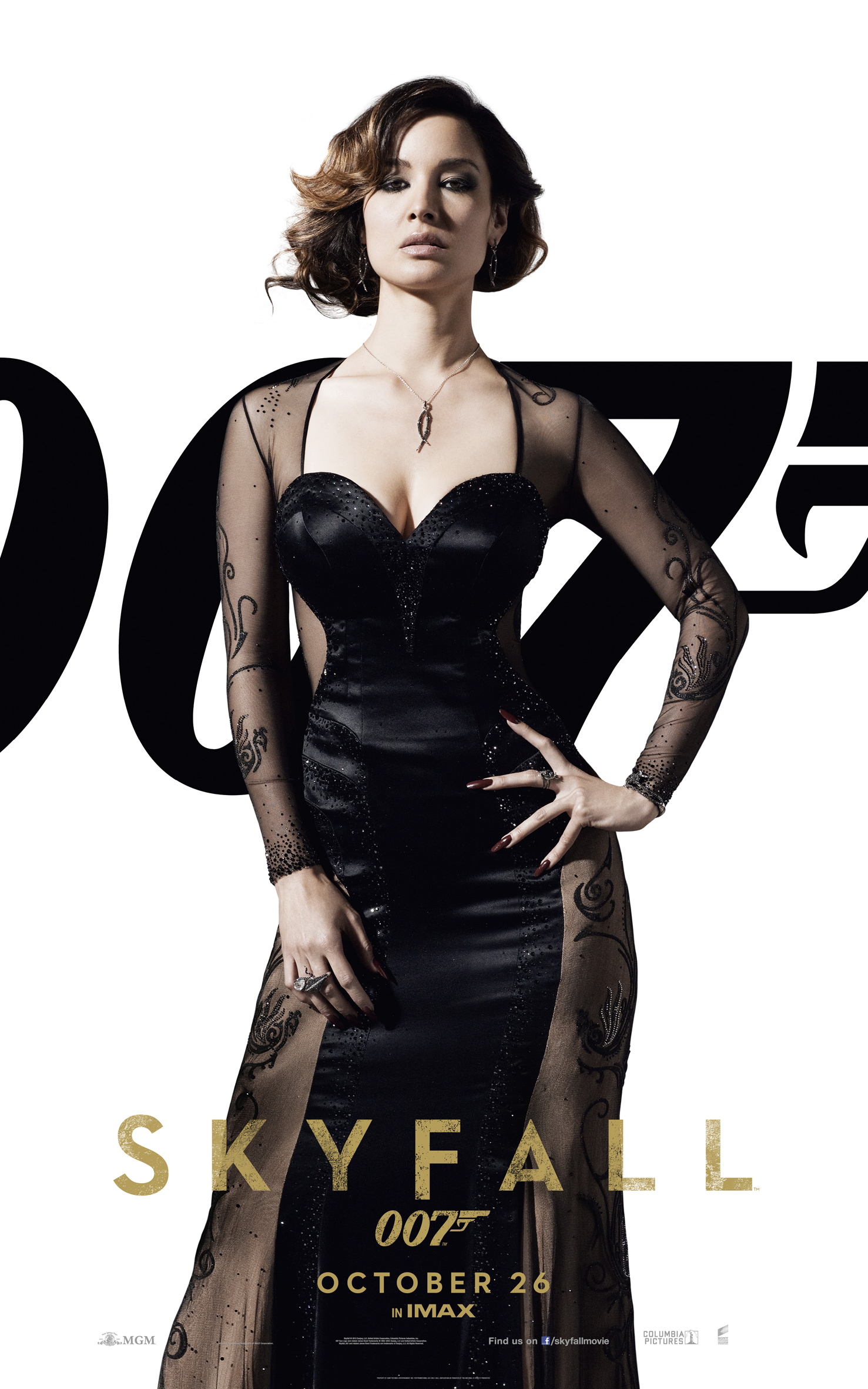
Much better than the character posters for Quantum Of Solace. The one that stands out the most for me is Berenice, she looks absolutely stunning!
#40
thecasinoroyale
-

- Veterans
-
- 14358 posts
Commander
- Location:Basingstoke, UK
Posted 09 August 2012 - 06:43 PM
Can we pleeeeease not get into a bicker about those who like and those who don't? After the brilliant reception of the trailers, this is simply more to whet our appetite in cinemas in passing by and it's certainly got the 007 vibe so they work for sure!
#41
MajorB
-
- Veterans
-
- 3700 posts
Commander
- Location:Phoenixville, Pennsylvania, USA
Posted 09 August 2012 - 09:21 PM
I think this is our first look at the official billing, etc., isn't it? I always get pumped about that--makes it more real somehow.
#42
marktmurphy
-

- Veterans
-
- 9055 posts
Commander
- Location:London
Posted 09 August 2012 - 10:11 PM
I think this is our first look at the official billing, etc., isn't it? I always get pumped about that--makes it more real somehow.
It's kind of bizarre to see 'directed by Sam Mendes' in that familiar font. Sam Mendes doing a Bond film!
#43
Melancholy Productions
-

- Crew
-
- 174 posts
Sub-Lieutenant
- Location:Perth, Australia
Posted 09 August 2012 - 11:50 PM
Decent posters, quite striking shots of the characters, but something about Bond's stance irks me. He looks quite stiff and unnaturally posed.
#44
Leon
-

- Veterans
-
- 1574 posts
Lt. Commander
- Location:England
Posted 10 August 2012 - 12:02 AM
Well, the white background was prevalent on the original Connery film posters. It's certainly classic. Would be nice to see another main poster on the same lines, just with more going on in it. I always felt the Dr No posters had a good bit of character to them.
#45
univex
-
- Veterans
-
- 2310 posts
Lt. Commander
Posted 10 August 2012 - 12:05 AM
That thair is positively ridiculous (Dan´s). Had to say it. Oh, and I hate character posters, always have. These are no exception. God forbid, but my instant thought was DUD2, and that isn´t a good thing. Still, it´s only a bunch if character posters. Dreadful ones IMO.
#46
quantumofsolace
-

- Veterans
-
- 1563 posts
Lt. Commander
Posted 10 August 2012 - 12:28 AM
Horrible. Bond looks ridiculous. This is very poor when you consider how good the trailers have been.
#47
tdalton
-

- Veterans
-
- 11680 posts
Commander
Posted 10 August 2012 - 12:44 AM
Jesus. They're character posters, people. They're not supposed to break amazing ground. It's James Bond, Bond girls, and a blatant Bond villain. It's fine.
Well said.

The posters are fine. They're not the greatest bit of marketing to be released for this film, but I'll take them over the teaser poster, especially the Severine poster, which is the best of the four. It's a shame Bond's is the weakest, but it doesn't really matter in the long run.
#48
Chief of SIS
-
- Crew
-
- 921 posts
Lieutenant
Posted 10 August 2012 - 01:51 AM
Bond's tux looks like velvet and blue.
Unfortunate.
Unfortunate.
#49
univex
-
- Veterans
-
- 2310 posts
Lt. Commander
Posted 10 August 2012 - 02:29 AM
Very.
I hope the final poster blows all of these to smithereens.
I hope the final poster blows all of these to smithereens.
#50
Simon
-

- Veterans
-
- 5884 posts
Commander
- Location:England
Posted 10 August 2012 - 07:58 AM
I wonder if these will actually be printed as posters.
The QoS ones above were for the French market only and the UK versions only came out as large vinyl banners.
The QoS ones above were for the French market only and the UK versions only came out as large vinyl banners.
#51
thecasinoroyale
-
- Veterans
-
- 14358 posts
Commander
- Location:Basingstoke, UK
Posted 10 August 2012 - 08:11 AM
I am sure the poster will be a cut above these, please don't forget as it said, they are cinema posters, so not global marketing material but simple indicators that James Bond is back in action. People will glance at them and see them as they're going about their own business in the cinema, so it will work to plant the seed. They're not going to break new ground with the character posters, they've no need to.
Hope we get the theatrical poster soon now then with these teasing images...!
Hope we get the theatrical poster soon now then with these teasing images...!
#52
Simon
-
- Veterans
-
- 5884 posts
Commander
- Location:England
Posted 10 August 2012 - 10:15 AM
Seems they are already printed on paper since ebay uk has a quad and a 1 sheet of the Craig design. (I use the word 'design' loosely)
The quad is of the 'lying down' standee (I am aware it is a contradiction in terms) thing we've already seen images for in the US.
And, to be sure, it is [censored]ing ugly.
The quad is of the 'lying down' standee (I am aware it is a contradiction in terms) thing we've already seen images for in the US.
And, to be sure, it is [censored]ing ugly.
#53
marktmurphy
-
- Veterans
-
- 9055 posts
Commander
- Location:London
Posted 10 August 2012 - 10:36 AM
Oh yes; good spot. Here it is:
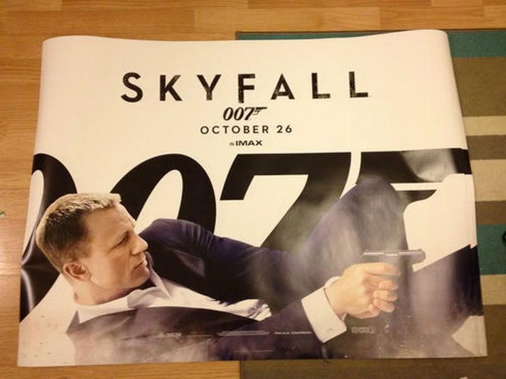
I like an original pose.
I like an original pose.
#54
Jackanaples
-

- Crew
-
- 992 posts
Lieutenant
- Location:Hollywood, CA
Posted 10 August 2012 - 01:51 PM
I do wish that movie studios across the board would get a bit more adventurous with their poster designs (and dvd covers). Still, these posters give nothing away about the movie, which is a plus. There's a simplicity to the design that I like. At this point you can boil the design elements down to James Bond in a tuxedo with a gun, the name of the movie, the 007 logo and release date --and people will get excited.
I love the tuxedo Daniel Craig is wearing. Elegant and midnight blue the way it should be. Don't think he looks stiff in the picture either. In contrast to the others, he looks like a coiled spring.
I love the tuxedo Daniel Craig is wearing. Elegant and midnight blue the way it should be. Don't think he looks stiff in the picture either. In contrast to the others, he looks like a coiled spring.
#55
Shrublands
-

- Veterans
-
- 4012 posts
Commander
- Location:Conveniently Near the NATO Base
Posted 10 August 2012 - 04:09 PM
Really, people might say 'they are only character posters' etc... but honestly, they're terrible. Amateurish even. For a campaign that the most complimentary description might be 'minimal' - they're cluttered and badly composed, all of them. An averagely talented teenager with the most rudimentary grasp of Photoshop could produce better.
Couldn't they have employed a talented designer to produced something professional and in some way imaginative?
This is a series celebrating its 50th anniversary, that once had ALL of its posters crafted by the likes of Robert Brownjohn, Robert Peak, Robert McGinnis and Frank McCarthy. I mean,![[censored]](https://debrief.commanderbond.net/topic/61778-new-skyfall-character-posters-released/style_emoticons/default/censored.gif) ing hell, just look at this substandard rubbish.
ing hell, just look at this substandard rubbish.
Couldn't they have employed a talented designer to produced something professional and in some way imaginative?
This is a series celebrating its 50th anniversary, that once had ALL of its posters crafted by the likes of Robert Brownjohn, Robert Peak, Robert McGinnis and Frank McCarthy. I mean,
ing hell, just look at this substandard rubbish.
#56
Mr Teddy Bear
-

- Veterans
-
- 1154 posts
Lt. Commander
Posted 10 August 2012 - 04:28 PM
Perhaps, but would anyone even care?
#57
Shrublands
-
- Veterans
-
- 4012 posts
Commander
- Location:Conveniently Near the NATO Base
Posted 10 August 2012 - 04:34 PM
Perhaps, but would anyone even care?
It they'd had that attidued from the start, do you think there'd be books and exhibitions celebrating the achievements of this unique series in its 50th year?
#58
x007AceOfSpades
-
- Veterans
-
- 4369 posts
Commander
- Location:Sunny Southern California
Posted 10 August 2012 - 04:34 PM
They're still better then the character posters for The Dark Knight Rises. Standing in the rain with 'Rise' above the top was surely clever. I like these because they're simple and get the point across. I'm sure the final theatrical release poster will be phenomenal.
Edited by x007AceOfSpades, 10 August 2012 - 04:35 PM.
#59
thecasinoroyale
-
- Veterans
-
- 14358 posts
Commander
- Location:Basingstoke, UK
Posted 10 August 2012 - 05:16 PM
Let's not be too hasty...let's have faith that the official theatrical poster has an even better Bond feel to it and captures the tone of the movie.
Remember let's start attacking yet...these are just extra character posters...!
Remember let's start attacking yet...these are just extra character posters...!
#60
Jim
-

- Commanding Officers
-
- 14266 posts
Commander RNVR
- Location:Oxfordshire
Posted 10 August 2012 - 06:04 PM
Remind me of the ones "they" used to put on the doors of cinemas, ceiling to floor things; perhaps that's the idea?