

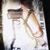
The Official SkyFall Logo.
Started by
DamnCoffee
, Nov 03 2011 12:03 PM
28 replies to this topic
#1

DamnCoffee
-
- Executive Officers
-

- 24459 posts
Commander
- Location:England
Posted 03 November 2011 - 12:03 PM
#2
MattofSteel
-
- Veterans
-
- 2482 posts
Commander
- Location:Waterloo, ON
Posted 03 November 2011 - 12:05 PM
'007' will end up in a faded font behind 'Skyfall'.
Otherwise, it's...the word Skyfall. Good start!
Otherwise, it's...the word Skyfall. Good start!
#3
Gobi-1
-

- Veterans
-
- 1529 posts
Lt. Commander
- Location:East Texas
Posted 03 November 2011 - 12:07 PM
Nice and simple. I like it. Looks like the same font as Quantum of Solace.
#4
marktmurphy
-

- Veterans
-
- 9055 posts
Commander
- Location:London
Posted 03 November 2011 - 12:09 PM
I wasn't too far off with my fan art 
#5
Pussfeller
-

- Veterans
-
- 4089 posts
Commander
- Location:Washington, D.C.
Posted 03 November 2011 - 12:11 PM
It looks like very subtle CamelCase. So is the title actually SkyFall? Wikipedia is going with plain old "Skyfall".
#6
Captain Tightpants
-
- Veterans
-
- 4755 posts
Commander
- Location::noitacoL
Posted 03 November 2011 - 12:16 PM
We can only go by what we see. And we cannot see any indication that the film is called "SkyFall". Should that change, we will move the page accordingly.Wikipedia is going with plain old "Skyfall".
#7
marktmurphy
-
- Veterans
-
- 9055 posts
Commander
- Location:London
Posted 03 November 2011 - 12:18 PM
No beard, then?
#8
Pussfeller
-
- Veterans
-
- 4089 posts
Commander
- Location:Washington, D.C.
Posted 03 November 2011 - 12:18 PM
It doesn't look like CamelCase to you? I'm just going by my ocular orbs.
#9
Mr. Blofeld
-
- Veterans
-
- 9173 posts
Commander
- Location:North Smithfield, RI, USA
Posted 03 November 2011 - 12:51 PM
...okay, seeing that in offical font has me convinced; SkyFall's a damn good title, in (official!) context. 
#10
d21089
-

- Crew
-
- 143 posts
Sub-Lieutenant
Posted 03 November 2011 - 12:54 PM
in the treatment on the publicity website- the F is longer than the other letters so it could be SkyFall but its more likely just a style thing- im not big on the title but its not so bad and looks good
#11
WhiteKnight
-

- Crew
-
- 184 posts
Sub-Lieutenant
- Location:Hong Kong
Posted 03 November 2011 - 12:56 PM
Official title treatment from Sony Pictures Publicity attached.
Attached Files
-
 Skyfall_Titlestyle_AW_100k.jpg 49.24KB
143 downloads
Skyfall_Titlestyle_AW_100k.jpg 49.24KB
143 downloads
Edited by WhiteKnight, 03 November 2011 - 12:58 PM.
#12
Matt_13
-

- Veterans
-
- 5969 posts
Commander
- Location:USA
Posted 03 November 2011 - 01:22 PM
That is a pretty awesome logo.
#13
MattofSteel
-
- Veterans
-
- 2482 posts
Commander
- Location:Waterloo, ON
Posted 03 November 2011 - 01:31 PM
"S" and "F" are different line heights than the other letters. So, "SkyFall".
#14
Gobi-1
-
- Veterans
-
- 1529 posts
Lt. Commander
- Location:East Texas
Posted 03 November 2011 - 04:18 PM
Official title treatment from Sony Pictures Publicity attached.
This was really nice of Sony/EON to do. Saves us fan art guys a lot of time.
#15
Nicolas Suszczyk
-

- Veterans
-
- 3735 posts
Commander
- Location:Buenos Aires, Argentina
Posted 03 November 2011 - 09:21 PM
Not convinced with the title and the logo, but still, BOND IS BACK!!!
#16
bondrocks14
-

- Crew
-
- 300 posts
Sub-Lieutenant
- Location:San Antonio, TX
Posted 03 November 2011 - 09:27 PM
I like the design of the logo...but not understanding why they would use the QOS font when this movie is supposed to be standalone...lack of creativity I guess 
#17
mrsbonds_ppk
-

- Veterans
-
- 1297 posts
Lt. Commander
- Location:Texas
Posted 03 November 2011 - 09:41 PM
The title is too simple for me but hey.. It's a nice simple logo also. Ok i'll bite. Cant wait till it comes out.
#18
mattjoes
-

- Crew
-
- 243 posts
Sub-Lieutenant
Posted 03 November 2011 - 09:41 PM
A piece of fan art somebody posted right here on CBn had a better logo, with a curved Y. Certainly more distinguished than the official design, which is alright, but too similar to the logos of the last two films.
I'm guessing this Bond film, unlike Casino Royale and Quantum of Solace, will get a rather busy poster, to put the significantly higher level of star power to good use. Several faces to display.
I'm guessing this Bond film, unlike Casino Royale and Quantum of Solace, will get a rather busy poster, to put the significantly higher level of star power to good use. Several faces to display.
Edited by mattjoes, 03 November 2011 - 09:55 PM.
#19
zencat
-

- Commanding Officers
-
- 25814 posts
Commander GCMG
- Location:Studio City, CA
Posted 03 November 2011 - 09:44 PM
Oh, yeah, that F is a different pints size, isn't it."S" and "F" are different line heights than the other letters. So, "SkyFall".
Still, the Facebook page is writing it Skyfall. And the press release has it all in caps. But nice to know for sure.
#20
DamnCoffee
-
- Executive Officers
-
- 24459 posts
Commander
- Location:England
Posted 03 November 2011 - 09:50 PM
I like the design of the logo...but not understanding why they would use the QOS font when this movie is supposed to be standalone...lack of creativity I guess
Quantum font was also the Casino Royale, font. It seems to be their favourite. Good old Century Gothic!
#21
DaveBond21
-

- Veterans
-
- 18026 posts
Commander
- Location:Sydney, Australia (but from the UK)
Posted 03 November 2011 - 09:57 PM
I like the design of the logo...but not understanding why they would use the QOS font when this movie is supposed to be standalone...lack of creativity I guess
Quantum font was also the Casino Royale, font. It seems to be their favourite. Good old Century Gothic!
Agreed. If people recognise the font, then they will realise they are looking at a Bond movie logo, even if the "007" is missing.
------------------------------------------------------------------------------------------------------------------------------------------
#22
Whalltt
-

- Crew
-
- 230 posts
Sub-Lieutenant
Posted 03 November 2011 - 10:10 PM
I guess we can assume they're going with a similar look for all of the Craig era movies. We'll probably see a lots of greyish tones in the posters and DVD covers as in CR and QoS.
#23
Captain Tightpants
-
- Veterans
-
- 4755 posts
Commander
- Location::noitacoL
Posted 04 November 2011 - 12:20 AM
Or it's just a stylistic choice - when THE WORLD IS NOT ENOUGH was announced, the tail of the 'g' underlined the title."S" and "F" are different line heights than the other letters. So, "SkyFall".
#24
TCK
-

- Crew
-
- 341 posts
Sub-Lieutenant
- Location:France
Posted 04 November 2011 - 12:22 AM
Whatever if it's Skyfall or Skyfall, on CBn, it'll be "SF" soon.
#25
zencat
-
- Commanding Officers
-
- 25814 posts
Commander GCMG
- Location:Studio City, CA
Posted 04 November 2011 - 12:37 AM
SF like SilverFin?Whatever if it's Skyfall or Skyfall, on CBn, it'll be "SF" soon.

#26
d21089
-
- Crew
-
- 143 posts
Sub-Lieutenant
Posted 04 November 2011 - 01:09 AM
The CR & QOS (and Skyfall is slightly different) fonts are different but yeah i think its just a Craig graphic design continuity thing like Brosnan's films from TND-DAD used the same font
CR - Century Gothic or similar
QOS- Neutraface
SF- Neutraface No.2
CR - Century Gothic or similar
QOS- Neutraface
SF- Neutraface No.2
#27
00 Brosnan
-

- Crew
-
- 506 posts
Lieutenant
- Location:East Coast, U.S
Posted 04 November 2011 - 01:17 AM
Eh...nice and simple, nothing really to complain about. Looks better than QoS that's for sure.
#28
bondrocks14
-
- Crew
-
- 300 posts
Sub-Lieutenant
- Location:San Antonio, TX
Posted 04 November 2011 - 02:26 AM
I like the design of the logo...but not understanding why they would use the QOS font when this movie is supposed to be standalone...lack of creativity I guess
Quantum font was also the Casino Royale, font. It seems to be their favourite. Good old Century Gothic!
If you look closely at the CR font you'll notice it's different than QOS and SF...most notably the letter A
#29
Jeff007
-

- Veterans
-
- 2076 posts
Lt. Commander
- Location:Afghanistan
Posted 04 November 2011 - 12:50 PM
Just happy they didn't put the 007 logo right in the logo (like Tomorrow Never Dies or The World is not Enough. Although since MGW and BB took over they have put the 007 somewhere in the logo for marketing.